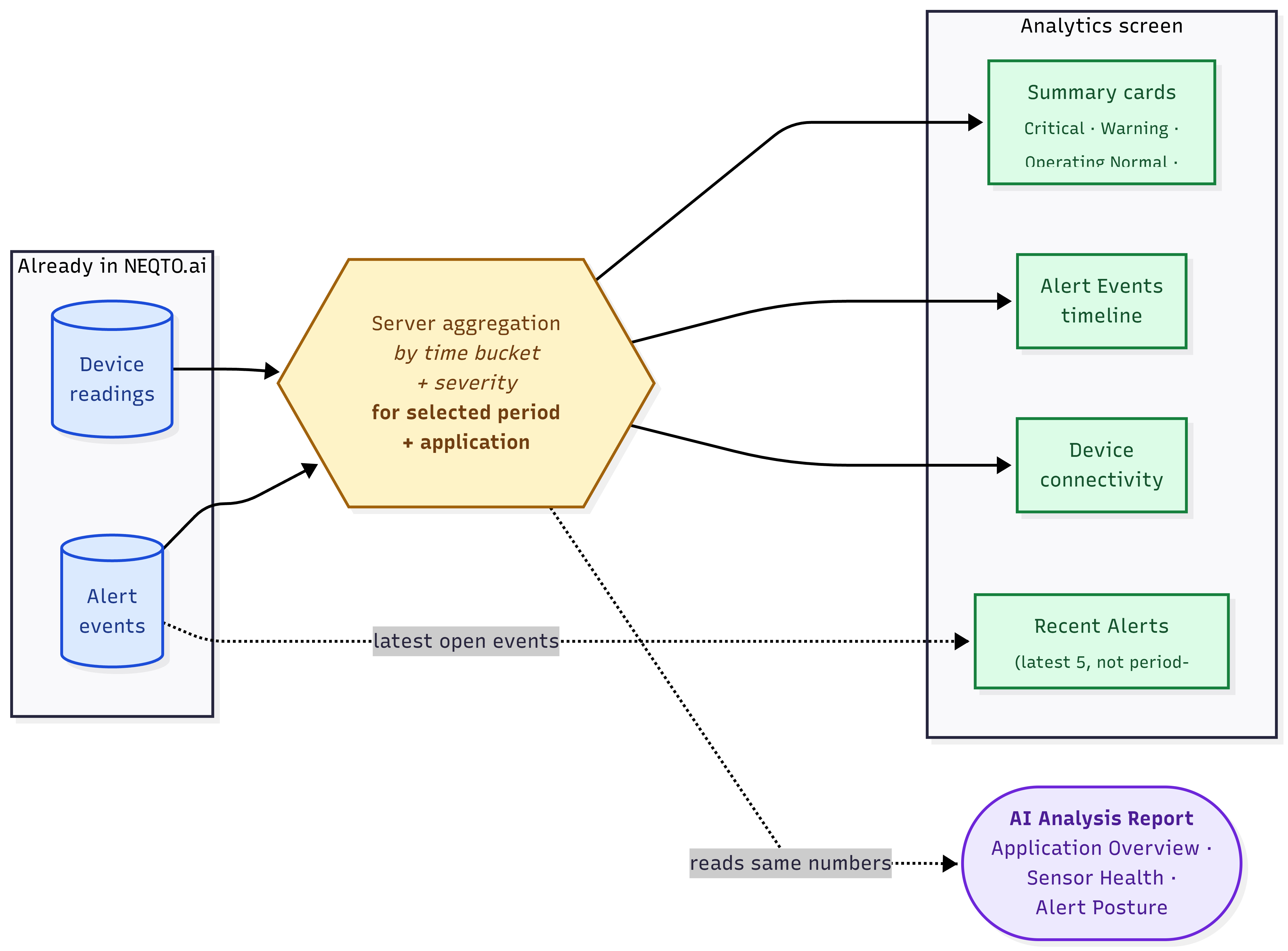
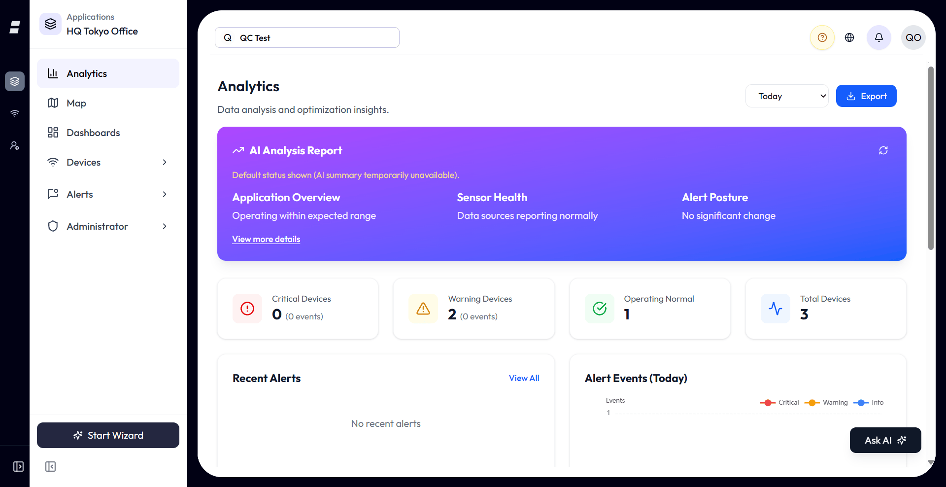
Analytics is the at-a-glance health view for an application. It rolls up your devices, their connectivity, and your alert events over a time range you choose, then adds an AI Analysis Report that reads the numbers and writes a short plain-language summary. It is read-only: there is nothing to configure, and the page updates itself as new data and alerts arrive.
Where Analytics Lives
Analytics is an application-scoped screen. It is the first item in an application’s sidebar, above Map, Dashboard, Devices, and Alerts.
- Inside an application: open an application and click Analytics in the sidebar. Everything shown is scoped to that application, so you only see devices and alerts assigned to it.
- Demo buildings: the same Analytics screen also appears in the demo-buildings area, which is a guided sample experience. It is the identical component, just pointed at the demo scope rather than one of your applications. The real product screen is the application one.
The Time Range
Everything on the page is driven by one control: the time-range selector in the top right. Change it and every card, chart, and the AI report all re-aggregate for that window.
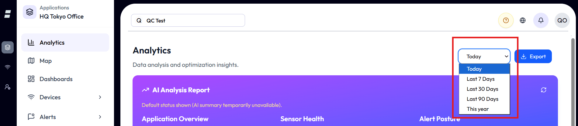
| Range | What it covers | Chart granularity |
|---|---|---|
| Today | Midnight today to now, in your profile timezone. | Hourly buckets. |
| Last 7 Days | The trailing 7 days. | Daily buckets. |
| Last 30 Days | The trailing 30 days. | Daily buckets. |
| Last 90 Days | The trailing 90 days. | Daily buckets. |
| This year | From January 1 of the current year to now. | Daily buckets. |
There is one range control, and it sets a fixed look-back window. There is no custom start/end date picker and no side-by-side period comparison. To compare a longer span, switch to the next range up.
The AI Analysis Report
At the top of the page, an AI model reads your aggregated numbers for the selected period and writes a short summary in three parts. This is a real generated analysis, not canned text.
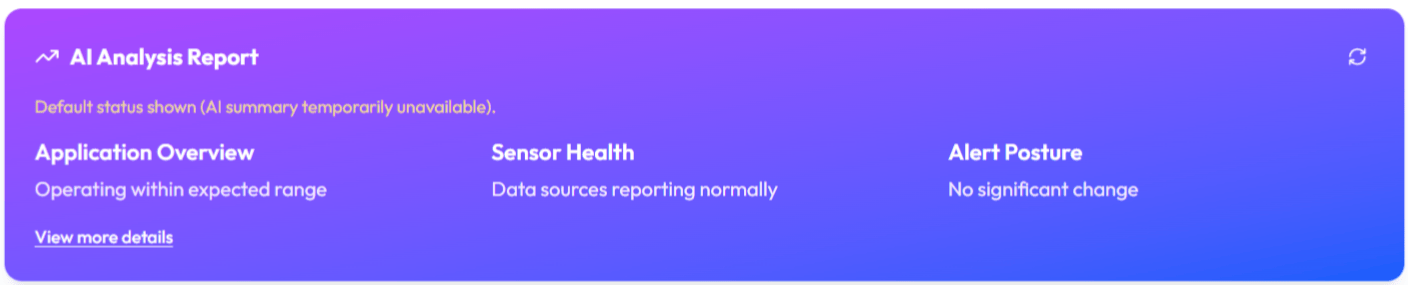
| Section | What it covers |
|---|---|
| Application Overview | A high-level read on the application for the period. |
| Sensor Health | How the devices and their readings are behaving. |
| Alert Posture | The alert situation: what is firing and how serious. |
- View more details expands each section into a longer paragraph and adds a numbered list of recommendations.
- Refresh (the circular arrow) re-runs the analysis. It also re-runs automatically when you change the time range.
- If the model is briefly unavailable, the panel shows a default status with the note that the AI summary is temporarily unavailable, then retries.
Summary Cards
Four cards give the headline device counts for the period. Most are clickable and jump you to the relevant list.
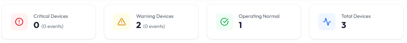
| Card | What it counts | Click goes to |
|---|---|---|
| Critical Devices | Devices whose highest-severity alert event in the period was critical. The subtitle shows the critical event count. | Notifications, filtered to critical. |
| Warning Devices | Devices that are not critical and not operating normally. This bucket also includes disconnected devices. The subtitle shows the warning event count. | Notifications, filtered to warning. |
| Operating Normal | Currently connected devices that had no alert event in the period. | — |
| Total Devices | All devices in scope (the application, or the demo scope in the demo view). | Devices list. |
Recent Alerts
A live list of the most recent open alert events for this scope, critical first.
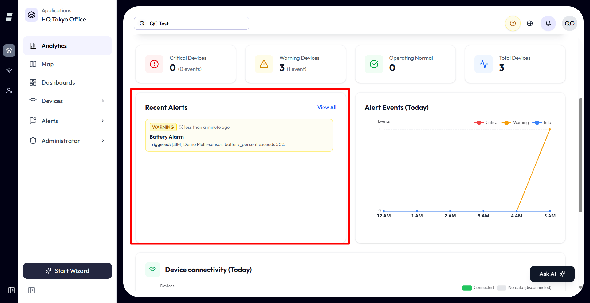
- Shows up to five non-completed alert events, sorted critical-first then by recency.
- View All opens the full Notifications list for the scope.
- This widget is not bound to the time range; it always shows the latest open alerts at the time the page loaded — it does not update live, so reload the page or switch scope to pick up newer events.
Alert Events Timeline
A line chart of alert events over the period, one line per severity, so you can see when things spiked.
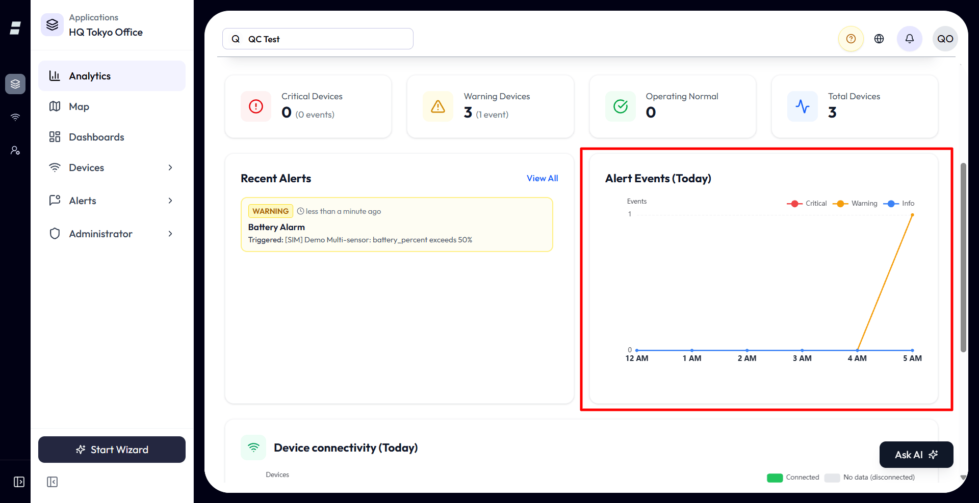
- Three lines: Critical, Warning, Info.
- Buckets are hourly for Today and daily for every other range. Empty buckets are filled with zeros so the timeline is continuous.
- The chart re-fetches whenever a new alert event arrives, so it stays current without a manual refresh.
- Empty state: “No alert events in this period.”
Device Connectivity
A stacked bar chart showing, per time bucket, how many of your eligible devices were sending data versus silent.
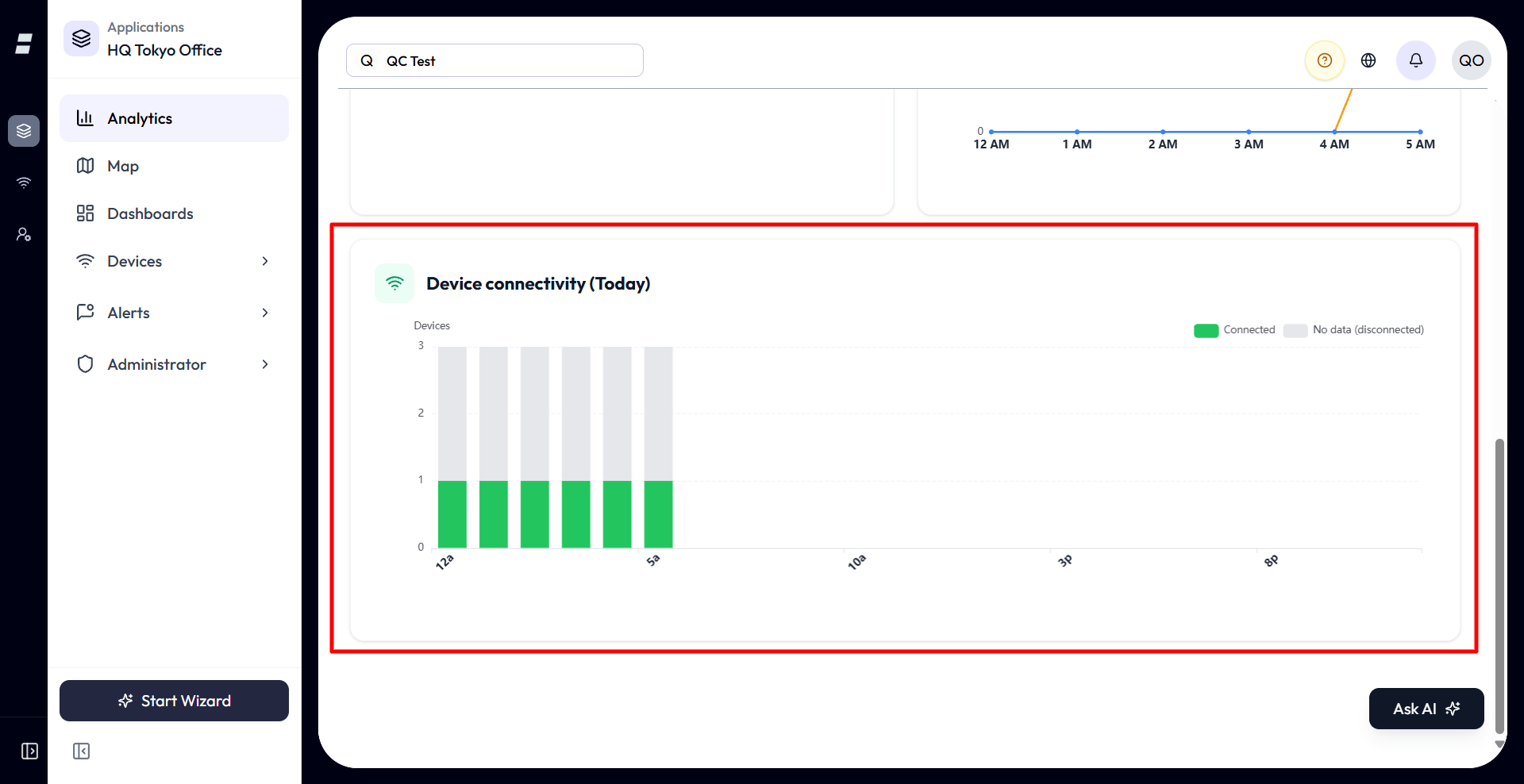
| Series | Meaning |
|---|---|
| Connected (green) | Devices that had aggregated data in that bucket and already existed at that time. |
| No data (disconnected) (grey) | Eligible devices that sent nothing in that bucket. |
- The y-axis counts devices, and the tooltip shows the connected and no-data counts plus a percentage of that bucket’s total.
- “Connected” here means sent data in the bucket, which is a coarser, historical view than the live green/red connectivity dot on the Devices list. Do not expect them to match minute-to-minute.
- Empty states: “No devices in scope” when there are none, or “No timeline data” when there is nothing to plot.
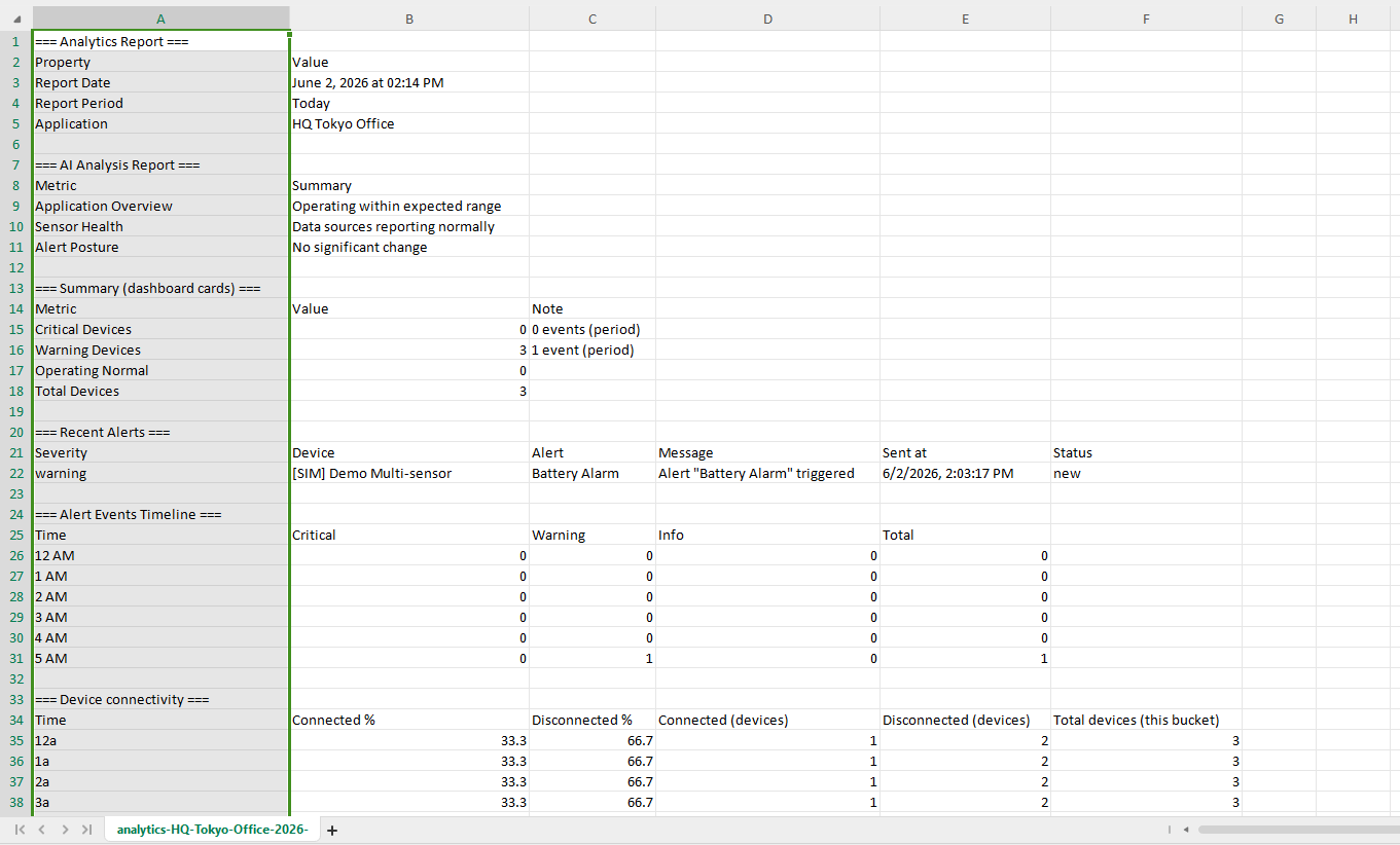
Exporting a Report
The Export button downloads everything currently on screen as a single CSV file.
-
1Pick your time range. The export captures whatever the page currently shows for that range.
-
2Click Export. A CSV downloads immediately, with sections for the report date and period, the AI report (including the expanded details if you have them open), the summary cards, recent alerts, the alert-events timeline, and device connectivity.
-
3Open it in any spreadsheet. In an application, the application name is included in the file so you can tell exports apart.
Analytics vs Dashboards
They look similar but do different jobs. Use this to pick the right one.
| Analytics | Dashboards | |
|---|---|---|
| Who builds it | Pre-built and fixed. You only pick a time range. | You build it from widgets. |
| What it shows | Whole-application health: alerts, connectivity, device counts, plus an AI summary. | Whatever attributes and devices you choose to pin. |
| Time control | One look-back range for the whole page. | Per-widget, depending on the widget. |
| Output | A CSV report. | A live monitoring view. |
In short: open a Dashboard when you want to watch specific readings the way you arranged them. Open Analytics when you want a quick, summarized read on the whole application for a period, and a report you can hand to someone.
Limits and Good to Know
A few behaviors that are not obvious from the screen.
- It is read-only. There is nothing to create, name, or save. The only input is the time range, which is remembered for next time.
- It only summarizes data you already have. Analytics aggregates stored device readings and alert events. Anything older than your plan’s data retention is gone, so a long range like “This year” only goes back as far as your history actually reaches.
- Five fixed ranges, no custom dates, no comparison. To widen the view, step up to the next range.
- Scope follows the application. Inside an application you see only that application’s devices and alerts. The demo-buildings view uses a broader demo scope.
- The AI report uses LLM tokens. Refreshing or changing the range regenerates it and counts against your usage limit; the charts and cards never do.
- “Connected” in the chart is historical. It means a device sent data in that bucket, which is not the same as the live connectivity dot on the Devices list.