A Dashboard is a live canvas of widgets that visualize what your devices are reporting right now. Each widget is bound to one or more device Attributes and updates on its own over a live connection. You arrange widgets on a grid, resize them, group them, and the layout saves itself. This page covers how dashboards work, the controls and settings every widget shares, and a complete catalog of every widget type with its configuration options.

Where Dashboards Live
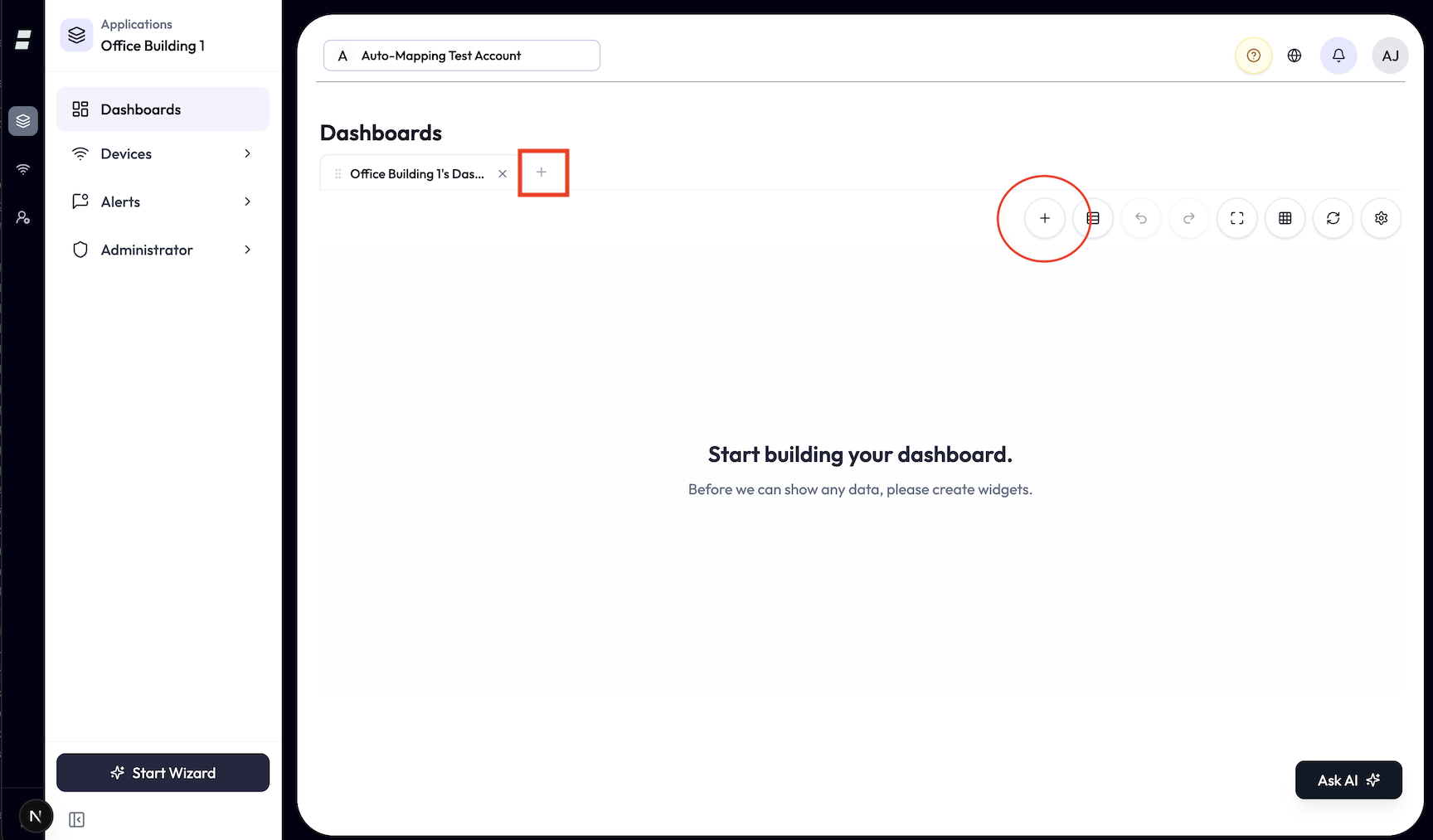
Every dashboard belongs to an application. You open, create, and manage an application’s dashboards from its Dashboards page, which is organized as tabs: you open dashboards into tabs and switch between them in place, rather than scrolling a list. A widget you create inside an application stays in that application’s context.
Create, rename, and delete
-
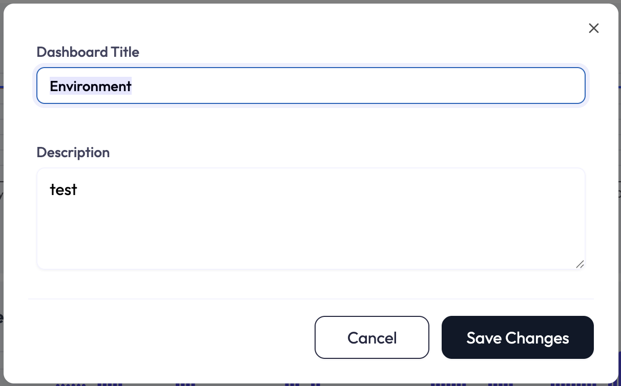
1On the Dashboards page, create a new dashboard. Give it a Dashboard Title (required) and an optional Description.
-
2Rename or edit the title and description any time from the dashboard’s gear menu (Edit). You can also double-click the dashboard’s description to edit it in place; the title is renamed from the Edit dialog (or by double-clicking a dashboard’s tab to rename the tab).
-
3The gear menu also offers Duplicate (creates a “Copy of …” with all its widgets) and Delete. Delete asks for confirmation, then permanently removes the dashboard and every widget on it. Deleting a dashboard cannot be undone — the Undo toast applies only to deleting an individual widget on a dashboard (see The Grid), not to deleting a whole dashboard.
Tabs: keep several dashboards open at once
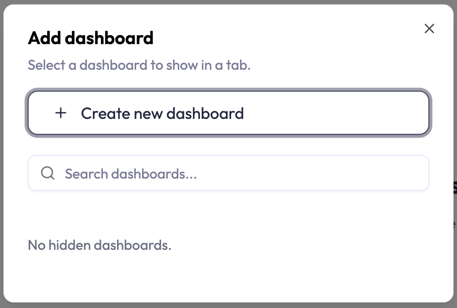
- Add a hidden dashboard to the tab bar, or create a brand-new one, from the add-tabs dialog.
- Reorder tabs by dragging, rename a tab (with edit permission), and close a tab to hide it from the bar (closing a tab does not delete the dashboard).
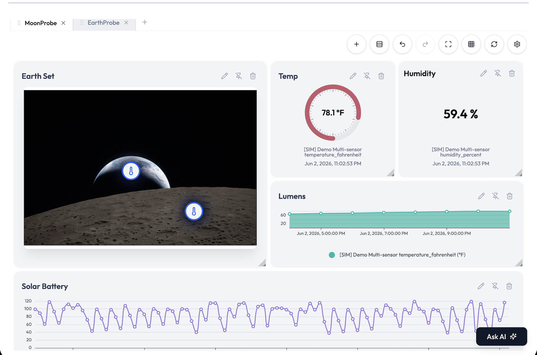
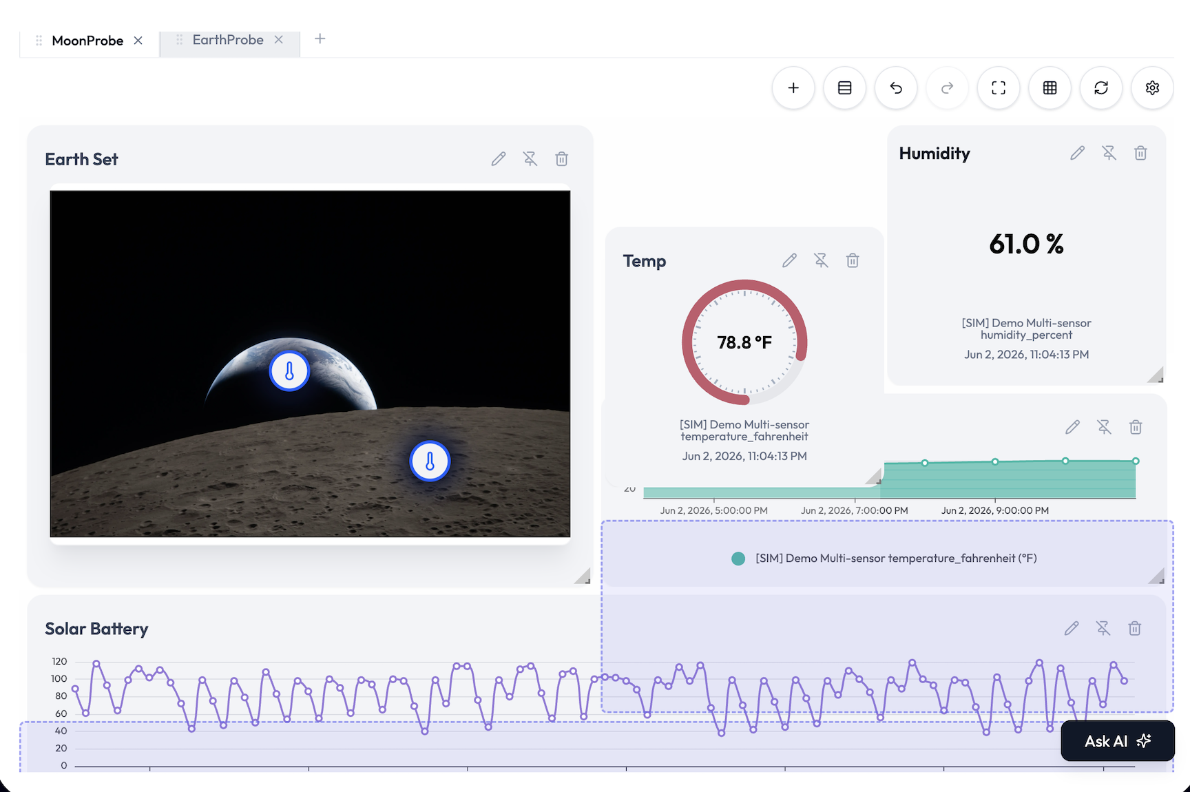
The Grid: Adding, Arranging, and Saving
Widgets live on a responsive 12-column grid. With edit permission you can drag, resize, and group them. Without it, the dashboard is view-only.
Layout behavior
| Behavior | Detail |
|---|---|
| Columns | 12 columns on desktop sizes (large, medium, small). On phones the grid collapses to a single column so every widget stacks full width. |
| Move | Drag a widget by the handle in its header. Widgets can overlap while you are editing. A pinned widget stays put (see Widget Controls below). |
| Resize | Pull the corner. New widgets drop in at the next free spot at a standard starting size, then resize freely. Auto Align gives each widget a sensible size for its type: gauge, label, progress, pie, and doughnut snap to a small square; charts to a wider rectangle; tables and maps to a full-width block. |
| Spacers | Add spacer drops a full-width divider that splits the dashboard into vertical sections (for example “KPIs” above, “History” below). Auto Align respects these sections. |
Saving, autosave, and history
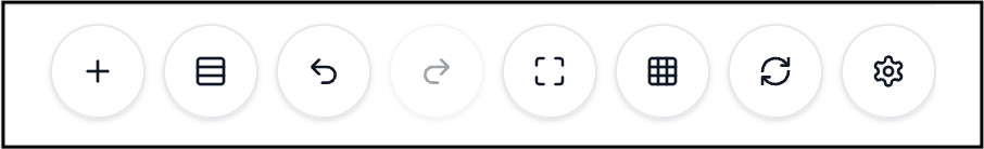
- Autosave: layout changes (moves, resizes, spacer edits) persist automatically. A small indicator shows Saving…, then Saved · just now, and warns if a save failed and will retry.
- Auto Align Widgets packs widgets tightly into a clean grid, section by section, in one action.
- Refresh Dashboard re-pulls data for every widget on demand.
- Undo / Redo covers layout commits plus adding and deleting widgets, up to the most recent 20 actions on the current dashboard.
- Full screen expands the dashboard for a wall display. When several dashboards are open as tabs, previous/next arrows flip between those open dashboards.
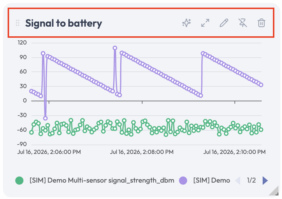
Widget Controls: Hover to Reveal
Widgets keep their controls hidden so the dashboard stays clean, especially on a wall display. Point at a widget and its controls fade in at the top. Move the pointer away and they disappear again. On a touch screen the controls live behind a ⋮ (More) button instead; tap it to show them, tap elsewhere to dismiss.
| Control | What it does |
|---|---|
| Drag grip | The grip beside the title (the whole title area works too). Hold it to drag the widget around the grid. Needs edit permission. |
| Ask AI (sparkles) | Opens the AI chat with a ready-made question about this widget, naming its title, its type, and the attributes and devices it shows. Send it as-is or edit the question first. Shown only if you can use the chat assistant. |
| Expand | Opens the widget in a large pop-up for a closer look. Double-clicking (or double-tapping) the widget body does the same. Available on every widget except Map and Data Push. See “The expanded view” below. |
| Edit (pencil) | Opens the widget editor with the widget’s current settings. Needs edit permission. |
| Pin / Unpin | Locks the widget in place. A pinned widget cannot be dragged or resized, and other widgets cannot push it around while you rearrange them. Unpin to move it again. Needs edit permission. |
| Delete (trash) | Removes the widget from the dashboard. An Undo toast appears so you can take it back. Needs delete permission. |
The expanded view
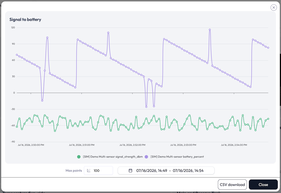
- Charts add a date-range picker and a Max points input, so you can look at a different time window or point density without editing the widget, plus a CSV download button. The CSV contains exactly the data drawn on screen.
- XY-Charts let you zoom into the plot with the scroll wheel. The date-range picker is not available here (the window comes from the widget’s own Live or Daily setting), but CSV download is: one file per pair, with Timestamp, X Value, and Y Value columns.
- Gauge and Label widgets let you grow or shrink the value text with the scroll wheel.
Live Data
Widgets update themselves. The dashboard opens an authenticated WebSocket connection and keeps every widget current as new readings arrive.
- Charts and XY-Charts request a time window (Live or Daily) and stream a series of readings.
- Single-status widgets (gauge, label) request the latest reading only.
- Multi-status widgets (table, map, progress, pie, doughnut) request the latest value per bound attribute.
- Data Push widgets display nothing, so they subscribe to nothing. They only send.
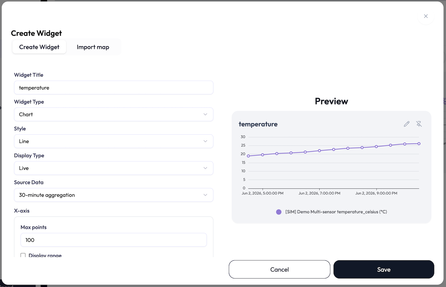
Building a Widget: What Every Widget Shares
Every widget is created and edited in the same editor: a config panel on the left and a live preview on the right. This section covers the controls that are the same for every widget type. The per-type options live in the Widget Catalog below, so they are not repeated for each widget.
-
1Check the Dashboard field, enter a Widget Title (required), and optionally a Description.
-
2Choose a Widget Type: Chart, Single Status, Multi Status, Data Push, or XY-Chart. Then choose a Style (the sub-type) within that type.
-
3Set the type-specific options (time range, scale, table cells, and so on), then add one or more Attributes (Data Push widgets have none).
-
4Watch the Preview, then save. The widget drops onto the dashboard at the next free spot.
Dashboard
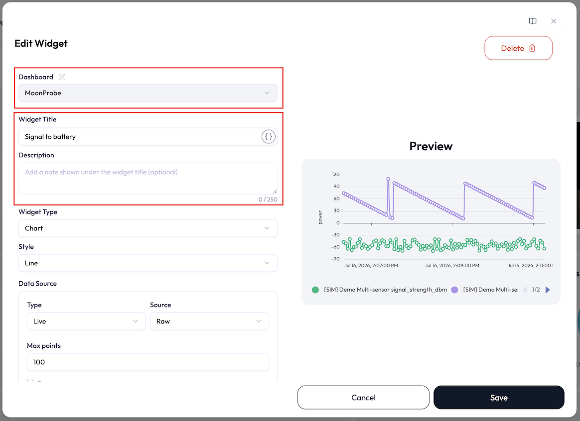
The first field in the editor shows which dashboard the widget belongs to. It is locked by default so you cannot move a widget by accident: the dropdown is greyed out until you click the small pencil next to the “Dashboard” label. Unlock it to create the widget on a different dashboard, or to move an existing widget when you edit it. In the few flows where the destination is fixed, the field is hidden entirely.
Widget Title, with tags
The Widget Title is required, and it can do more than plain text: it can embed
one of your tags. Click the braces button (Insert a tag) at
the end of the field, search the application’s tags, and pick one. This drops a token like
{{tag.room}} into the title, and the widget shows the tag’s current value in its
place.
- A Resolves to preview under the field shows the finished title. If the tag is missing, a Referenced tag not found warning appears instead.
- Rename once, update everywhere: point several widget titles at the same tag and editing the tag’s value renames them all.
- Only tags whose key uses letters, numbers, hyphens, and underscores can be inserted. Others are shown greyed out in the picker.
Description
An optional Description (up to 250 characters) appears in smaller, muted text under the widget’s title on the dashboard. Long descriptions are truncated; hover to read the full text. Use it for context the title can’t carry, like “3rd floor, north wing” or “resets at midnight”.
Preview, with sample data
The right-hand pane always shows something useful. Before you bind an attribute it is labelled Preview (Sample) and renders your widget with realistic sample data, using the exact type, style, and options you have picked so far. Map and Data Push widgets show a sketch placeholder instead. Once a real attribute is bound the label switches to Preview and the data is live.
Attributes and their options
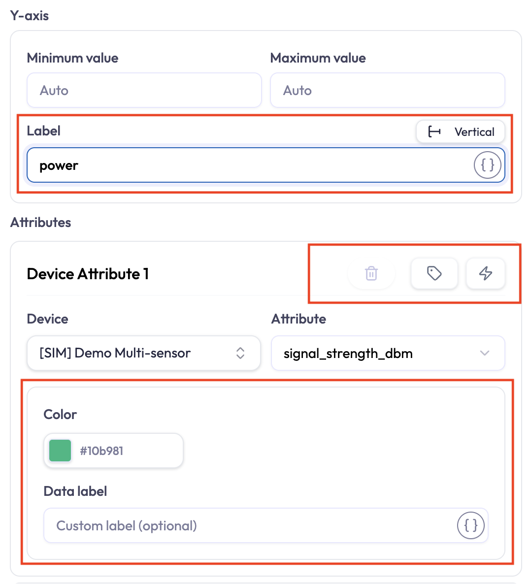
Every widget except Data Push is built from one or more Attributes (data points). Each attribute row ties a device to one of its measurements, plus display options. Which options appear depends on the widget type:
| Field | What it does |
|---|---|
| Device | Searchable picker. Type to find a device by name. Required for each attribute row. |
| Attribute | The measurement to show. The list fills only after a device is chosen, and reflects that device’s auto-detected attributes. |
| Statistic | Chart and XY-Chart only: how to reduce a window of readings into one aggregated point. The selector shows short labels: Max, Min, Ave, Sum, |Max|, and |Min|; the open menu spells out the full names (Maximum, Minimum, Average, Sum, Max absolute, Min absolute). The default is |Max|. Hidden when the chart is showing Raw data, since there is nothing to aggregate. |
| Color | The series, slice, or value color for this attribute. (No Color picker on a Map data point, and it is hidden on a Gauge once Advanced color settings is on.) |
| Data label | A custom name (up to 100 characters) shown in legends and labels instead of the raw attribute name. Available on Chart, XY-Chart, Single Status, Pie, and Doughnut. Like the title, it can embed a tag via the braces button. |
| Rounding | Single Status and Table only. Opens a small panel with a Rounding style (None, Round, Round up, Round down) and a Decimal places stepper from Integer to four places, with a live preview of the formatted number. |
| Unit (temperature only) | For a temperature attribute, a quick toggle between Celsius (°C) and Fahrenheit (°F). |
Calculations
Attribute rows on chart and status widgets carry two calculation buttons, so a widget can plot computed values instead of raw readings:
- The tags toggle switches the row between a single attribute and a simple combination of two attributes (add, subtract, multiply, or divide). Use it for quick sums and differences, like supply minus return temperature.
- The lightning-bolt button (Advanced calculation) opens a formula editor for anything beyond the basics: unit conversions, scaling, and full formulas. Once a formula is set, the row collapses to a Calculation card with Edit and Remove links, and the button turns blue.
On the dashboard a calculated series plots like any other, with a small ⚠ badge if the calculation has a problem. The formula itself is shown in the editor, not on the widget. The Advanced calculation editor and the formula language are covered on their own page.
The Widget Catalog
There are five widget types, most with several styles. The type identifiers
are chart, single_status, multi_status,
data_push, and correlation (the XY-Chart); each style has its own
sub-type identifier shown below.
| Type | Styles (sub-type id) |
|---|---|
Chart (chart) |
Line (line), Bar (bar), Area (area), Scatter
(scatter)
|
Single Status (single_status) |
Gauge (gauge), Label (label) |
Multi Status (multi_status) |
Table (table), Map (map), Progress (progress), Pie
(pie), Doughnut (doughnut)
|
Data Push (data_push) |
Form (form), Button (button) |
XY-Chart (correlation) |
Line (line), Scatter (scatter) |
Chart — Line, Bar, Area, Scatter
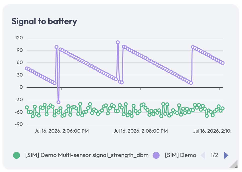
What it shows: one or more attributes plotted over time. Use it for trends, comparisons across devices, and history. Charts plot numeric values only.
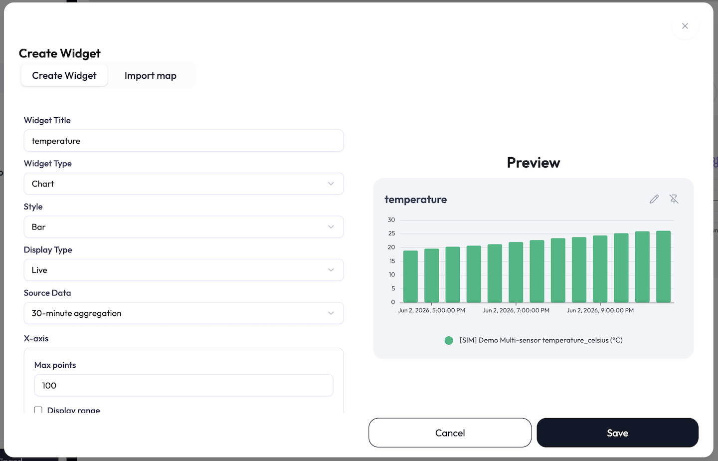
| Option | What it does |
|---|---|
| Style | Line, Bar, Area, or Scatter. |
| Display Type | Live (a rolling relative window) or Daily (a rotating day-based window). For Daily, the Duration select picks which day to show: Today, Yesterday, Two days ago, or Three days ago. |
| Source Data | The aggregation interval: Raw, 1-minute aggregation, 5-minute aggregation, 10-minute aggregation, 30-minute aggregation, 1-hour aggregation, or 3-hour aggregation. Daily charts cannot use Raw. With Raw selected, the per-attribute Statistic is hidden. |
| X-axis | For Live, Max points caps how many points are drawn (up to 1440) and an optional Display range sets how far back to look (a number plus seconds / minutes / hours / days). For Daily, the Duration day-selector above sets the window. |
| Y-axis | Minimum value and Maximum value. Leave both blank for Auto. If you set one you must set the other, and the max must be greater than the min. An optional Label names the axis; once it has text, a small toggle switches the label between Vertical (the default) and Horizontal. |
| Attributes | One or more device attributes, each with a Color, an optional Data label, and (when aggregating) a Statistic. |
XY-Chart — Line, Scatter
What it shows: the relationship between two measurements, instead of one measurement over time. Each point pairs an X reading with a Y reading taken in the same time window, so you can see how one attribute moves with another: temperature against humidity, power draw against occupancy, and so on. Scatter draws a cloud of points; Line connects them in time order.
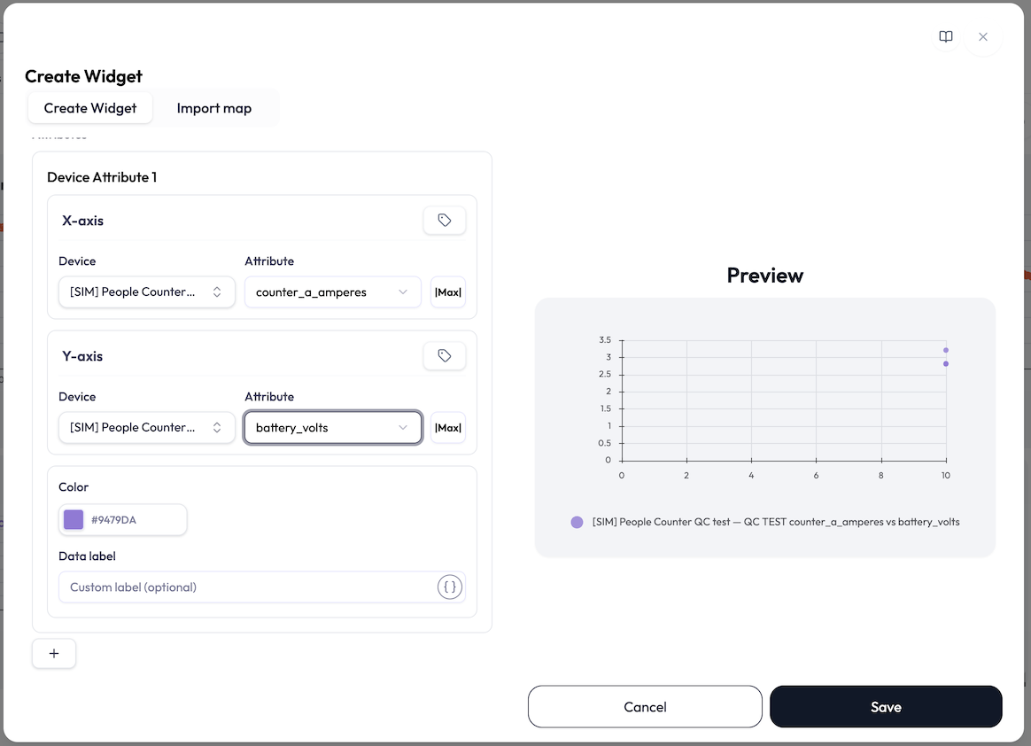
| Option | What it does |
|---|---|
| Pairs | Each series is a pair: one attribute for the X-Axis and one for the Y-Axis, laid out as two blocks in one card. Add up to 8 pairs; each is drawn in its own Color and appears in the legend as “X vs Y” unless you set a Data label. |
| Display Type / Source Data | Same as a Chart: Live or Daily, with the same aggregation intervals and per-attribute Statistic. |
| X-axis / Y-axis ranges | Both axes are numeric here, so each gets its own Minimum value and Maximum value (blank for Auto) plus a Label. The Y-axis label has the same Vertical/Horizontal toggle as a Chart. Max points and Display range control the Live window. |
| Combined axes | A small toggle on each axis block switches it from a single attribute to a combination of two (add, subtract, multiply, or divide), so an axis can plot a computed value. |
| Unit (temperature only) | Convert a temperature attribute between °C and °F; the series name notes the conversion. |
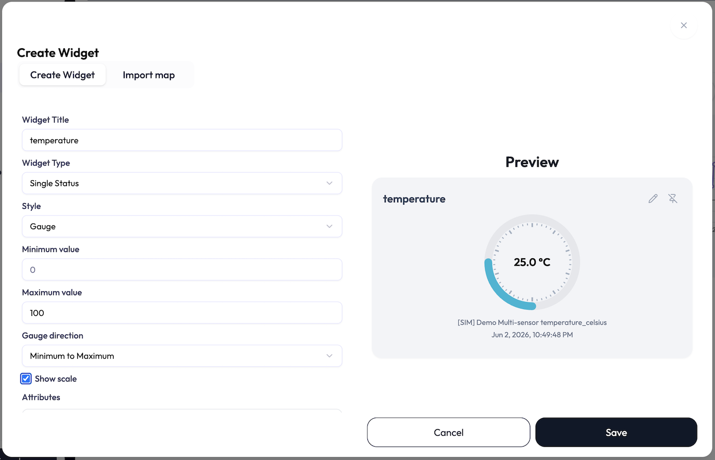
Single Status — Gauge
What it shows: a single device’s latest value as a dial against a min/max range. Use it for “current temperature”, “current CO₂”, and similar at-a-glance KPIs. Exactly one attribute.
| Option | What it does |
|---|---|
| Minimum value / Maximum value | The gauge’s scale ends, entered as whole numbers. Min defaults to 0, max to 100. Both are required, and min must be less than max. |
| Gauge direction | Sweep Minimum to Maximum or Maximum to Minimum. |
| Show scale | Draw the numeric tick marks around the dial. |
| Advanced color settings | Turns on optional threshold bands for the attribute. Each row pairs a target value (shown as ≥ Target value for a Minimum-to-Maximum gauge, or ≤ Target value for Maximum-to-Minimum) with a Gauge color and a Text color, so the dial recolors as the value crosses each threshold. Add rows with the plus button; the first row’s threshold is fixed to the gauge min (or max) and cannot be removed. Each threshold must stay within the min/max range and follow the gauge direction. (With this on, the attribute’s normal Color picker is hidden.) |
| Rounding | Rounding style and decimal places, as described under common attribute options. |
Single Status — Label
What it shows: the latest value as plain text with its unit. Use it for compact readouts and for non-numeric attributes (status strings, on/off states) that a gauge cannot show. One attribute.
- Rounding (style and decimal places) for numeric values.
- Color for the value.
- Handles string and boolean values, which is why it pairs well with categorical attributes.
Multi Status — Table
What it shows: a grid of latest values, one attribute per cell. Use it to lay out related readings (for example one row per room, one column per metric).
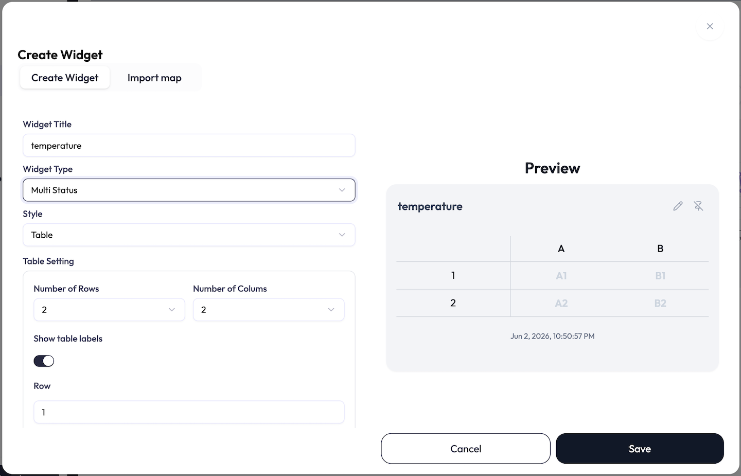
| Option | What it does |
|---|---|
| Number of Rows / Columns | Grid size. Rows up to 16, columns up to 8, capped so total cells stay at or under 16 (more rows means fewer columns allowed). |
| Show table labels | Toggle the row and column header labels on or off. |
| Row / Column labels | Editable text. Defaults are letters for columns (A, B, C…) and numbers for rows (1, 2, 3…). |
| Cell (per attribute) | Each attribute row gets a Cell picker (A1, B2, and so on) that places it in the grid. Every attribute needs a cell, and two attributes cannot share a cell. |
options.tableLabel, which holds the column labels and row labels ({ "colum": ["A","B"], "row": ["1","2"] }). Each attribute then carries its own placement in options.tableIndex, stored as
a JSON string of [row, column] indices (for example the string
"[0,1]" means row 1, column B). So a complete table widget needs both:
options.tableLabel on the widget for the grid, plus a per-attribute
options.tableIndex string for where each value sits. If the grid is resized
smaller, any attribute pointing at a cell that no longer exists has its
tableIndex cleared, and you re-assign it.
Multi Status — Map
What it shows: device pins placed on an uploaded floor plan or site image, colored by attribute. Use it for spatial monitoring (a floor of sensors, a site map).
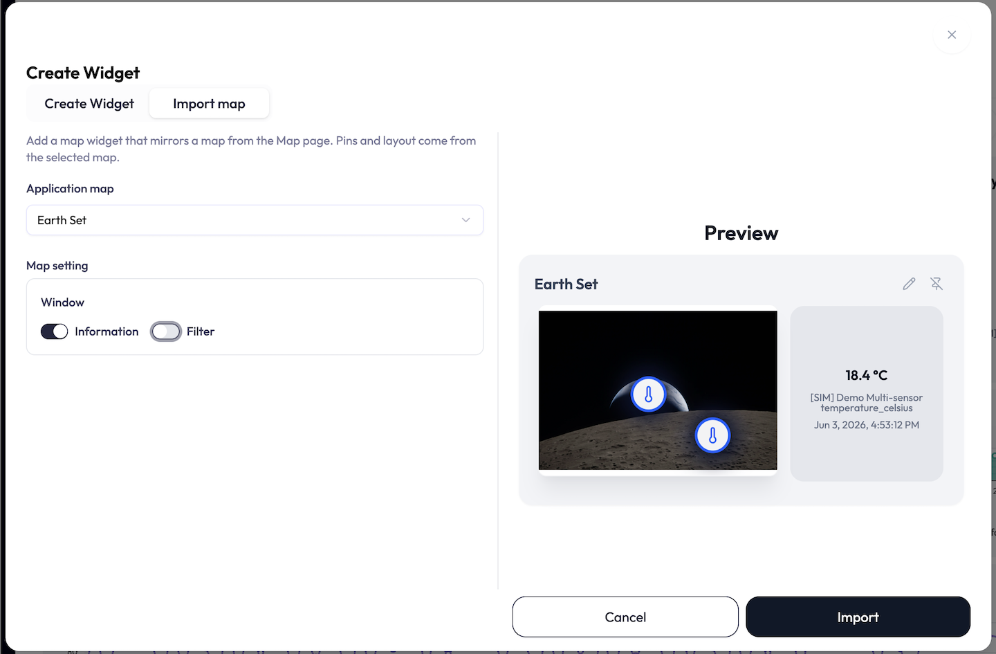
| Option | What it does |
|---|---|
| Map image (Upload image) | Upload a PNG, JPEG, or WebP floor plan or site image. Required — a warning reads “Map image is required.” and the widget will not save without one. |
| Window: Information | Toggle an on-map info panel for the selected pin. |
| Window: Filter | Toggle an on-map filter control. |
| Advanced Settings | Unlocks per-pin extras: a Use label checkbox that reveals a label-text field, a Place value switch with a Label position (Center, Top, Bottom, Left, Right), and a Related widget select that links the pin to another widget on the dashboard bound to the same device and attribute. |
| Category (per attribute) | The pin icon, chosen from a “Select a category” menu: Air Flow, Temperature, Humidity, CO₂, Acceleration, Door (open/close), Brightness, Motion, Occupancy, and Other. Required per pin. |
| Icon-x / Icon-y (per attribute) | Place the pin from 0 to 100 across and down the image, via a number input or a slider. |
| Show Chart on Click (numeric attributes) | Optionally show a small history chart when a numeric pin is clicked, with its own style, Live/Daily duration, aggregation interval, Y-axis, and color. |
appMapId). A single dashboard can hold
up to 16 map widgets; adding more than that is rejected. One map widget can
hold up to 32 attributes (pins).
Multi Status — Progress
What it shows: progress bars toward a target, per attribute. Use it for “X of max” style readouts (people counted vs capacity, output vs goal).
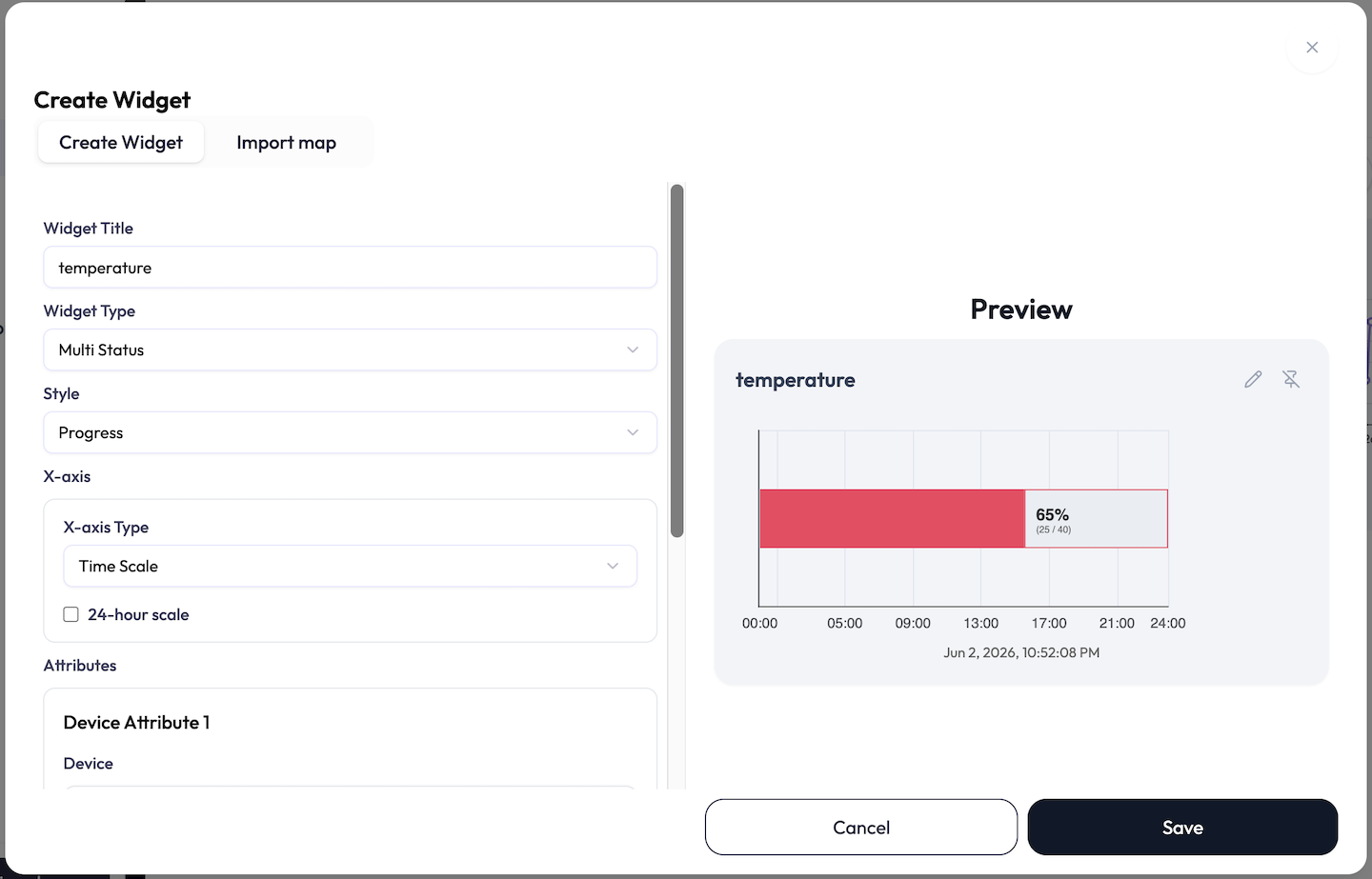
| Option | What it does |
|---|---|
| X-axis Type | Time Scale or Numeric Scale. |
| 24-hour scale | For Time Scale, fix the axis to a full 24-hour span. |
| Per-attribute | Each attribute can carry a task name, a target total, and a start/end time range (time scale) or start/end number range (numeric scale). |
Multi Status — Pie and Doughnut
What it shows: a share-of-total breakdown across attributes. Pie is a filled circle; Doughnut is the same with a hole in the middle. Use them for composition (share of devices by state, contribution to a total).
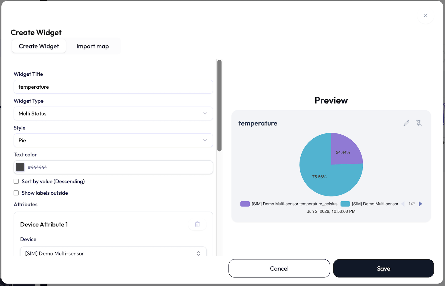
| Option | What it does |
|---|---|
| Text color | Color of the slice labels. |
| Sort by value (Descending) | Order slices largest to smallest. |
| Show labels outside | Place value labels outside the ring instead of on the slices. |
| Per-attribute | Each attribute is one slice, with its own Color and an optional Data label. |
Data Push — Form, Button
What it does: everything above shows data. Data Push is the one widget that sends it. It pushes a payload (a command or setting) from the dashboard to a device endpoint, so an operator can act without leaving the dashboard: reset a counter, switch a mode, send a configuration string.
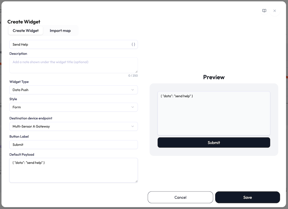
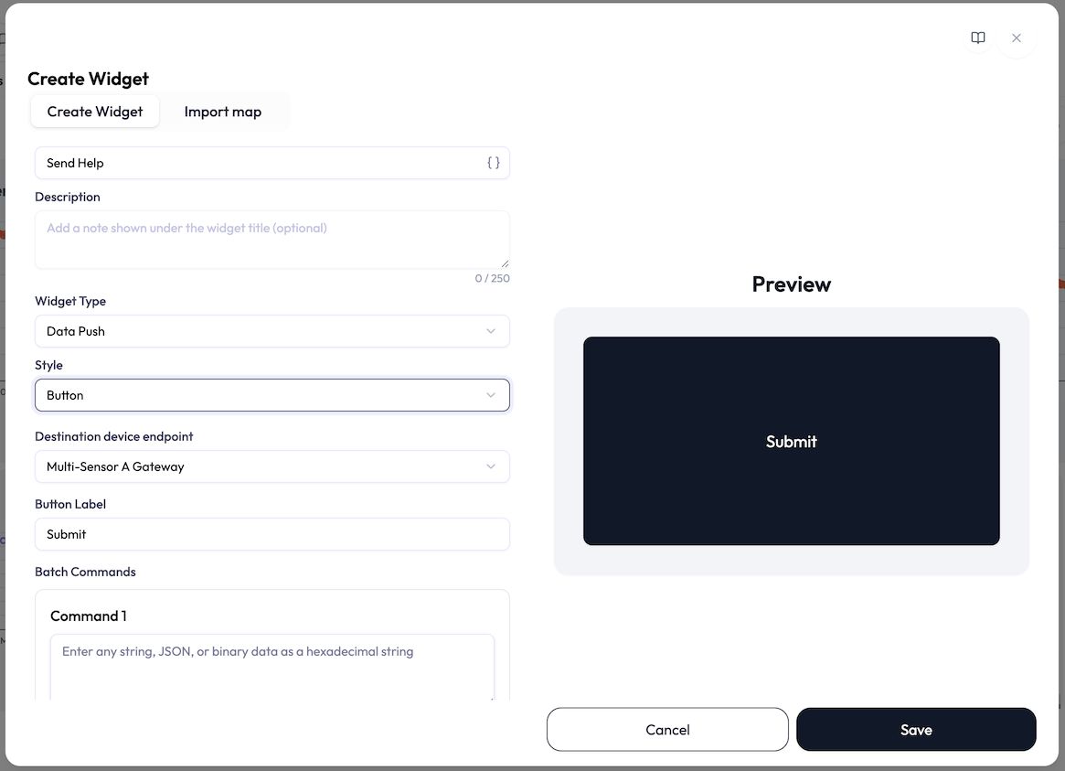
| Option | What it does |
|---|---|
| Destination device endpoint | Where the payload goes. Required. HTTPS endpoints cannot receive pushes and are shown disabled (“not supported”) in the list. |
| Button Label | The text on the send button. Required; defaults to Submit. The placeholder suggests the idea: “e.g., Submit, Send, Start, Stop…”. |
| Default Payload (Form style) | The text that pre-fills the widget’s input box: any string, JSON, or binary data as a hexadecimal string, up to 4096 characters. |
| Batch Commands (Button style) | One to four payloads (Command 1, Command 2, …), each up to 4096 characters. Clicking the button sends them all, in order. |
On the dashboard the two styles behave differently:
- Form shows an editable text box pre-filled with the Default Payload, above the send button. The operator can adjust the payload before sending, or just click.
- Button is a single large button that fills the widget. One click sends the configured commands. There is no text box to edit.
Data Push widgets bind no attributes. Saving one only requires a destination and a button label.
Plan Limits
Each plan card in Billing lists a Dashboards allowance for the workspace, which may appear as a specific number or as Unlimited depending on your plan; there is no separate per-widget cap surfaced in the product. The limits that always apply are structural and are covered with each widget above: up to 16 map widgets per dashboard, up to 32 attributes (pins) per map widget, up to 16 cells per table widget (up to 16 rows and 8 columns, capped at 16 cells total), up to 8 pairs per XY-Chart, and up to 4 commands per Data Push button.