
Analytics
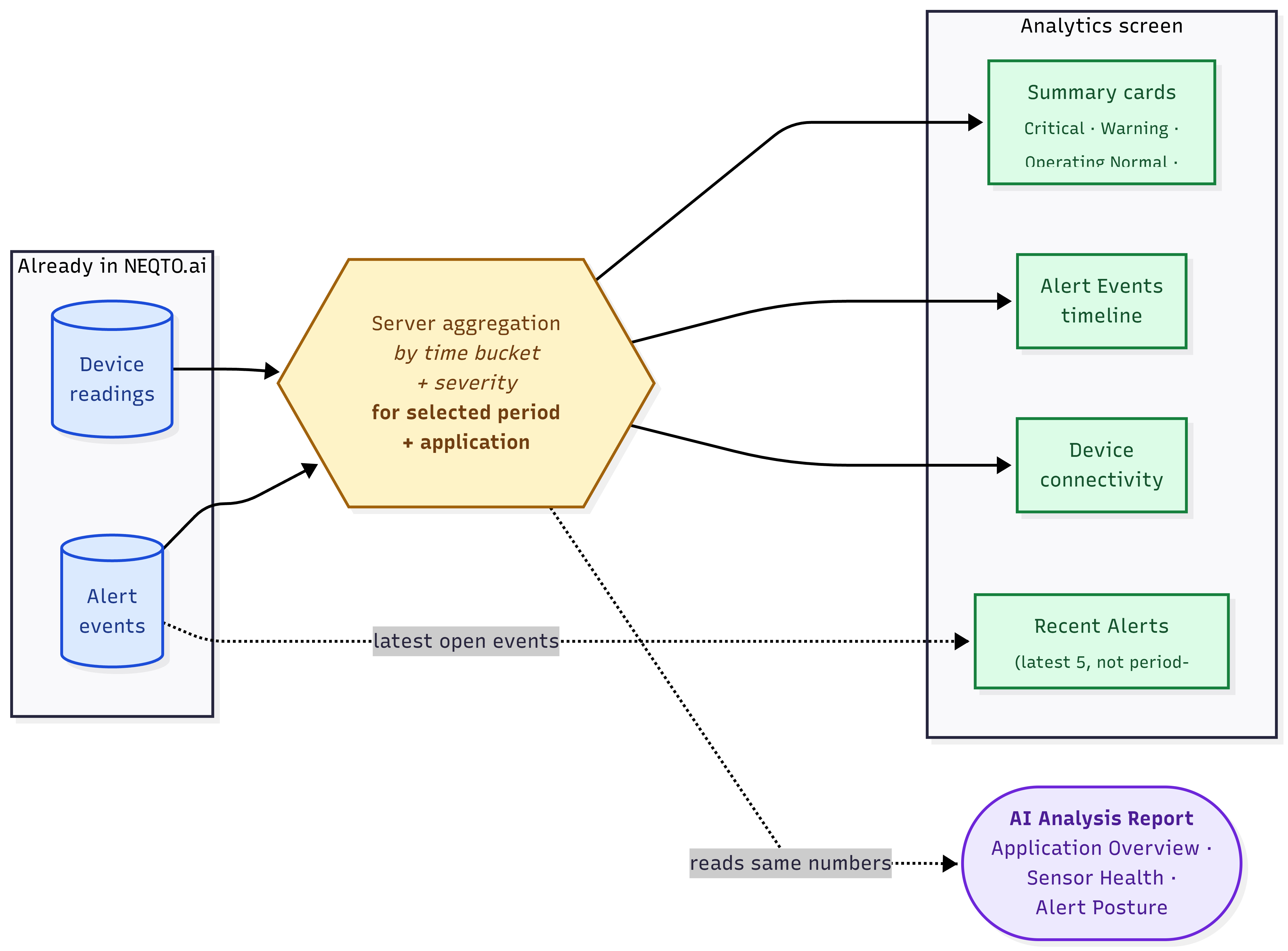
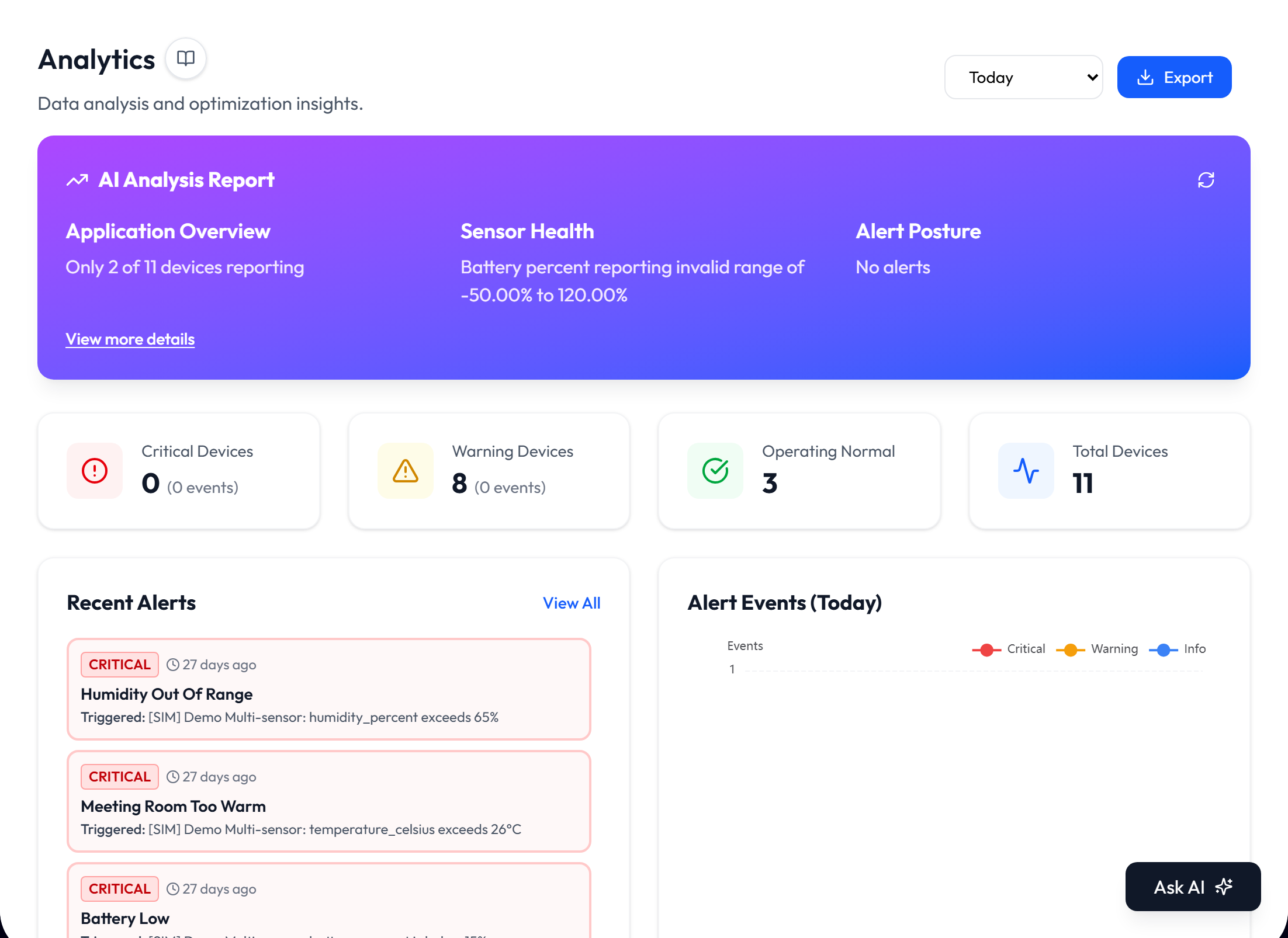
Analytics summarizes device status, connectivity, and alert activity for an application. It combines an AI Analysis Report with summary cards, recent alerts, two charts, and a CSV export. The page is read-only; you choose a time range and review the results.
Where Analytics Lives
Open an application and select Analytics in the application sidebar, directly below Dashboards. The report is limited to that application’s devices and alerts.
The Demo Buildings area also includes an Analytics screen with demo data. Use the Analytics screen inside your own application to review live application data.
The Time Range
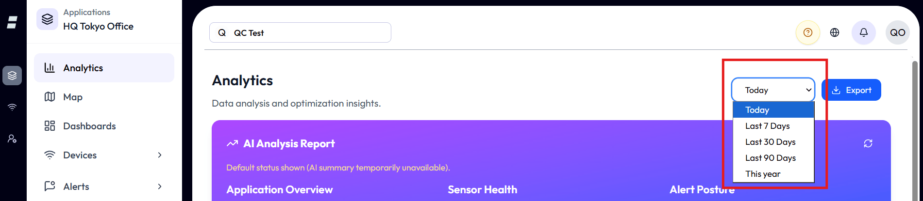
The selector in the top right controls the AI report, summary cards, Alert Events timeline, and Device connectivity chart.
| Range | Coverage | Alert timeline |
|---|---|---|
| Today | Midnight to now. | Hourly counts. |
| Last 7 Days | The previous 7 days through now. | Daily counts. |
| Last 30 Days | The previous 30 days through now. | Daily counts. |
| Last 90 Days | The previous 90 days through now. | Daily counts. |
| This year | January 1 of the current year through now. | Daily counts. |
Today starts at midnight in the timezone saved in your profile. Chart labels also use that timezone. If the times appear shifted, check your profile timezone.
The AI Analysis Report
The AI report interprets aggregated device readings and alert activity for the selected period. Treat the generated text as a summary and confirm important conclusions against the cards and charts below it.
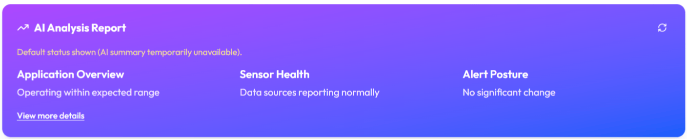
| Section | What it covers |
|---|---|
| Application Overview | Notable activity and changes across the application. |
| Sensor Health | Reading ranges, reporting cadence, and possible sensor problems. |
| Alert Posture | Alert volume, severity, and the devices or alerts with the most activity. |
- View more details expands the three sections and shows up to three recommendations when detailed analysis is available.
- Refresh requests a new analysis. Changing the time range also requests an analysis for the new period.
- When analysis fails, the panel shows a default status or an unavailable message. Select Refresh to try again.
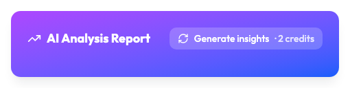
- When your plan uses AI credits, the panel does not run on its own. It shows today’s report if one was already generated, and a Generate insights button with its price in credits. Changing the time range or refreshing goes through the same button. A default status is shown as it is and is not retried automatically.
Summary Cards
The first three cards divide the scoped devices into Critical, Warning, and Operating Normal. The fourth card shows their total.

| Card | What it counts | Click goes to |
|---|---|---|
| Critical Devices | Devices with at least one non-completed critical alert event in the selected period. The subtitle shows the number of critical events. | Notifications filtered to critical. |
| Warning Devices | Devices that are neither Critical nor Operating Normal. This includes disconnected devices and devices whose highest non-completed event is warning or info. The subtitle shows warning events only. | Notifications filtered to warning. |
| Operating Normal | Devices that are currently connected and had no non-completed alert event in the selected period. | Not clickable. |
| Total Devices | All devices in the current application scope. | Devices list. |
Recent Alerts
Recent Alerts shows up to five non-completed alert events. It prioritizes critical events, then warning and info events.
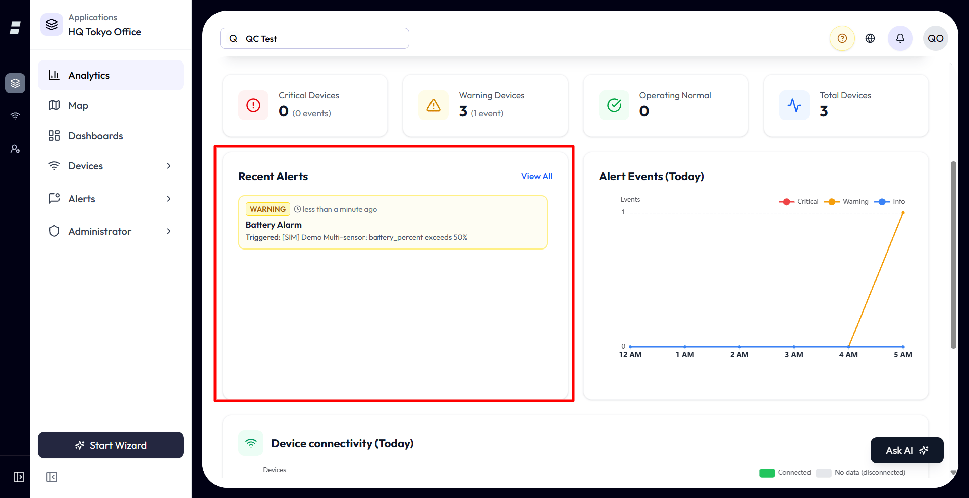
- The list keeps the most recent event for each alert and device combination.
- View All opens the full Notifications list.
- The list is not tied to the selected time range. It refreshes when alert updates arrive.
Alert Events Timeline
This chart counts alert events over the selected period. Separate lines show critical, warning, and info events so you can see when activity increased.
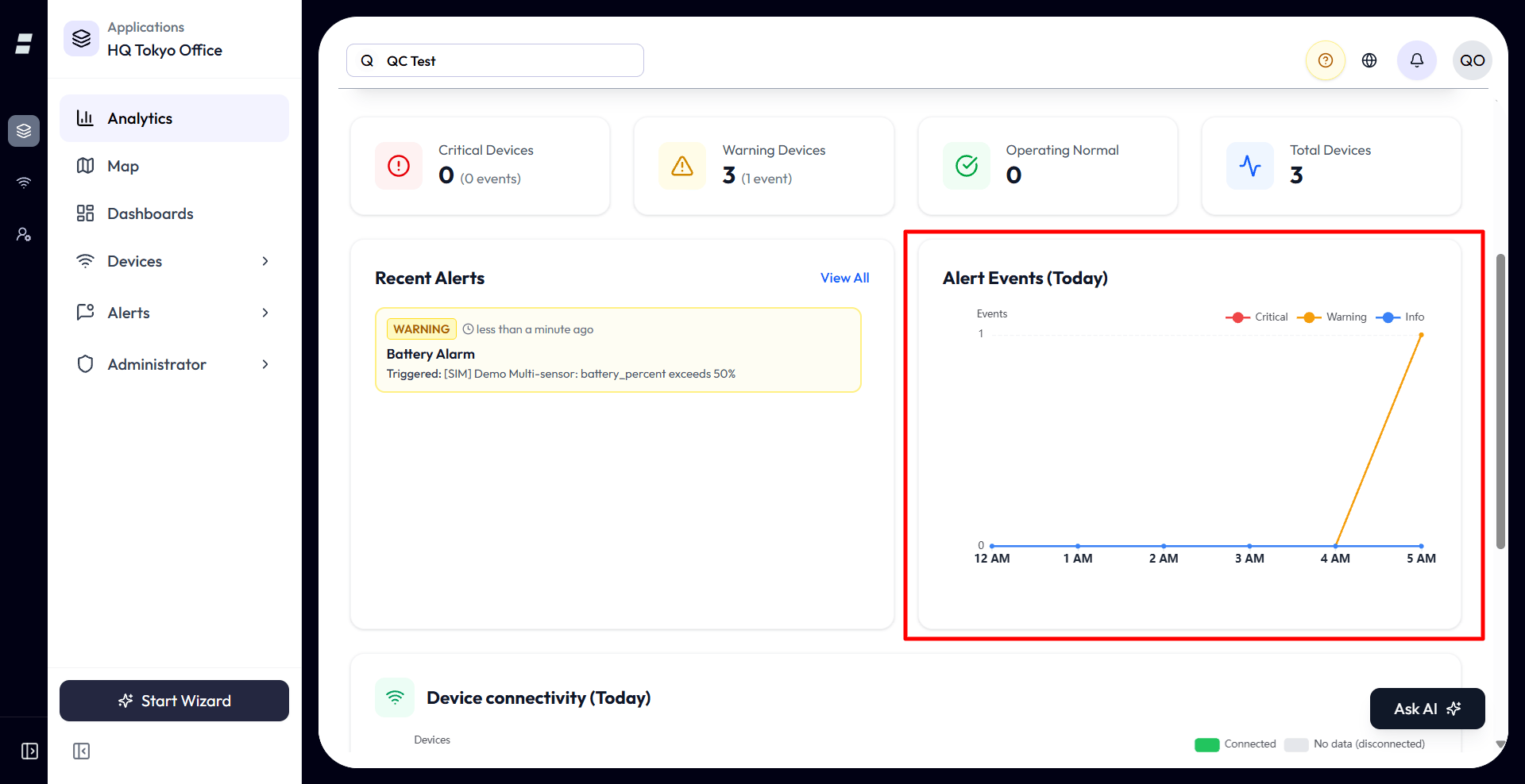
- The chart uses hourly buckets for Today and daily buckets for longer ranges.
- Missing buckets appear as zero so the timeline remains continuous.
- The chart refreshes when a new alert update arrives.
- If the period contains no events, the chart shows “No alert events in this period.”
Device Connectivity
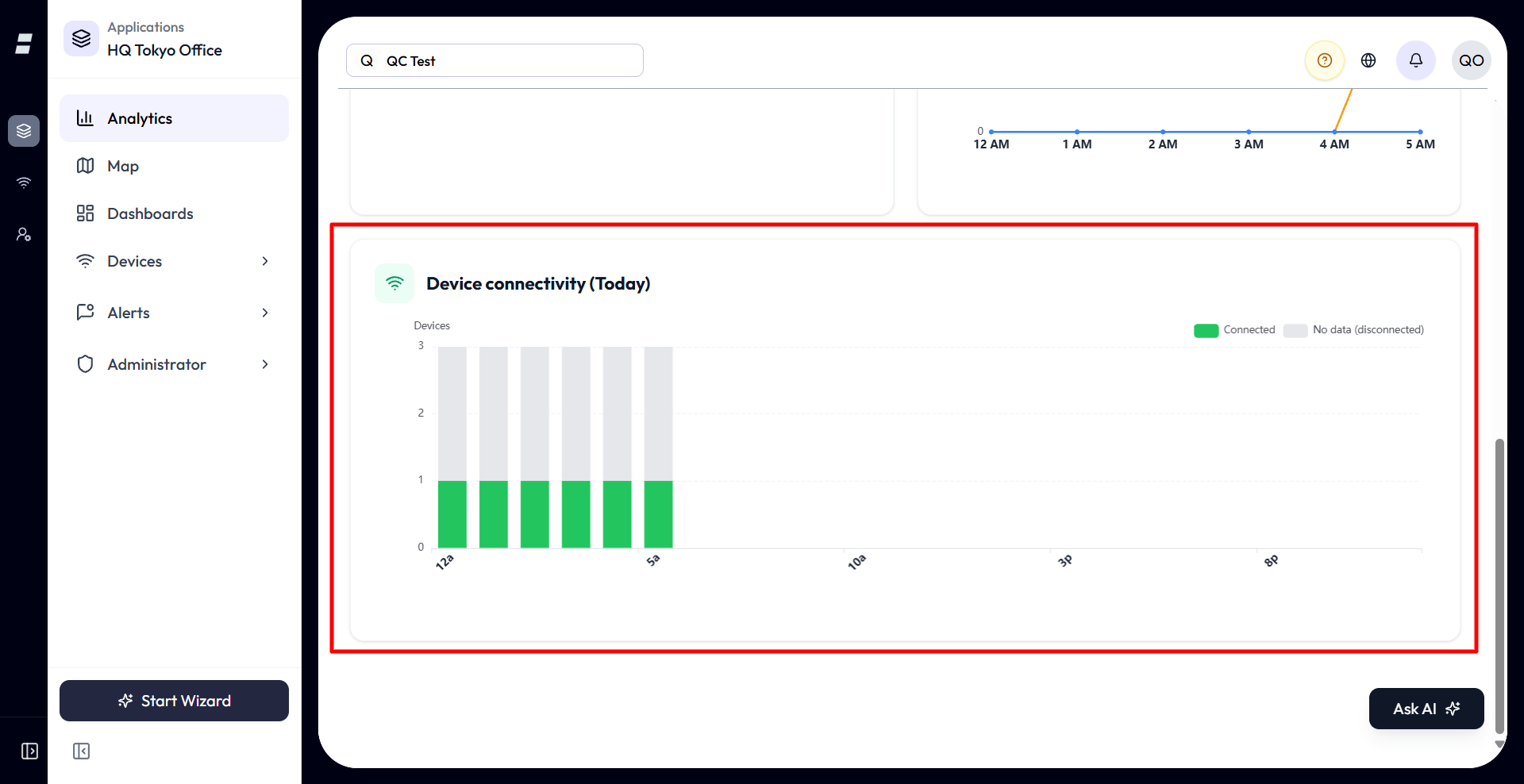
The stacked bars compare devices that sent data with devices that sent no data in each time bucket.
| Series | Meaning |
|---|---|
| Connected (green) | Devices that existed in the bucket and sent at least one reading. |
| No data (disconnected) (grey) | Devices that existed in the bucket but sent no readings. |
- Buckets are hourly for Today, daily for Last 7 Days and Last 30 Days, three days for Last 90 Days, and seven days for This year.
- The tooltip shows device counts and percentages for each bucket.
- This is a historical measure. A device that sent data during a bucket can still be disconnected now, so the chart may not match the current connectivity indicator on the Devices list.
- If there is nothing to chart, the page shows “No devices in scope” or “No timeline data.”
Exporting a Report
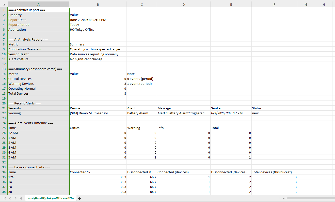
Select Export to download a CSV snapshot of the report data currently shown.
-
1Select the time range you want to report.
-
2Select Export. The CSV includes the AI summary when available, summary cards, Recent Alerts, Alert Events timeline, and Device connectivity data.
-
3Open the file in a spreadsheet application. For application reports, the application name appears in the file and its filename.
Analytics vs Dashboards
Both pages read the same stored device data. Analytics gives you one fixed application-wide report, and Dashboards let you build widget layouts for the devices you pick.
| Analytics | Dashboards | |
|---|---|---|
| Setup | Fixed report; choose a time range. | Build and arrange widgets. |
| Focus | Application-wide device status, alerts, connectivity, and AI analysis. | Selected devices and attributes. |
| Time control | One range for the period-based report sections. | Configured per widget when supported. |
| Export | CSV report data. | PDF containing selected widgets. |
Limits and Good to Know
The five fixed time ranges, device-data retention, and a 500-device cap on the connectivity chart bound what an Analytics report can cover.
- Analytics has five fixed ranges. It does not provide custom start and end dates or a side-by-side period comparison.
- Analytics can report only retained device readings and alert events. A long range may contain less history if older data has passed its retention period. Your plan sets that period, and it does not give the exact deletion time of an individual reading.
- The Device connectivity chart includes up to 500 devices in its current scope.