Dashboards
A dashboard is a grid of widgets that shows device data and provides selected device controls. Widgets update automatically, and users with the right permissions can move, resize, edit, pin, or delete them. You can start a dashboard from a ready-made template or let the assistant plan one from your devices’ own data, and every widget editor has an AI field that fills the form from a plain-language description. This page explains how a dashboard is created, the dashboard grid, the settings shared by all widgets, and the options for each widget type.
Where Dashboards Live
Dashboards can be account-wide or belong to an application. An application dashboard uses that application’s devices, attributes, Systems, and alerts. Dashboards is the first item in the application sidebar, and the page opens dashboards in tabs so you can switch between them without leaving it.
Creating a Dashboard
Creating a dashboard starts with a title. From there you can save an empty dashboard and add widgets yourself, or choose devices and let NEQTO.ai build the first version for you, from a template when one fits and otherwise by planning from the devices’ data.
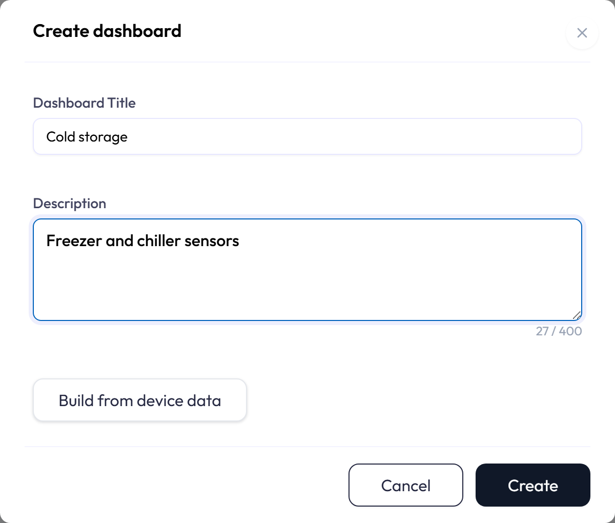
Step 1: Select devices
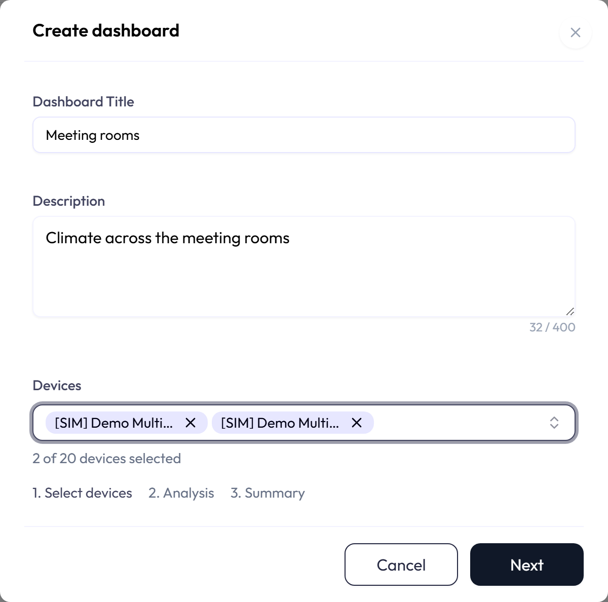
-
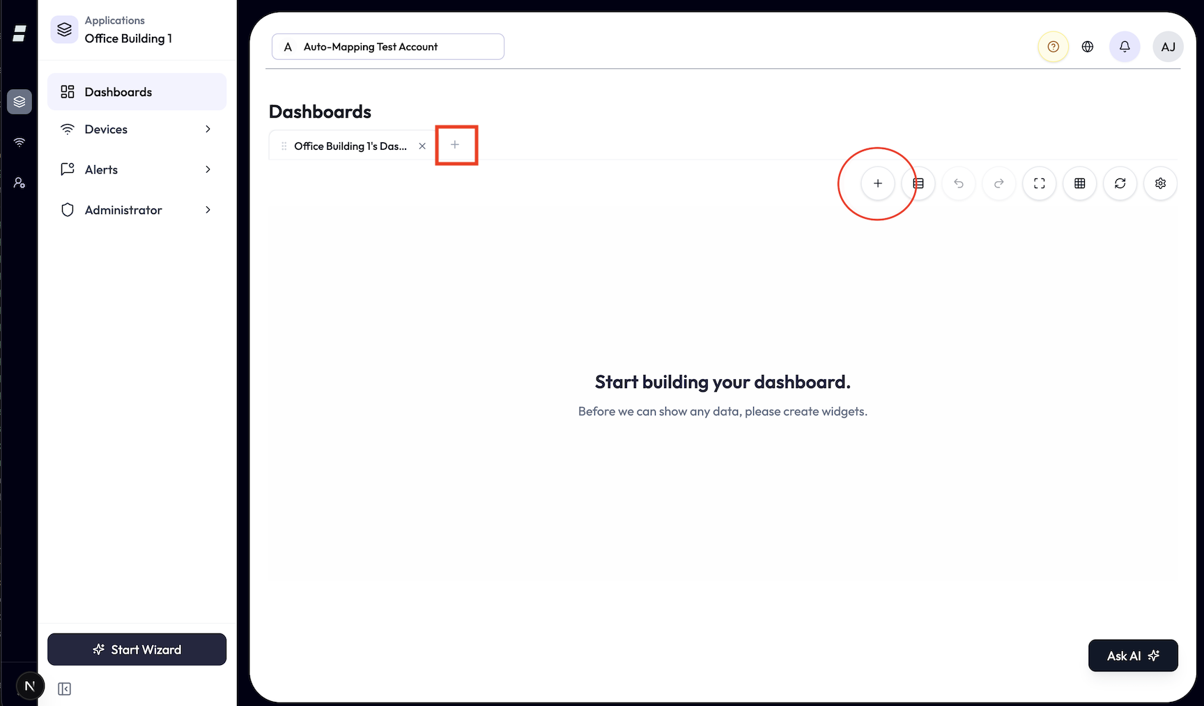
1Open Create dashboard from the empty page, from the + on the tab bar, or from the Add-dashboard dialog. Enter a Dashboard Title of up to 100 characters and an optional description of up to 400.
-
2Select Build from device data. A device picker opens with the step indicator above it. Type to search; the picker lists only devices the wizard can use, and counts your selection as n of 20 devices selected.
-
3Select Next. The wizard checks the selection and moves to Analysis. Without any device selected the button reads Create and saves an empty dashboard instead.
A device is skipped, and never offered, when it has been deleted, is not currently connected, or has no mapped attributes. A dashboard can be built from at most 20 devices; adding a 21st is refused with a message rather than trimming the selection. If a selected device stops qualifying between selection and Next, the wizard says which condition failed, for example One of the selected devices is no longer connected.
Step 2: Analysis
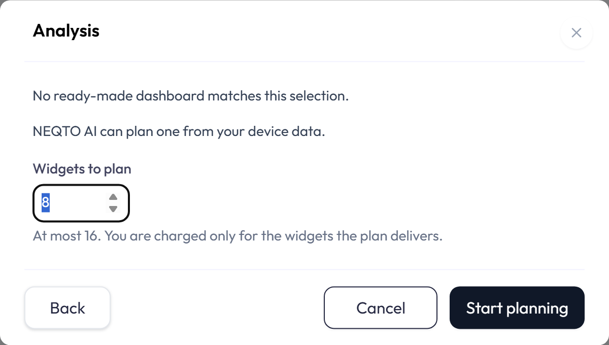
Analysis is decided by your selection, not by chance. When a published template covers every selected device, the wizard skips this step and opens the Summary with the template’s widgets. When none does, the Analysis step reads No ready-made dashboard matches this selection and offers to plan one from your device data.
- Widgets to plan sets how many widgets the plan should hold, from 1 to 16. The default is 8.
- When your plan uses AI credits, the price for that many widgets appears under the field, and Start planning stays disabled until the price has loaded and your credits cover it. If they do not, the line says how many credits the plan needs and how many are left, or that this period’s credits are used up. If your account’s plan does not include AI credits, your trial has ended, or the account has no active plan, the line says so instead. A high price, or one that would use a large share of the credits left, opens Confirm AI credit use before planning starts.
- Start planning sends the devices to the planner. The status line reports the stage as it runs: reading what the devices report, choosing the widgets, saving the plan. Planning usually finishes in under a minute; the dialog cannot be closed while it runs.
- When the planner needs a decision it cannot make safely, the dialog shows The planner has a question with the question, any suggested answers, and an answer box. Answer inline and it continues. Each session has a limited number of questions, shown under the box; when they are used up the planner stops and asks you to adjust the selection or try again.
- If AI planning is not available in your environment, the step says so and offers Create blank dashboard, which saves an empty dashboard with the title you typed. Go back and choose devices covered by a ready-made dashboard to get a template instead.
Step 3: Summary
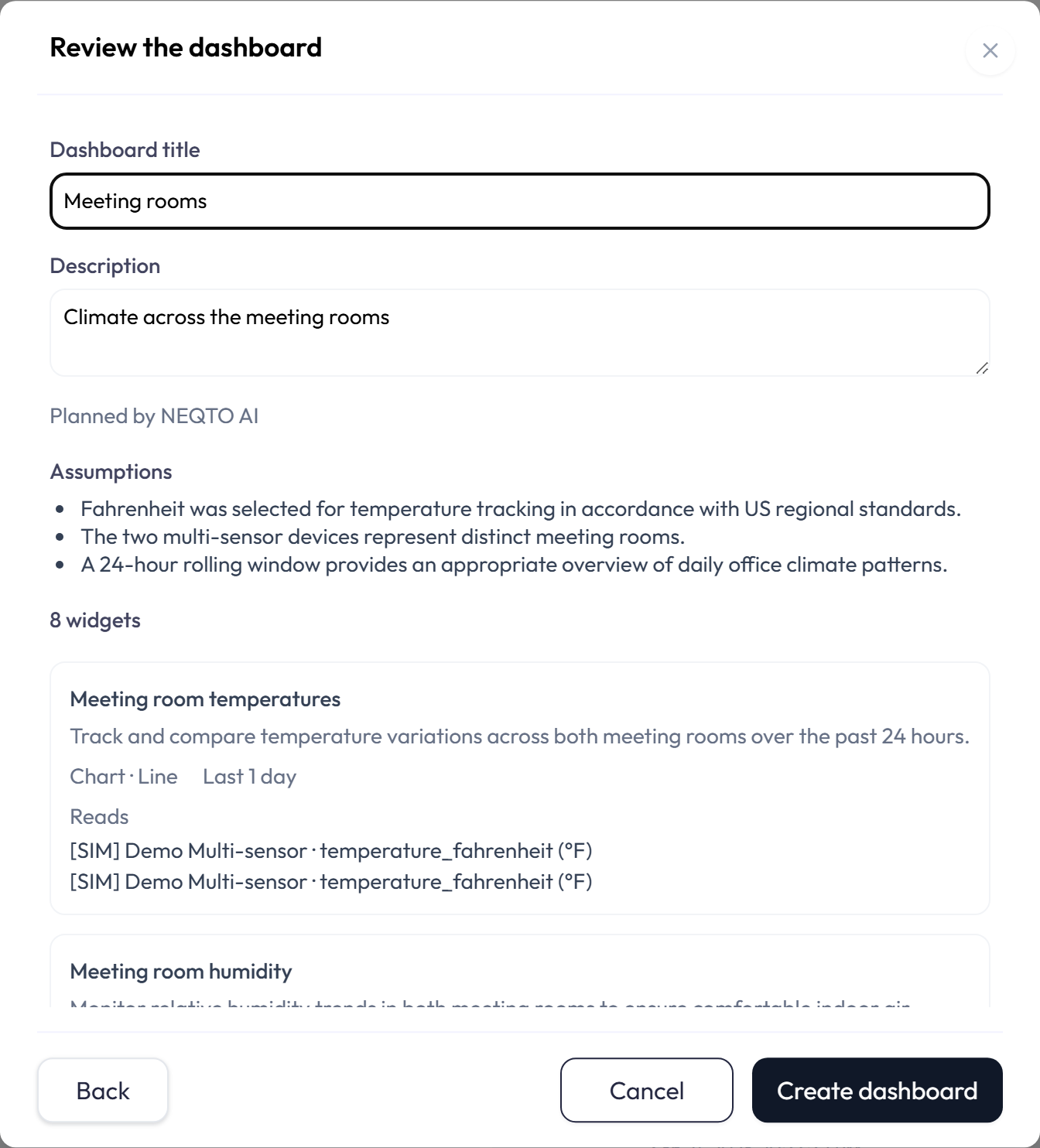
The Summary, titled Review the dashboard, is the same whether the plan came from a template or from the planner. It shows where the plan came from, From the … template, revision n or marked as planned by the assistant, then a list of Assumptions the planner made, then every widget.
| Shown per widget | Meaning |
|---|---|
| Title and reason | The widget’s title and one sentence on why the planner included it. |
| Type · Style | The widget type and style it will be created as, for example Chart · Line. |
| Time window | Last n hours, Last n days, and so on, or No time window for latest-value widgets. A widget with a time window also names its interval, for example 1-hour aggregation or Raw. |
| Reads | One line per source as Device · Attribute (unit), with the calculation in brackets when the series is computed. |
| Added / Changed / Needs attention | Badges after a refinement, or when a refused create named the widget as out of date. Widgets dropped by a revision are listed under Removed in this revision. |
The Dashboard title and Description above the plan start from what you typed in step 1 and can be edited here; an edit survives a later refinement. Create dashboard creates the dashboard and all of its widgets in one step and opens it as the active tab. Back returns to the device picker with your selection, title, and description intact.
When your plan uses AI credits, the Summary of a plan the assistant made also says what cancelling costs: no dashboard is created, the planning already done and the widgets already delivered are charged, and the rest of the reservation is returned.
Refining the plan
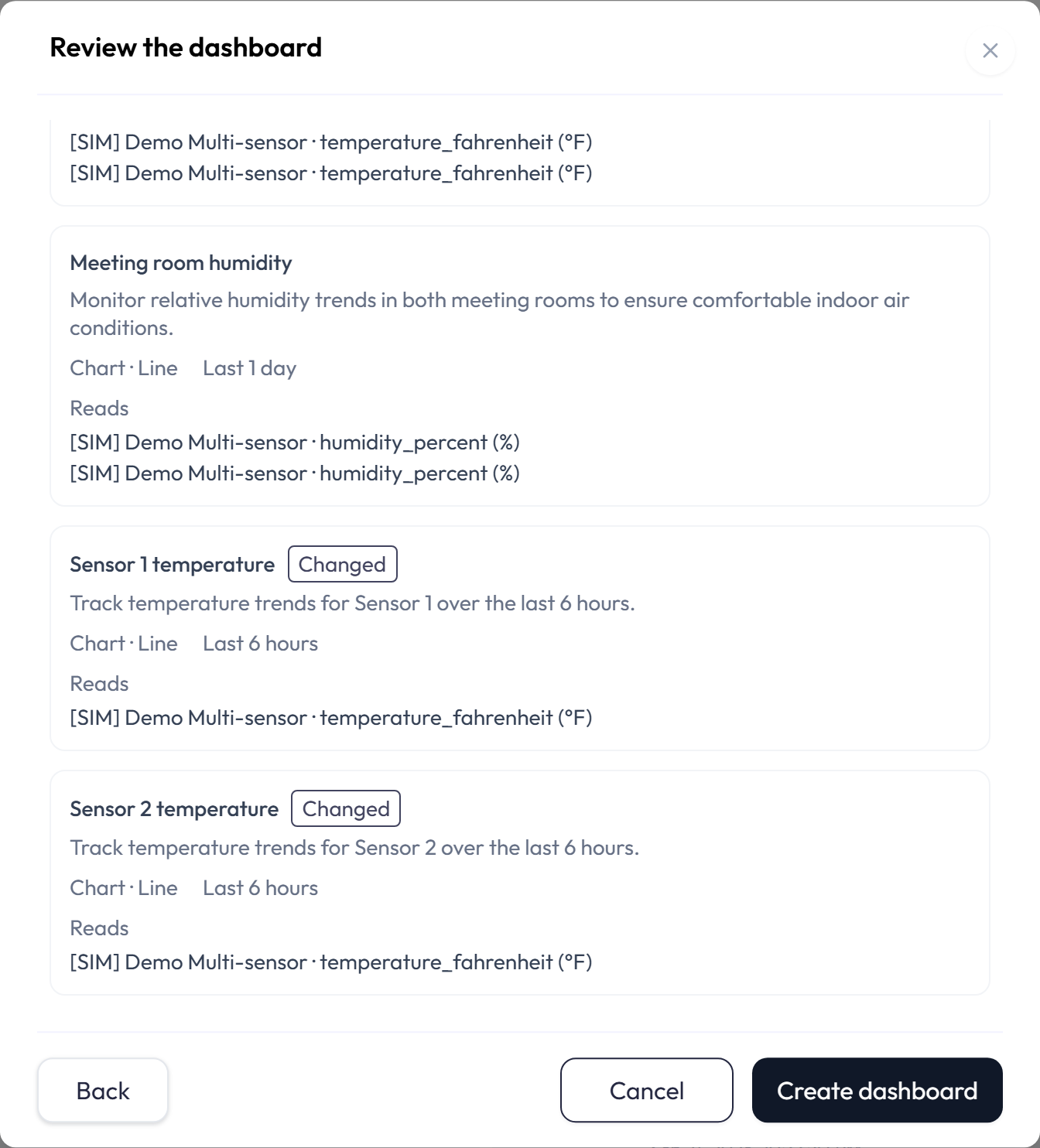
Under the plan, the Refine box asks for a change in plain language, for example add a humidity gauge for the roof. The planner revises the plan while the status line reads Revising the plan, and the Summary then marks each widget as Added or Changed and lists the ones it removed. Refining a template hands the plan to the assistant; the dialog asks you to confirm with Refine with AI or to Keep the template. The planner can also ask a question during a refinement, in the same way as during planning.
When your plan uses AI credits, that dialog also shows the most the revised plan can cost; the template itself stays free. Later refinements of a plan the assistant made use the same reservation and ask for no new price. If a revision needs more widgets than the reservation covers, the Summary says Raise it to continue and shows how much more it would hold. Raise and retry raises it; widgets already reserved are not charged again. Keep the current plan dismisses the offer and leaves the plan as it was.
When planning stops
The wizard says plainly why a plan could not be made and whether trying again can help. The messages you are likely to meet:
| Message | What it means, and what to do |
|---|---|
| Planning took too long and was stopped. Nothing was created. Try again. | The planner did not finish in time. Press the button again. |
| None of the selected devices has reported in the last 7 days, so there is nothing to plan from. | The planner works from recent readings. Go back and pick devices that are reporting. |
| A selected device is no longer connected, in this application or mapped. Go back and adjust the selection. | A device changed since you selected it. Remove or replace it. |
| The planner has used all of its questions for this session and could not decide safely. | Adjust the selection so there is less to guess about, or try again. |
| This planning session has expired. Go back to start a new one. | A session left open too long, for example after a reload, has closed. Also shown as cancelled when the session was discarded from the chat. Go back and press Next again. |
| There are not enough AI credits to plan this dashboard. | The planning could not be paid for, or the credit check did not complete, so nothing was created. Try again, or lower Widgets to plan. If your credits are used up, planning works again in the next credit period; Billing shows your balance and reset date, see Administration. |
| This plan has already been created as a dashboard. | The dashboard exists. Close the wizard and find it on the Dashboards page under the title you gave it. |
| The dashboard was not created. Nothing has been added. | Creation was refused, for instance by a dashboard allowance or a permission. The plan is still on screen; fix the cause and press Create again. |
Other ways to start a dashboard
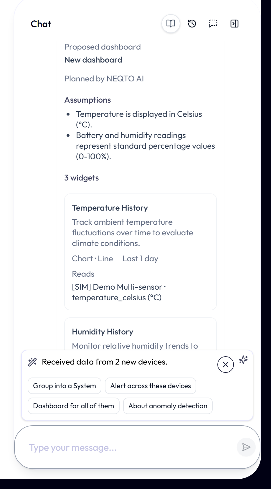
- From Ask AI. Ask for a dashboard in plain language, naming the devices. The assistant replies with a Proposed dashboard card that holds the same Summary, with a Create dashboard button and a Discard this plan link. Create adds the dashboard to the application straight away.
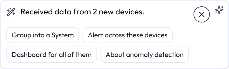
- From an assistant suggestion. When the first data arrives from a new device, the assistant may suggest a dashboard in the suggestion card beside the Ask AI button. Build a dashboard, or Dashboard for all of them when several devices arrived together, opens the creation dialog with those devices already selected. On a template match the dashboard is created at once and opened; otherwise the wizard runs as described above. See Ask AI → Assistant suggestions for how the card itself works.
- From the integration wizard. After a new integration reports its first devices, its Verify step offers Create dashboard, which opens the same dialog with those devices selected.
Rename, duplicate, and delete
-
1Use the dashboard menu to edit its title or description. You can also double-click the tab name to rename it, or double-click a visible dashboard description to edit it in place.
-
2Use Duplicate to copy the dashboard and its widgets. Use Delete to remove the dashboard and its widgets after confirmation. Dashboard deletion cannot be undone. The widget deletion toast restores only an individual widget.
Tabs: keep several dashboards open at once
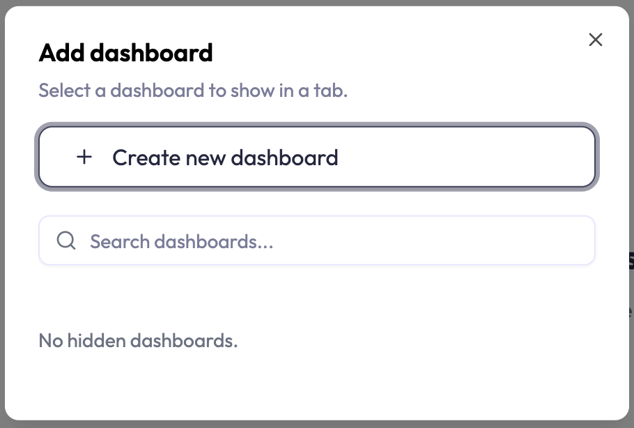
- Use the + button to open a dashboard that is not on the tab bar, or to create a new dashboard.
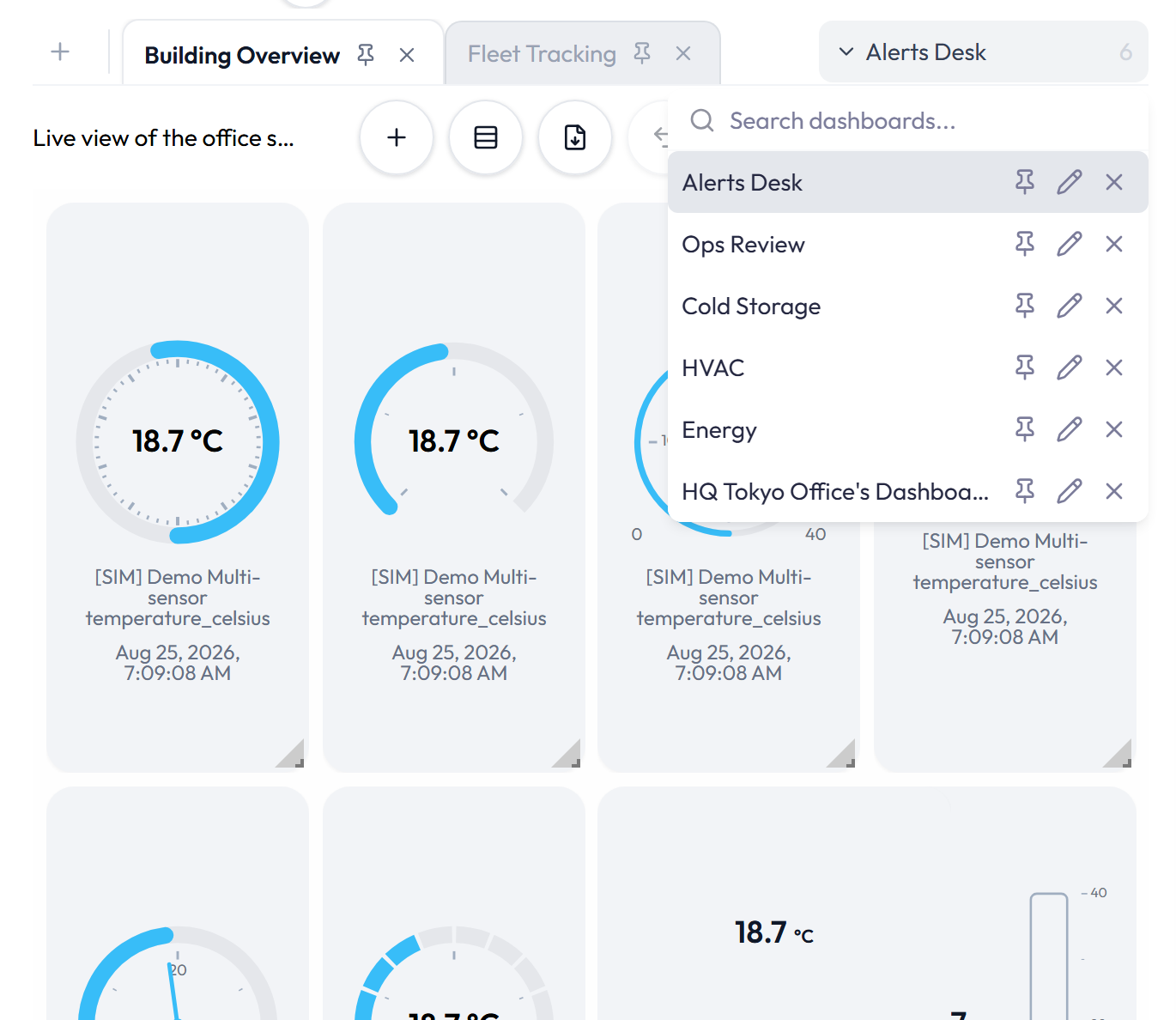
- Use the pin button, or drag a tab across the pinned divider, to pin or unpin it. Pinned tabs stay at the start of the bar; unpinned tabs follow recent use.
- Close a tab to hide it from the bar. Closing a tab does not delete the dashboard.
- Tabs that do not fit move into More dashboards. Select one there to open it.
The Grid: Adding, Arranging, and Saving
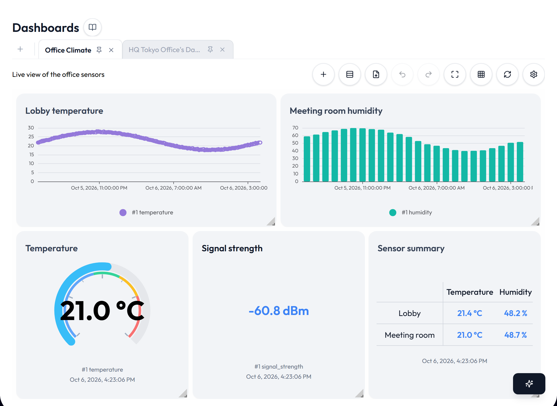
Dashboards use a responsive grid. On a desktop, widgets use a 12-column layout. On a phone, they stack in one column.
Layout behavior
| Action | Behavior |
|---|---|
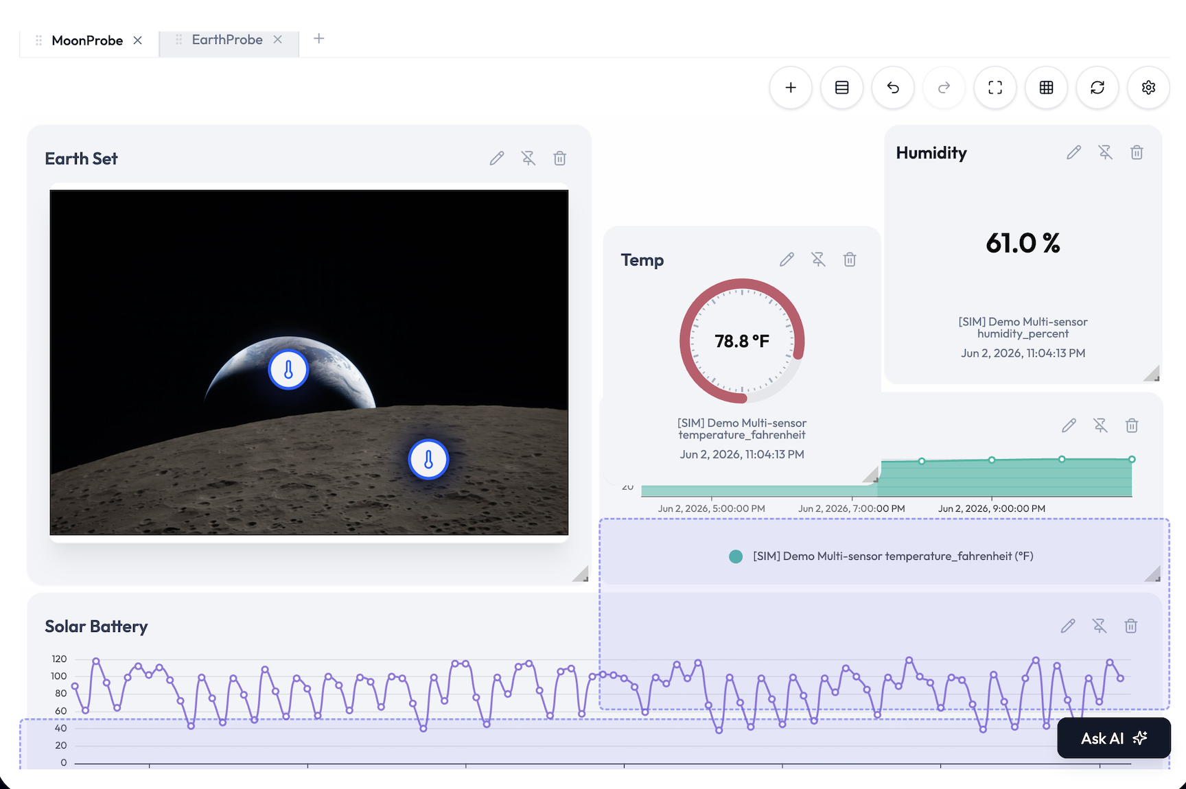
| Move | Drag a widget by its header. Widgets may overlap while you arrange them. Pinned widgets stay in place. |
| Resize | Drag a widget’s corner. New widgets start in the next available space. |
| Auto Align | Packs widgets into a clean layout and applies a suitable size for each widget type. |
| Spacers | Add a full-width spacer to divide the dashboard into sections. Auto Align keeps those sections separate. |

Saving, autosave, and history
- Layout changes save automatically. The status beside the toolbar shows when a save is in progress, succeeds, or fails.
- Refresh Dashboard requests current data for every data-backed widget.
- Undo and Redo cover widget moves, resizes, additions, deletions, spacer changes, and Auto Align. History holds the latest 20 actions for the active dashboard and resets when you switch dashboards.
- Keyboard shortcuts also work: Ctrl or Command + Z for undo, and Ctrl or Command + Shift + Z or Ctrl + Y for redo. They do not override typing inside a field.
- Full screen is useful for wall displays. If several dashboard tabs are open, use the previous and next controls to move between them.
Widget Controls: Hover to Reveal
On devices with a pointer, widget controls appear when you hover over the widget. On touch screens, tap the More button to show them.
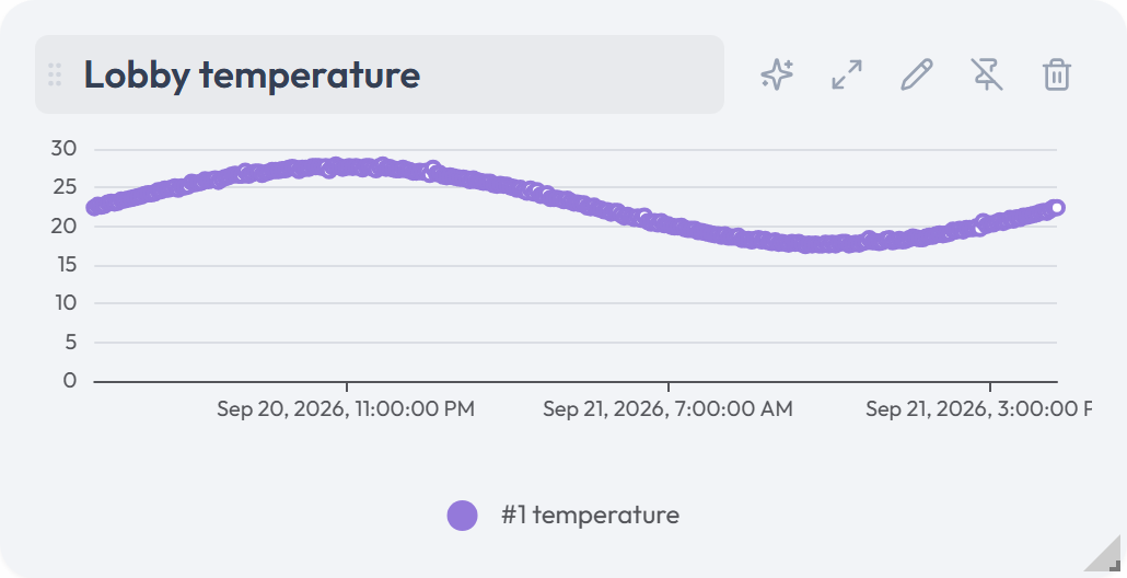
| Control | What it does |
|---|---|
| Drag grip | Moves the widget. The title area also acts as the drag handle. |
| Ask AI | Opens the chat sidebar with a draft question containing the widget title, type, devices, and attributes. You can edit the question before sending it. A Label that shows formatted text has no Ask AI control. |
| Open System | On a Map widget that shows a System, opens that System’s page, where its image and pins are edited. |
| Expand | Opens a larger view when the widget type supports it. |
| Edit | Opens the widget editor with the current settings. |
| Pin | Prevents the widget from being moved or resized until it is unpinned. |
| Delete | Removes the widget after confirmation. Use the Undo toast to restore it. Undo can fail if a device the widget uses has left its application or an attribute mapping is no longer available. |
The expanded view
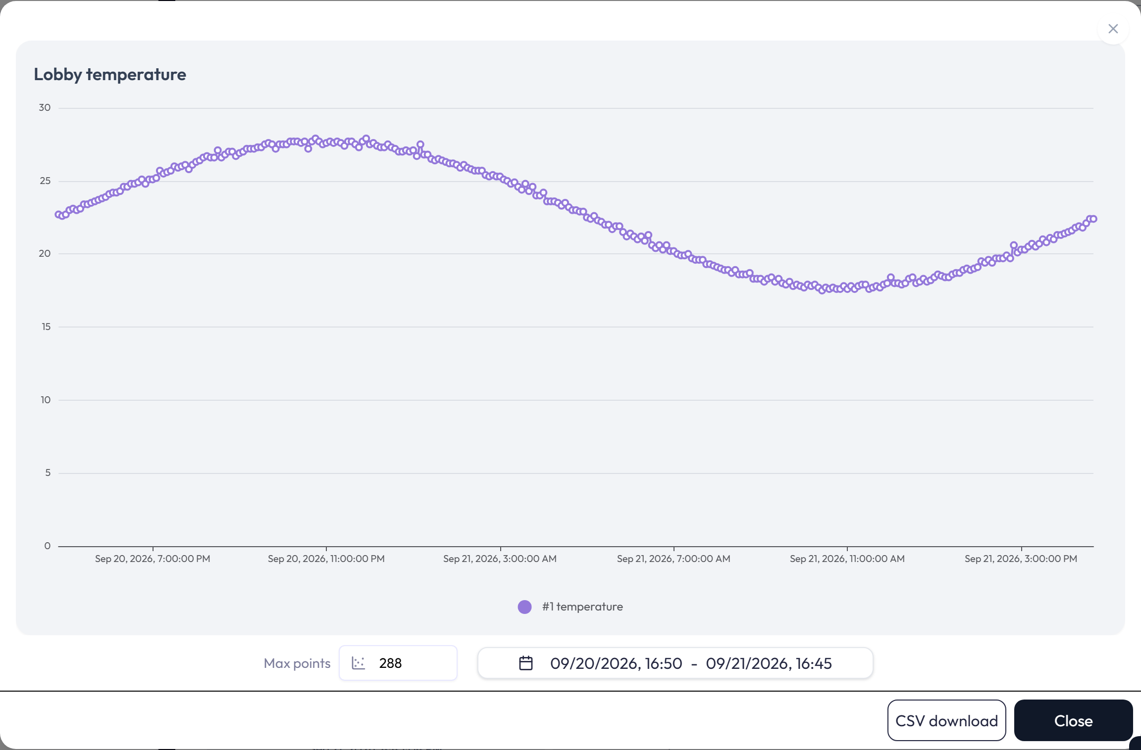
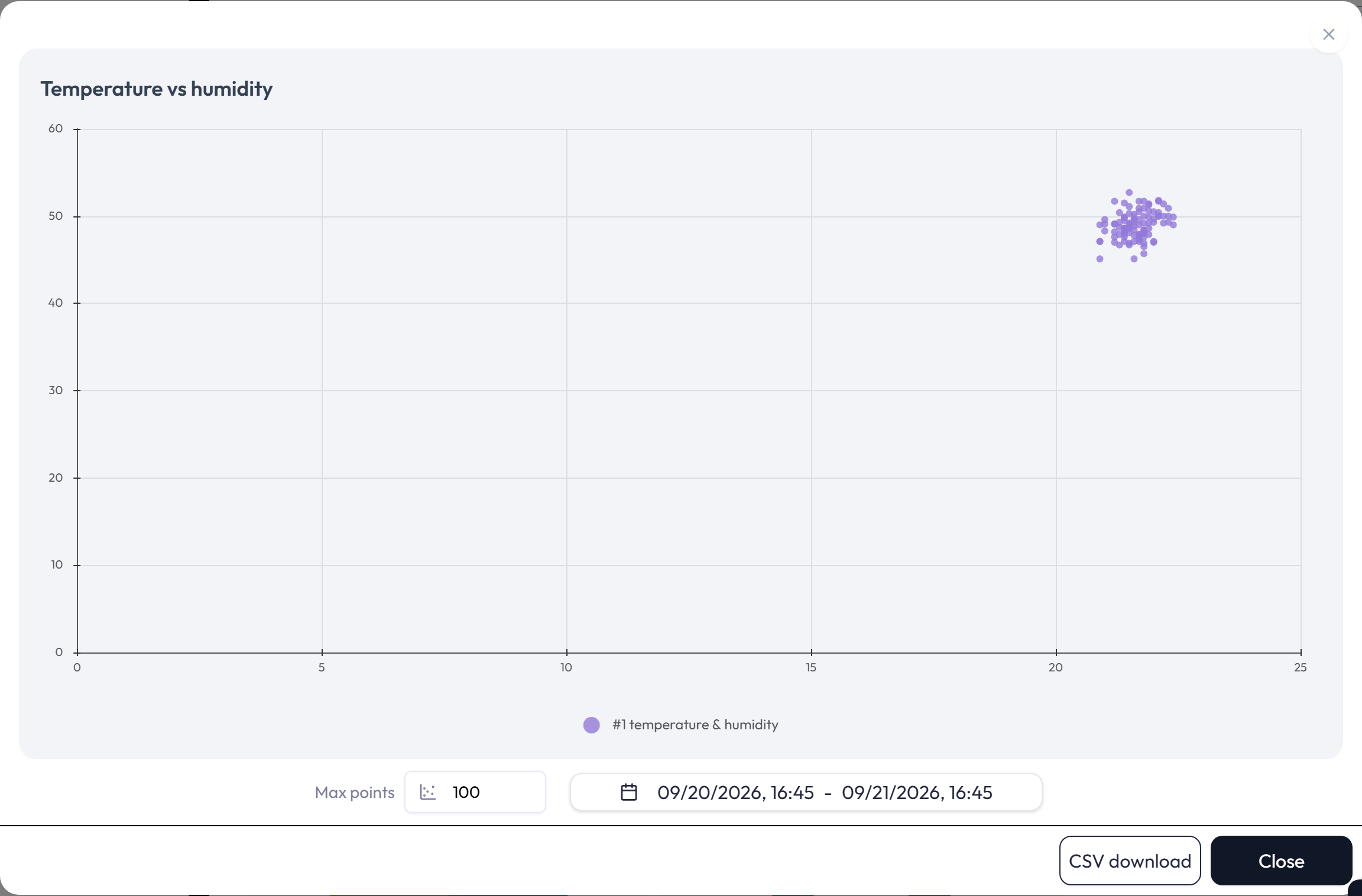
- Charts, XY-Charts, and Tracking Maps add a date-range picker. Charts and XY-Charts also add Max points and CSV download. Max points accepts 1 to 1,440. These changes affect the expanded view, not the saved widget configuration. The CSV contains the data shown in the expanded chart.
- An XY-Chart downloads one CSV per X and Y pair. Each file has Timestamp, X Value, and Y Value columns.
- In the expanded view, Charts zoom along the time axis with the scroll wheel, and XY-Charts zoom on both axes.
- Gauge widgets, and Labels that show an attribute value, let you resize the value with the scroll wheel.
- Map and World Map widgets expand to a larger canvas with the same panels. Data Push, Device List, and Alert List widgets do not have an expanded view.
Live Data
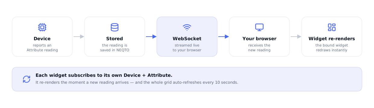
Data widgets request their current values when they load and continue to refresh while the dashboard is open. If the live connection is interrupted, the dashboard reconnects and requests the data again.
- Charts request readings for their configured time range.
- Single Status and Multi Status widgets request the latest value for each attribute.
- Device List updates connection changes as they arrive and periodically refreshes other device details.
- Alert List updates when alert definitions, events, or event statuses change.
- Data Push sends commands and does not subscribe to device readings.
PDF Reports
Export as PDF creates a report from the data widgets on the active dashboard. Data Push, Device List, and Alert List widgets are not offered for PDF export.
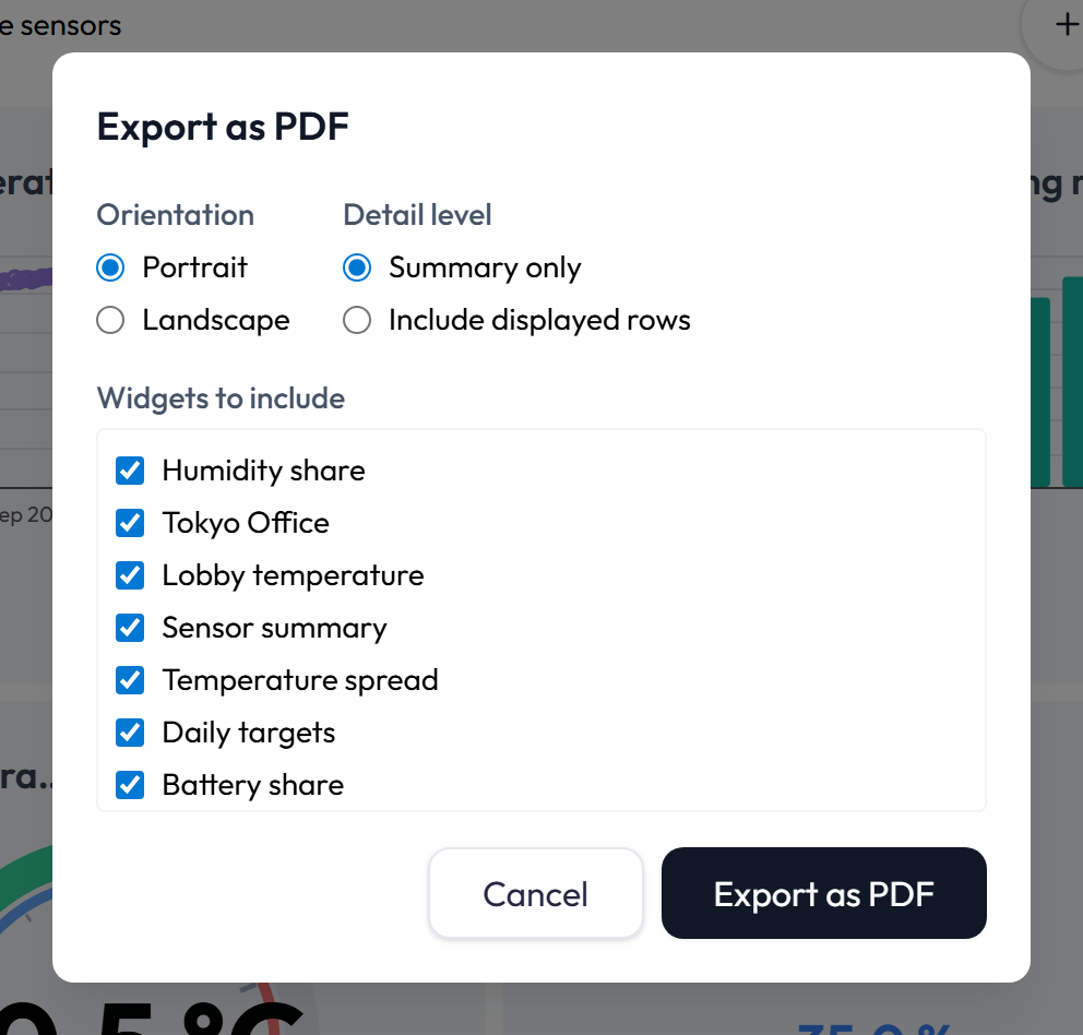
- Orientation: Portrait or Landscape.
- Detail level: Summary only, or Include displayed rows. Row export keeps the newest 200 rows per widget and reports how many older rows were omitted.
- Widgets to include: select at least one supported widget before exporting.
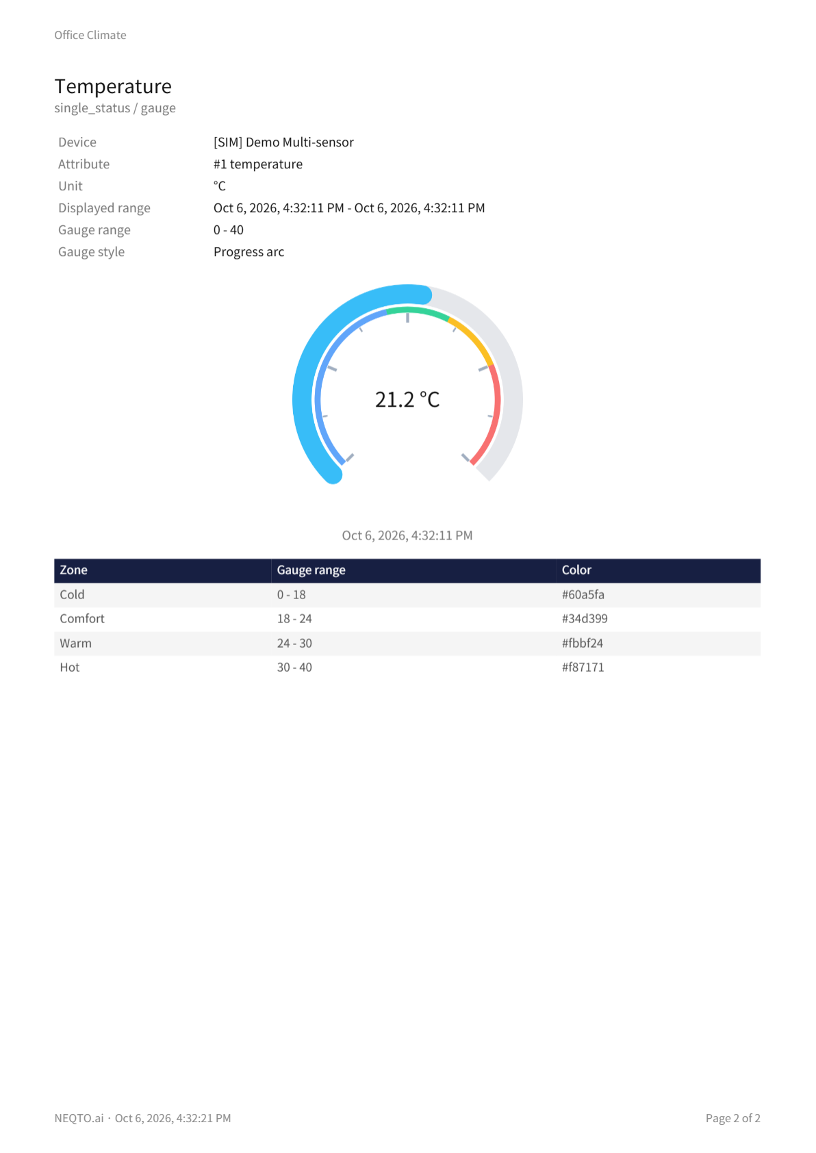
The report cover identifies the dashboard, application when applicable, account, author, generation time, and timezone. Each widget section can include its visual, displayed range, aggregation interval, and relevant statistics such as current value, minimum, maximum, mean, count, and last updated time. Gauge sections also list the style, range, and zones. Progress sections carry each series’ Task Name. Switch sections draw the switches in their style and list each row’s state words. A Label prints its image above the value or the formatted text, which keeps its bold, italic, colors, sizes, and bullets; an image that cannot be loaded is noted as Image not included. XY-Chart rows list the X and Y value of every pair under the series name. A Tracking Map exports its positions, speed, and heading as a table, with the speed written in the unit the widget’s legend uses; Map and World Map sections list each pin’s current value.
Building a Widget: What Every Widget Shares
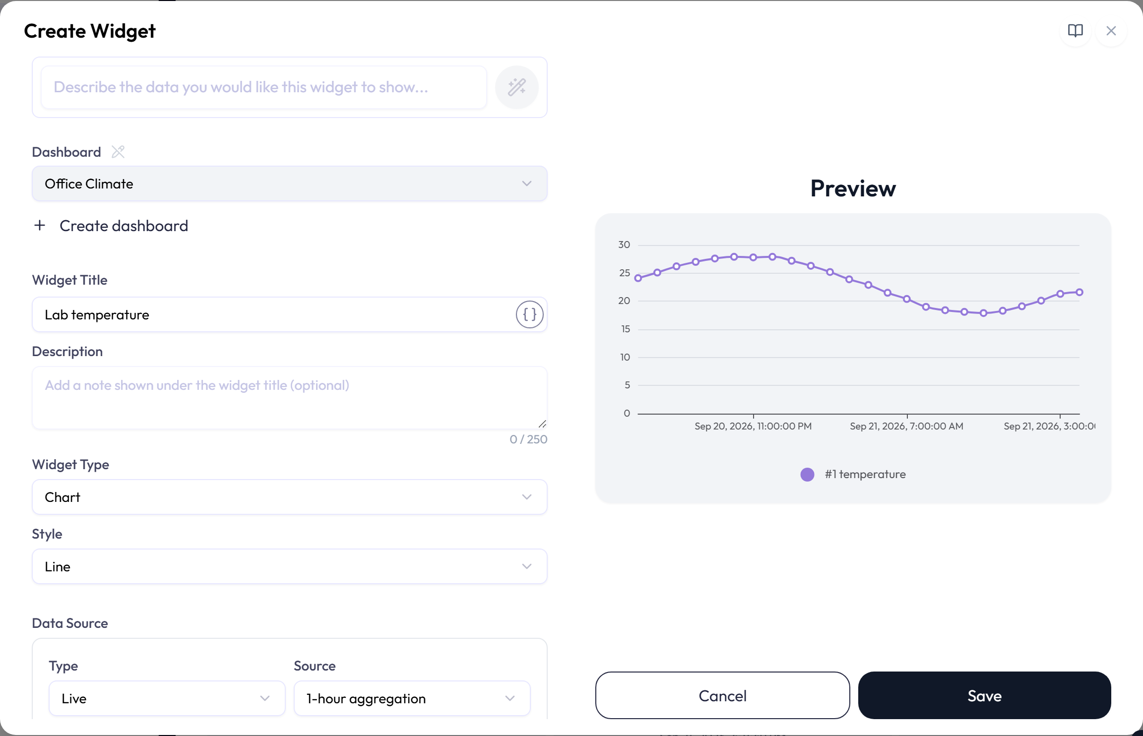
The widget editor places settings on the left and a preview on the right. Describe the widget to the AI field at the top, or fill in the common fields below, then use the Widget Catalog for type-specific options.
-
1Confirm the Dashboard, enter a required Widget Title, and add an optional description. Or describe the widget in the AI field and let it fill these in.
-
2Choose the Widget Type and, where available, a Style. Device List and Alert List have no style selector.
-
3Set the type-specific options and select the required attributes, devices, alerts, or Data Push destination.
-
4Check the preview, then save the widget.
Drafting a widget with AI
The field at the top of the editor reads Describe the data you would like this widget to show… when you create a widget, and Describe what you would like to change about this widget… when you edit a saved one. Type what you want, for example a line chart of the last 24 hours of temperature for the two lobby sensors, and press Enter or the wand button. Shift + Enter adds a line break.
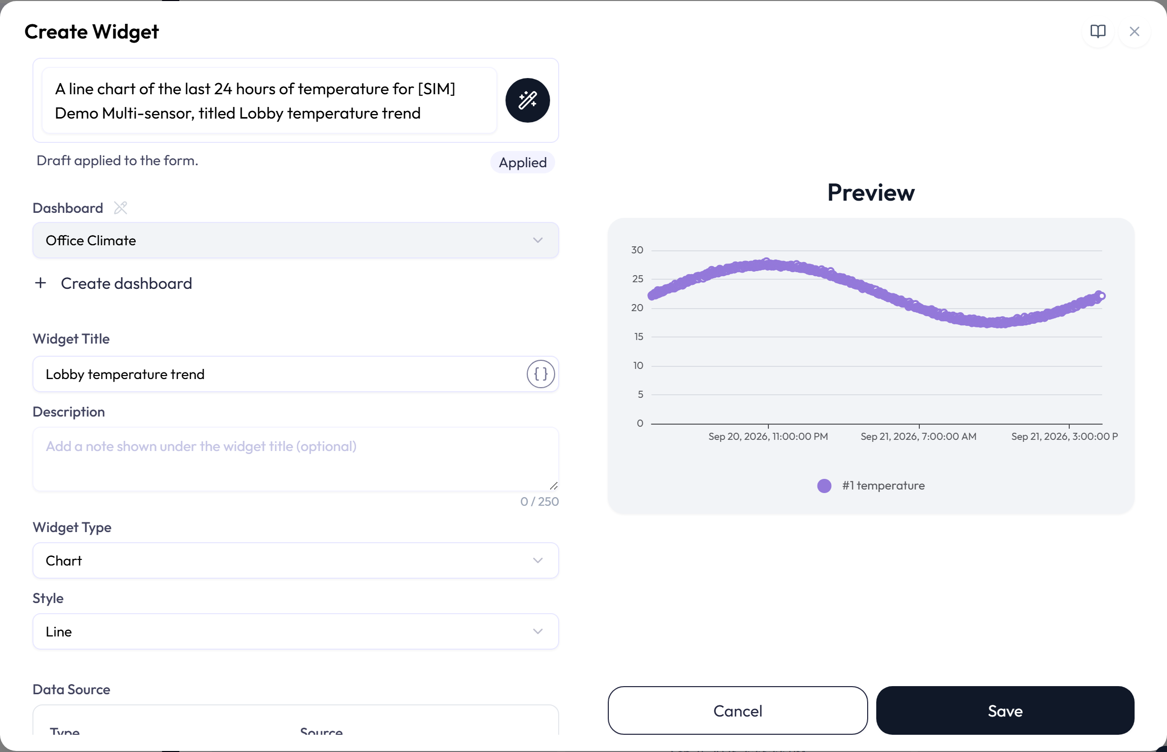
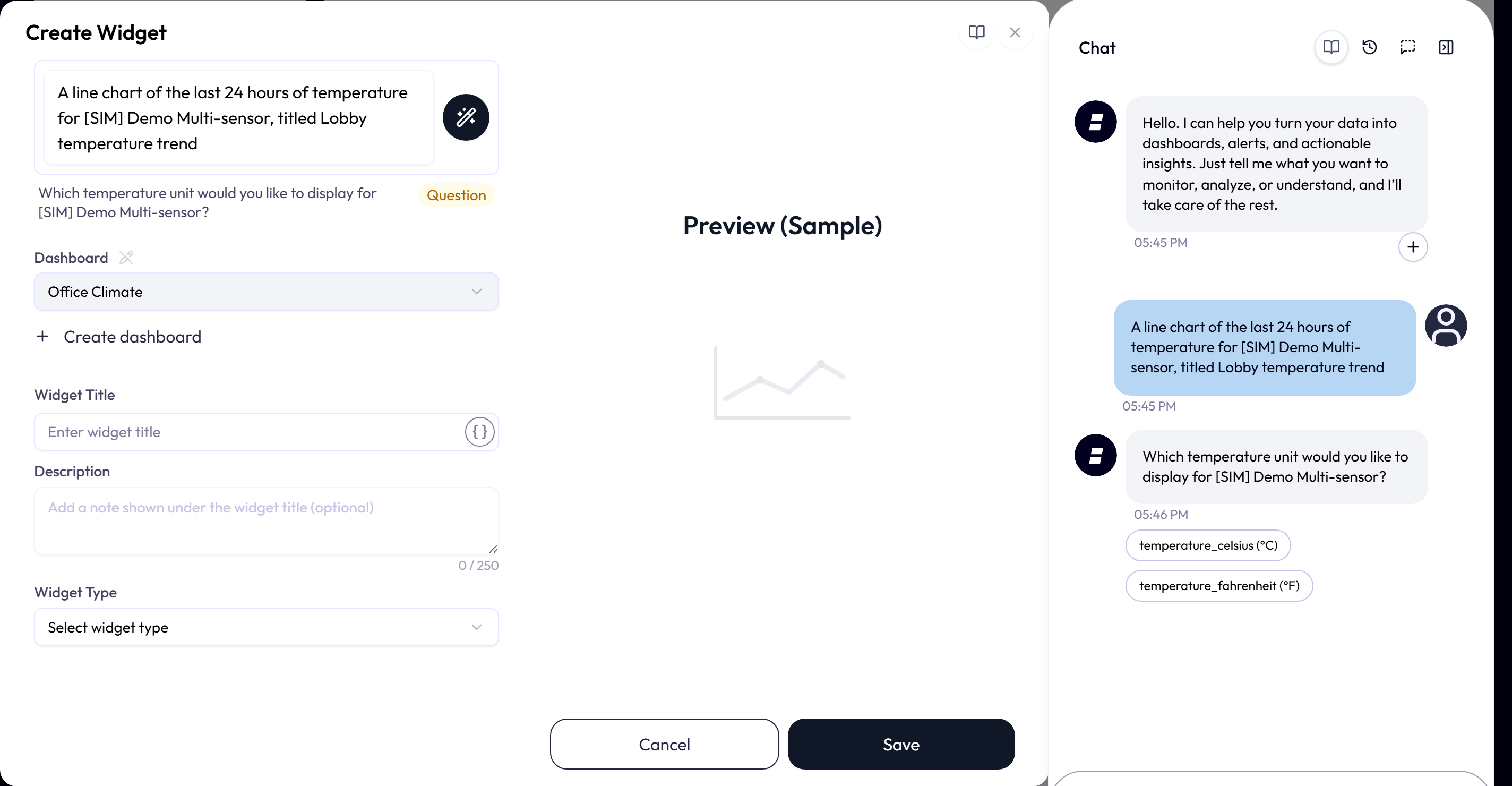
The status row under the field tells you what happened:
| Status | What it means |
|---|---|
| Drafting | Drafting with AI… The request is with the assistant. The form stays editable. |
| Applied | Draft applied to the form. The fields changed. An AI-inferred pill names every field the assistant chose, such as Widget Title, Style, Attributes; a field leaves the list as soon as you edit it. |
| No changes | Nothing new to apply. The draft matched what was already in the form. |
| Question | The assistant needs a decision from you and shows its question here. Answer it in Ask AI; the next draft comes back into the open editor. |
| Your own entries were kept | Added to Applied or No changes as Your own entries were kept for n field(s). A draft never overwrites a field you have already filled in. |
- A value the assistant proposed but the editor could not accept is listed under the status with the reason, for example The proposed number of series does not fit this widget type. The current value is kept.
- When a draft produces a Map widget that has no floor image yet, the editor asks Add the floor image now? Yes opens the file picker for the image; No leaves it for later.
- The field is disabled, with a note, in two cases: AI drafting is unavailable right now: the widget catalogue could not be loaded, and AI drafting is unavailable: the editor and the server use different widget catalogue versions. Reload the page; if the second note persists, the platform is mid-update and the field returns after the next reload.
- When your plan uses AI credits, the line under the field shows the draft’s price and how many credits are available; point to the sparkle icon in the field’s corner to see the price again. Your message and each step the assistant takes are charged on top, as in chat. If your credits cannot cover the draft, the field reads Not enough credits for this action and is disabled. A high price asks you to confirm first, as planning does.
- The field does not appear on a Map widget that shows a System, or when the editor was opened from a proposal the assistant made in the chat, because that widget is already drafted.
Dashboard
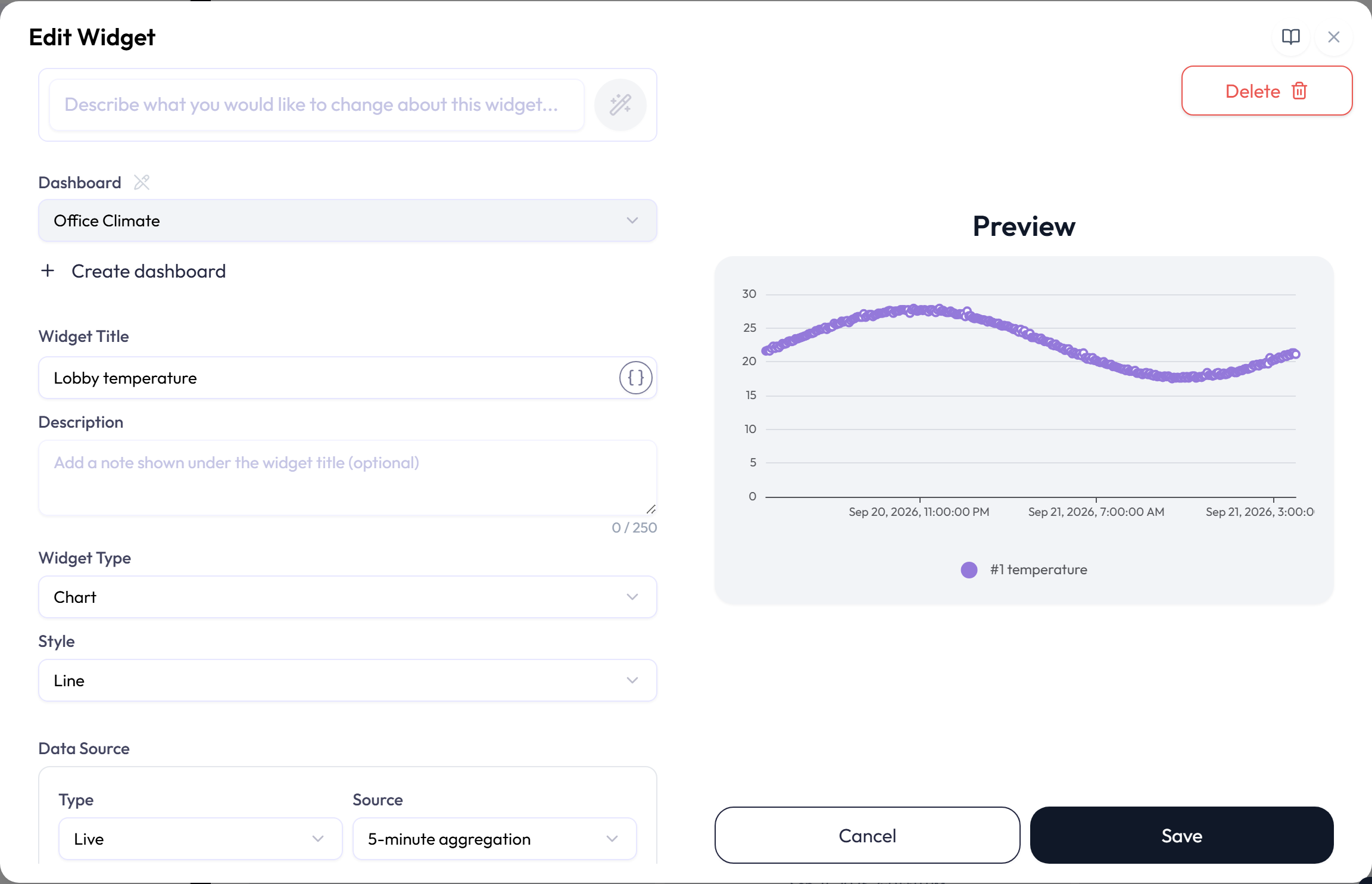
The Dashboard field shows where the widget will be saved. Select the pencil beside the field to unlock it and choose another dashboard, or Create dashboard to make a new one without leaving the editor. Inside an application, the list offers only that application’s dashboards, because a widget cannot move to another application. Some creation flows fix the destination and hide this field.
Widget Title, with tags
A widget title is required. Select Insert a tag to add a token such as
{{tag.room}}. The dashboard replaces the token with the tag’s current value.
- Resolves to previews the completed title.
- A warning appears if a referenced tag cannot be found.
- Insertable tag keys use letters, numbers, hyphens, and underscores. Other keys are disabled in the picker.
Description
The optional description can contain up to 250 characters. It appears below the widget title and is shortened when space is limited. Point to it to see the full text. A Label with Show title turned off hides the description along with the title.
Preview, with sample data
Until the widget has one valid device attribute, the panel is headed Preview (Sample) and draws the real widget with made-up values, so a gauge or label shows its style at once. As soon as an attribute is bound the heading changes to Preview and the widget renders live data. A Map widget previews from its image alone, and a Label that shows formatted text previews its own text. Preview controls for Data Push never send a real command.
Attributes and their options
Charts and status widgets use one or more attribute rows. Data Push, Device List, and Alert List use their own selectors instead.
| Field | What it does |
|---|---|
| Device | Selects the device that provides the value. |
| Attribute | Selects a measurement detected for that device. |
| Statistic | For aggregated Chart and XY-Chart data, selects Maximum, Minimum, Average, Sum, Max absolute, or Min absolute. The default is Max absolute, shown as |Max|. Raw data does not use a statistic, and the field is hidden. |
| Color | Sets the series, slice, pin, or value color when the selected widget supports it. |
| Data label | Replaces the source attribute name in the widget. Data labels can also contain tag tokens and can contain up to 100 characters. |
| State text |
For Label and Switch widgets, sets the words shown for an on/off value:
Not set (the default), On / Off, Open / Closed, Active / Inactive,
Yes / No, or Custom words of up to 24 characters each. A value counts
as on when it is true or 1, and as off when it is
false or 0, whether it arrives as a number, a boolean, or
text.
|
| Rounding | For Single Status and Table widgets, selects no rounding, nearest, up, or down, with up to four decimal places. |
| Temperature unit | Converts a temperature attribute between Celsius and Fahrenheit. |
Calculations
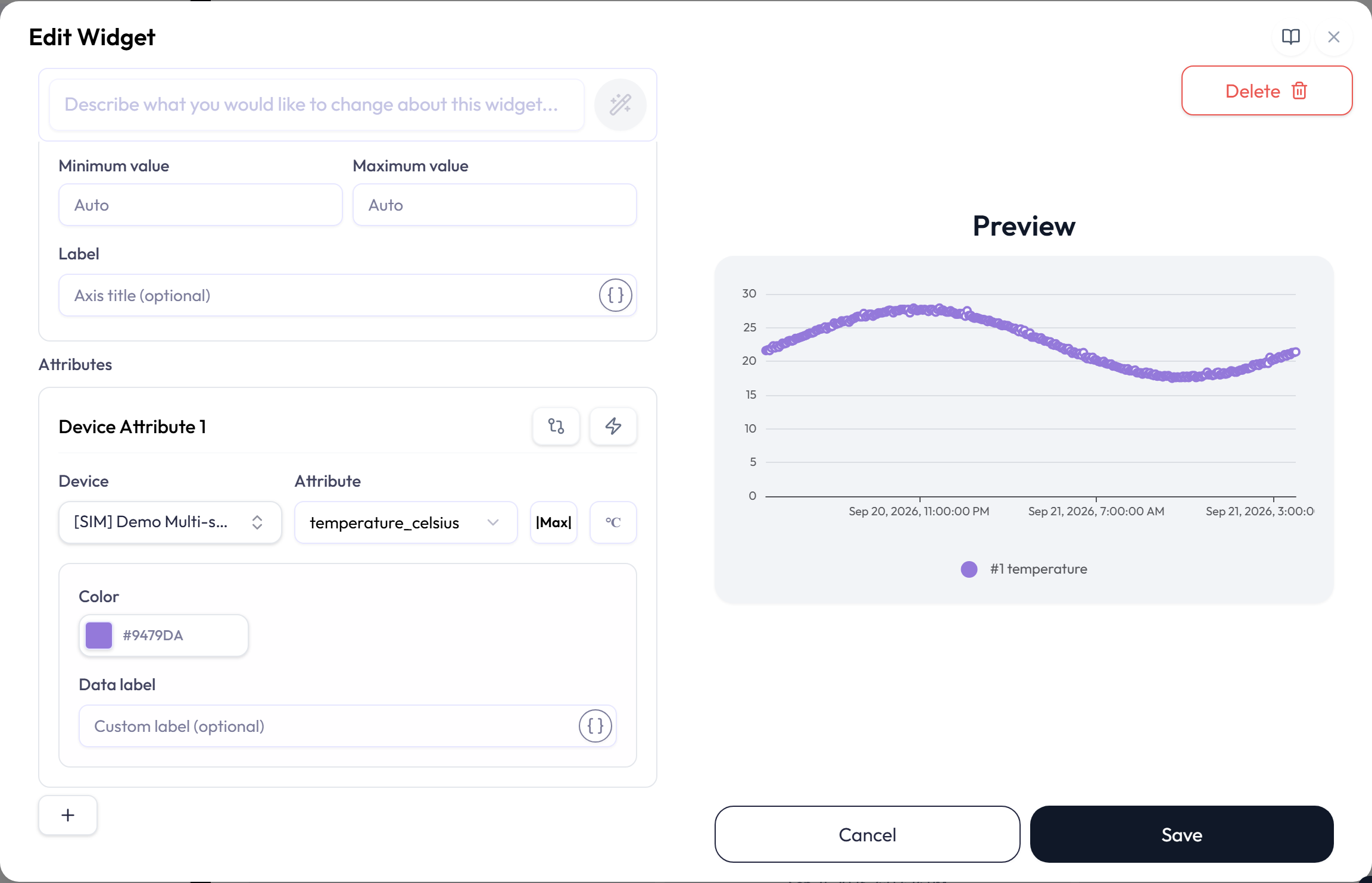
Calculation-capable widgets can show a computed value instead of a raw attribute. Use the simple calculation control to add, subtract, multiply, or divide two attributes. Use Advanced calculation for formulas, scaling, and unit conversions. A warning on the widget indicates a calculation problem. See the Widget Calculations page for the formula language, and for how to ask the assistant for a calculated widget in plain language.
The Widget Catalog
The editor offers seven widget types. Available styles and options depend on the dashboard scope, permissions, and whether Google Maps is enabled for the application.
| Type | Styles |
|---|---|
| Chart | Line, Bar, Area, Scatter, Fan, Distribution, and Tracking Map |
| Single Status | Gauge and Label |
| Multi Status | Table, Progress, Pie, Doughnut, Switch, Map, and World Map |
| Data Push | Form and Button |
| XY-Chart | Line and Scatter |
| Device List | One table or card presentation |
| Alert List | One list or card presentation |
Chart: Line, Bar, Area, Scatter
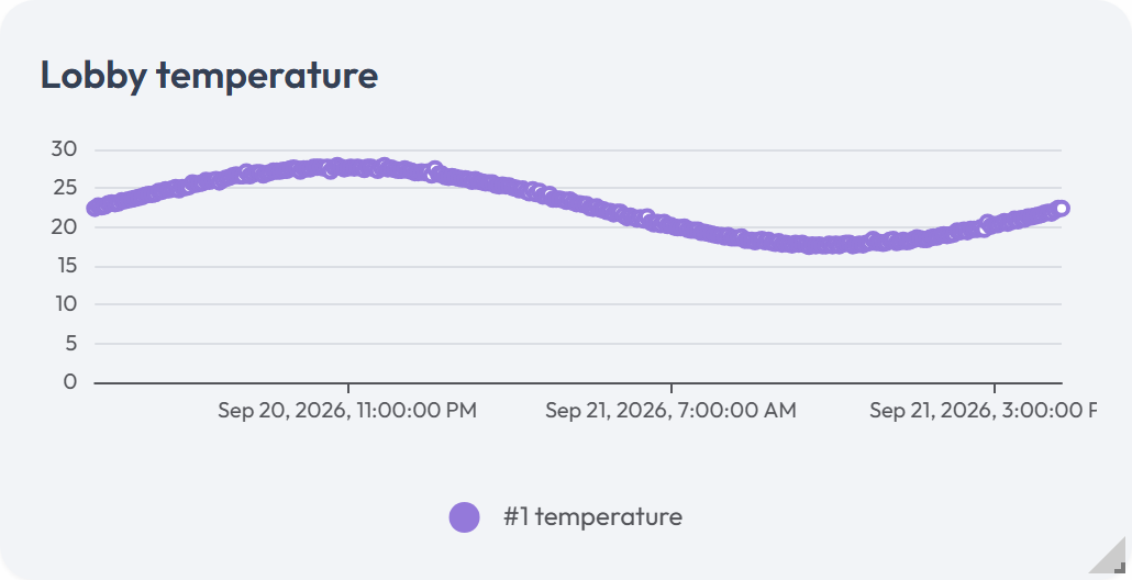
These charts plot one or more numeric attributes over time. Use them to show trends or compare devices.
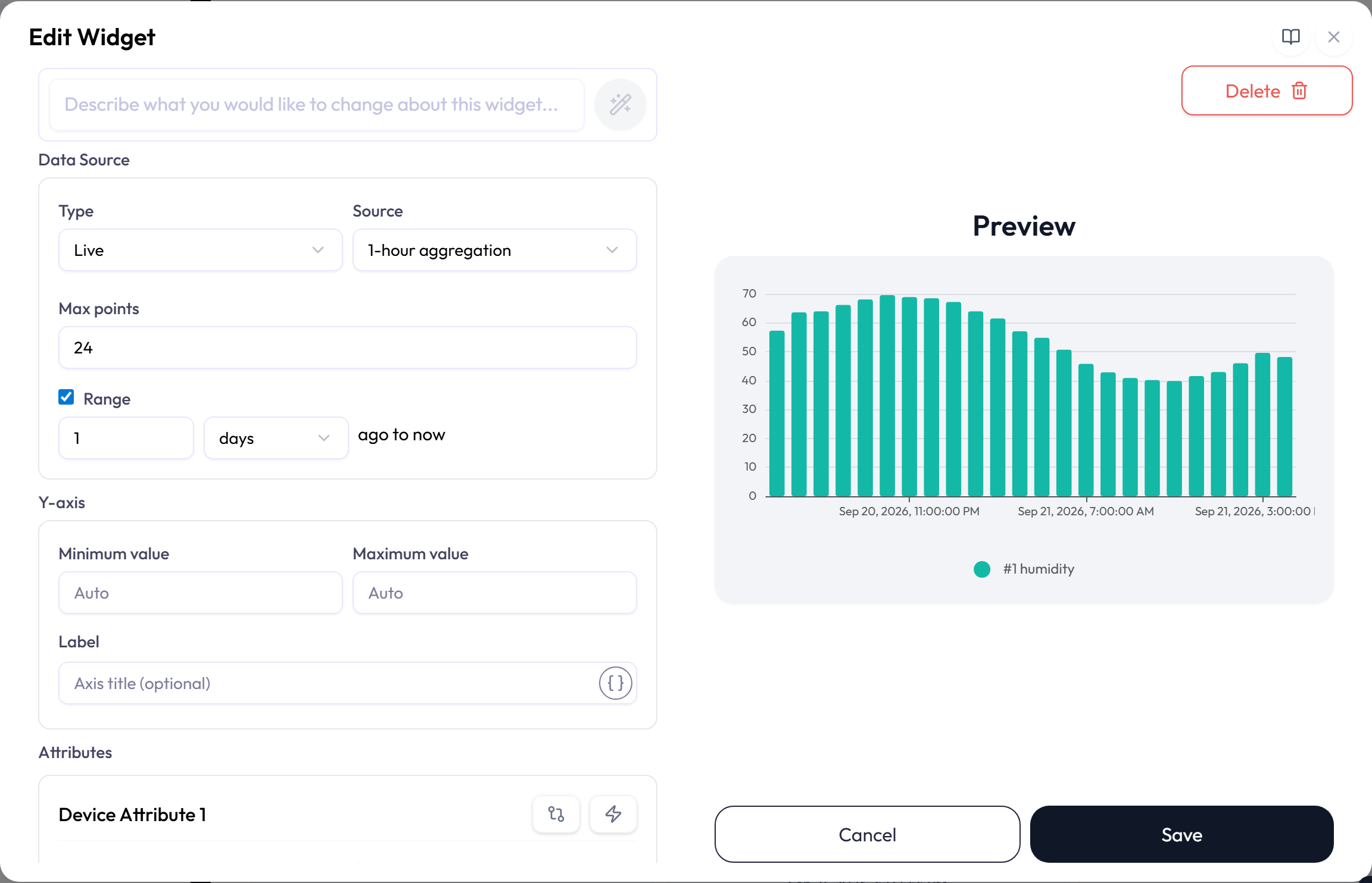
| Option | What it does |
|---|---|
| Style | Draws the values as lines, bars, filled areas, or separate points. |
| Data Source: Type | Live uses a rolling time window. Daily shows one calendar day; the Duration field then picks Today, Yesterday, Two days ago, or Three days ago. |
| Data Source: Source | Uses Raw readings or aggregates them into 1-minute, 5-minute, 10-minute, 30-minute, 1-hour, 3-hour, 1-day, or 1-week intervals. Daily charts require aggregation and cannot use Raw, 1-day, or 1-week. |
| Range with 1-day or 1-week | Choosing either interval turns Range on and keeps it on. A missing range, or one shorter than one interval, is set to 30 days for 1-day or 84 days for 1-week. The range must cover at least one interval and at most 90 days. Days run from midnight to midnight and weeks start on Sunday, in your profile’s time zone. Each point is dated by the day or week it starts, and the current day or week stays partial until it ends. |
| Max points and Range | For Live charts, Max points limits the chart to no more than 1,440 points. Turn on Range to set how far back to look in seconds, minutes, hours, or days. |
| Y-axis | Leave both limits blank for automatic scaling. If you set one, enter both a minimum and a larger maximum. You can also add an axis label and orient it vertically or horizontally. |
Chart: Fan (Forecast)
A Fan chart extends one numeric attribute’s recent history with a forecast line and shaded confidence bands. Use it to see the likely direction of a changing value, while treating the forecast as an estimate rather than a measurement.
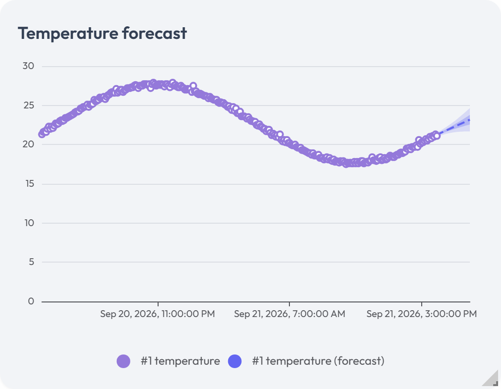
| Option | What it does |
|---|---|
| Show forecast | Shows or hides the forecast while keeping the historical series. |
| Forecast horizon | Sets how far ahead to project in minutes, hours, or days. The effective horizon cannot exceed twice the visible history. |
| Confidence bands | Selects which uncertainty bands to draw. |
| Colors and opacity | Styles the forecast line and bands. |
Chart: Distribution
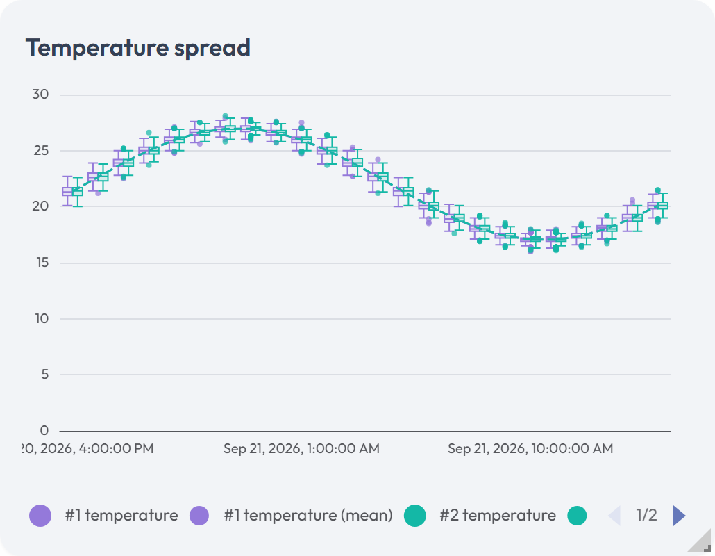
Distribution charts compare the spread of values rather than their order over time. Box plot mode shows quartiles, median, whiskers, and optional outliers. Violin-like mode shows a smoothed summary of the same distribution.
![The Temperature Spread chart widget in violin-like mode. The vertical axis runs from 0 to 30 and the horizontal axis carries four dated timestamps across Aug 24 and Aug 25, 2026. A purple band of stacked translucent curves surrounds a darker center line. That line dips to about 17 near the left edge, peaks near 27, and settles around 20 on the right. A legend under the plot pairs a purple dot with the series name [SIM] Demo Multi-sensor temperature_celsius.](https://neqto.ai/wp-content/uploads/2026/08/dashboard-chart-distribution-violin.png)
| Option | What it does |
|---|---|
| Distribution style | Selects Box plot or Violin-like. |
| Show mean / Show outliers | Shows or hides those markers. |
| Fill opacity / Mean line color | Styles the distribution shapes and mean marker. |
Chart: Tracking Map
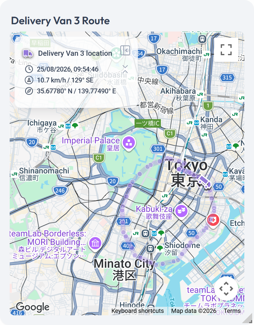
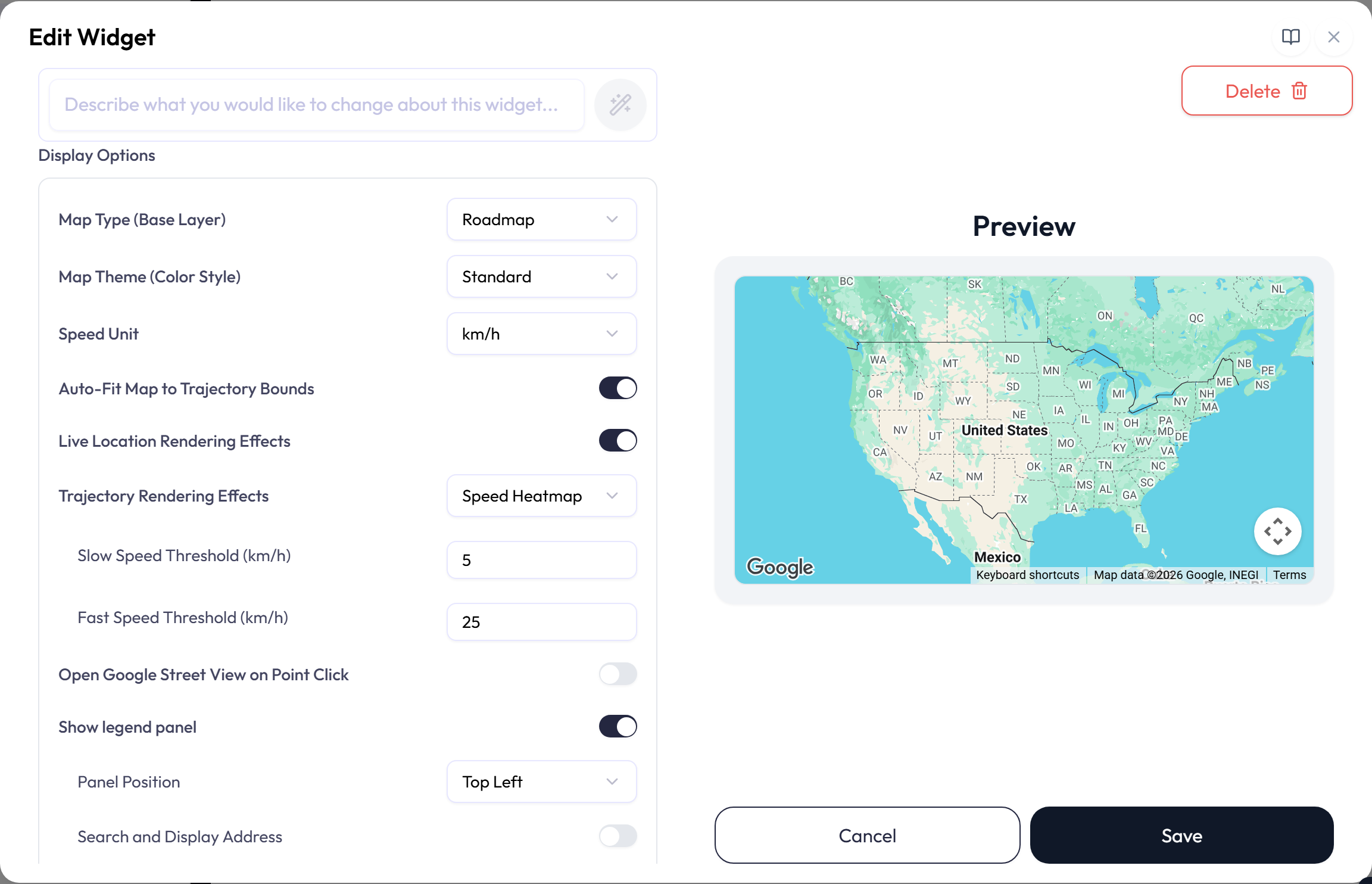
A Tracking Map plots reported locations on Google Maps and can draw a trail for each selected device. It can show current position, time, speed, heading, and coordinates. This style appears only when Google Maps is available and supports up to eight location series.
| Option | What it does |
|---|---|
| Location attribute and icon | Selects the required location data and marker for each device. |
| Map type and theme | Selects Roadmap, Satellite, Hybrid, or Terrain, with Standard, Dark, Silver, or Retro styling. |
| Speed and trail | Selects km/h or mph and a Standard, Dots only, Fade by Time, or Speed Heatmap trail. Thresholds control speed-based coloring. |
| Framing | Controls auto-fit, default zoom, recentering, and zoom reset on updates. |
| Legend panel | Show legend panel lists each series with its latest position, time, speed, and heading. Panel Position places it in one of the four corners. The panel scrolls when it has more series than fit, so it never covers the whole map. Search and Display Address adds a resolved street address to each entry, and a point can open Street View when selected. |
XY-Chart: Line, Scatter
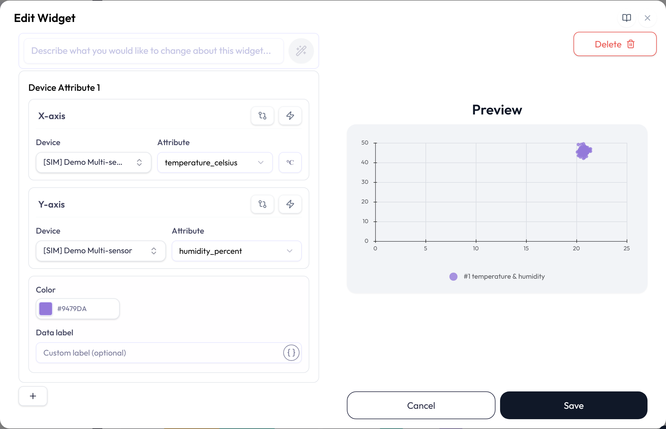
An XY-Chart plots one measurement against another. Scatter shows separate paired points; Line connects them in time order. Use it to compare values such as temperature and humidity or power and occupancy.
| Option | What it does |
|---|---|
| Pairs | Adds up to eight X and Y pairs. Set a color and optional label for each plotted series. |
| Time range and source data | Uses the same Live, Daily, raw, and aggregated choices as standard charts. |
| Axis ranges and labels | Sets automatic or fixed numeric ranges. Add X-axis and Y-axis labels when the units are not obvious. |
| Calculations | Applies a simple or advanced calculation independently to either side of a pair. |
Single Status: Gauge
A Gauge compares one numeric attribute’s latest value with a minimum and maximum. Choose from Classic, Progress arc, Numbered, Semicircle, Speedometer, Segmented, Linear, and Tank styles. The preview draws the chosen style with sample values before you pick an attribute, and with the live value afterwards.
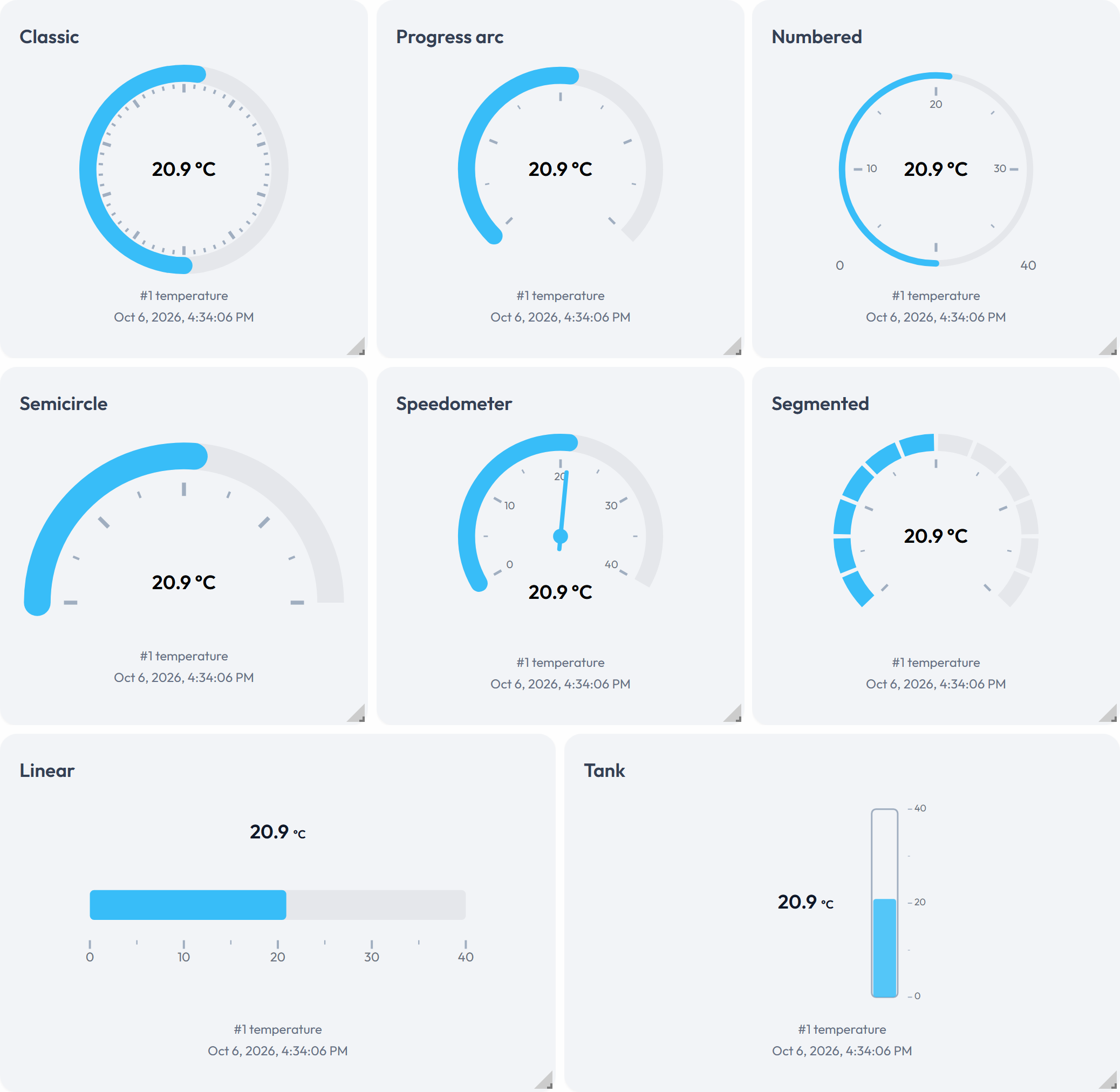
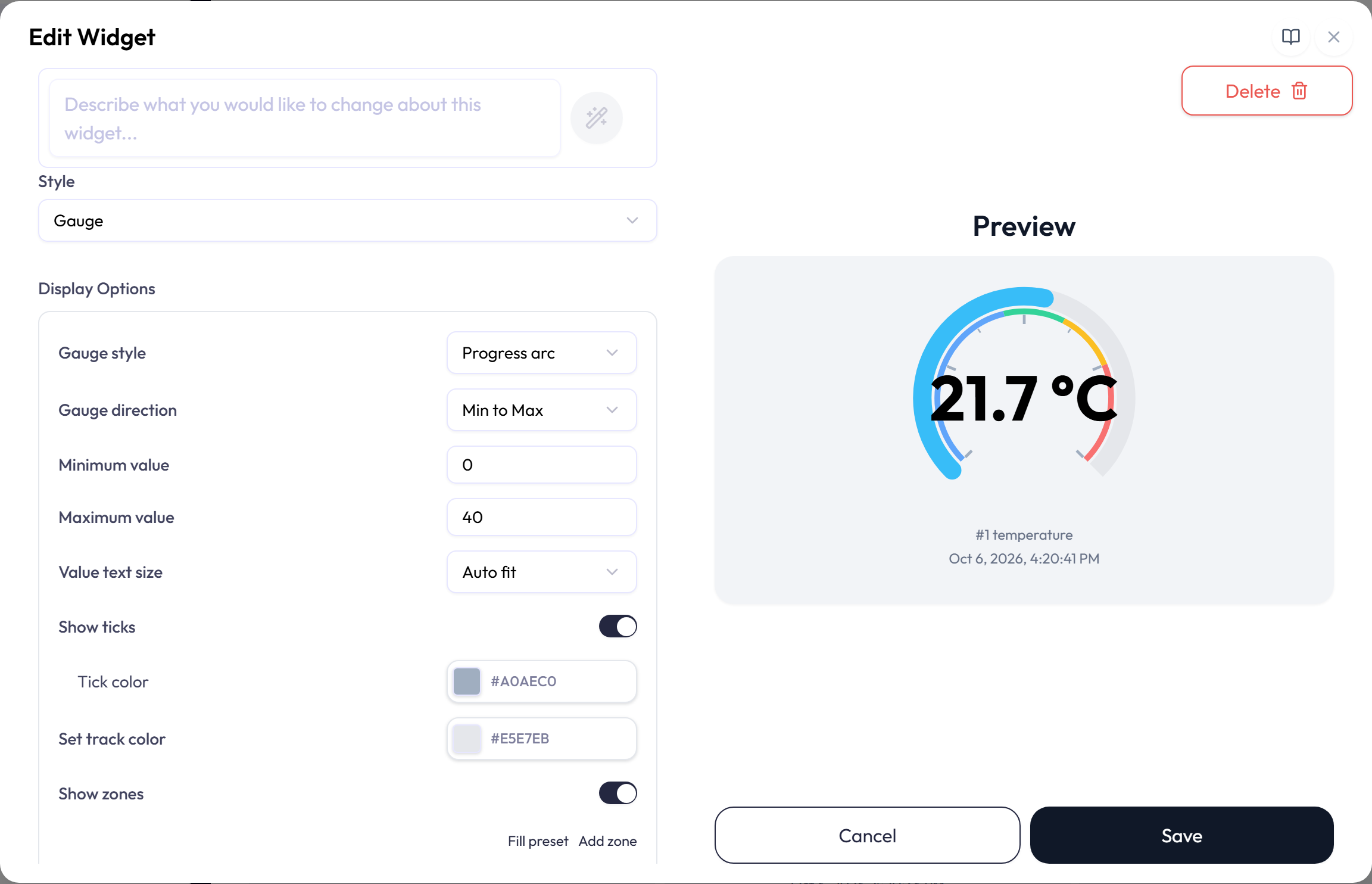
The Display Options box holds the gauge settings:
| Option | What it does |
|---|---|
| Gauge style and Orientation | Selects the gauge shape. Linear and Tank can be horizontal or vertical. |
| Gauge direction | Min to Max fills from the minimum up to the value. Max to Min fills from the value up to the maximum; the scale itself is not reversed. Zero-based fills from 0 to the value on whichever side of 0 it falls, so a negative reading fills toward the minimum. If 0 is outside the range, the fill starts at the nearer end. Tank ignores Max to Min and always fills from its minimum, but honors Zero-based. |
| Minimum value / Maximum value | Sets the scale. Both values are required and must be whole numbers. New gauges start at 0 and 100, and the minimum must be lower than the maximum. |
| Value text size | Standard, Auto fit, or Manual, which sets Text size (px). |
| Show ticks | Shows or hides the numeric scale marks. While it is on, Tick color sets their color. |
| Set track color | Sets the color of the background track. |
| Show zones | Turns zones on. Turning it on with no zones fills in the preset; zones are kept only while it is on. |
The attribute row decides how the gauge itself is colored:
- Color is the gauge color when nothing below applies.
- Overwrite with zone color appears when zones are on, and colors the gauge with the zone the reading is in. It is off by default.
- Change color by threshold sets the gauge and value-text colors from the reading. Each row pairs a Threshold with a Gauge color and a Text color, compared with ≥ for Min to Max and Zero-based, or ≤ for Max to Min. The first row is the base color for readings no other row matches, and can sit outside the range. Later rows must stay inside the range, in order. Changing Gauge direction resets the rows. Every style except Classic draws a tick at each threshold.
Zones add named, colored ranges such as Safe, Warning, and Danger to the gauge face.
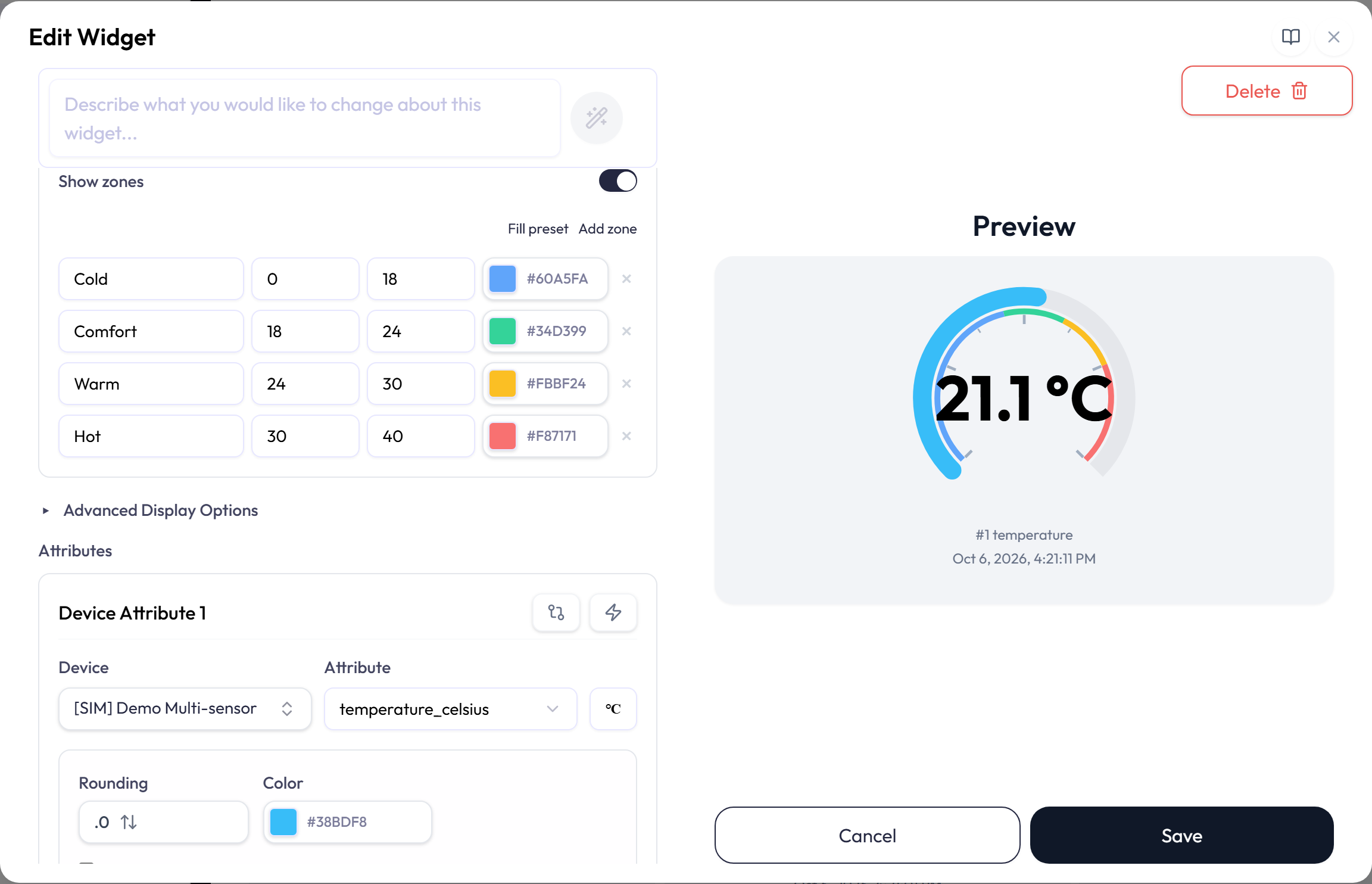
- Each zone needs a name of 1 to 60 characters, a minimum, a maximum, and a color.
- A zone that runs past the gauge range is cut at its edge, and one entirely outside the range is not drawn.
- The preset creates Idle, Safe, Optimal, and Danger zones that you can edit.
- PDF reports include configured gauge zones.
Advanced Display Options
Gauge, Fan, and Distribution widgets include an advanced geometry section. Available controls depend on the selected style. They can adjust gauge radius and thickness, tick count, linear or tank dimensions, chart margins, forecast line width, box width, and outlier size. Fan and Distribution charts also choose a Legend position of Top or Bottom here; other charts keep their legend under the plot. Each field enforces a safe range, and Reset to defaults removes the custom geometry settings.
![The Edit Widget dialog scrolled to the expanded Advanced Display Options, with Reset to defaults at its right edge and four fields, Gauge radius, Arc thickness, Value offset (%), and Major ticks, each showing Default. Below it the attribute card for [SIM] Demo Multi-sensor and temperature_celsius shows Rounding, Color #38BDF8, and two unchecked options, Overwrite with zone color and Change color by threshold.](https://neqto.ai/wp-content/uploads/2026/10/dashboard-config-advanced.png)
Single Status: Label
A Label shows either the latest value of one attribute or a formatted note, such as a heading or instructions, and either can carry an image. The Label settings box holds the choices.
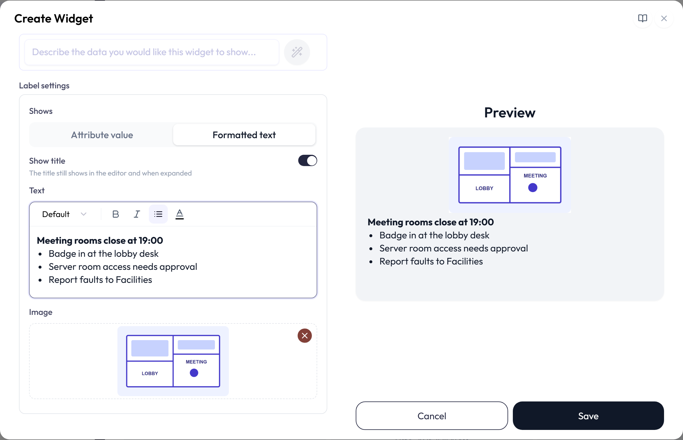
| Option | What it does |
|---|---|
| Shows | Attribute value, the default, shows the latest value and unit. Formatted text shows a note you write, an image, or both, instead. It removes the attribute row, and the widget then reads no device data. |
| Value text size | For a value, Auto fit sizes the text to the widget, and Manual sets Text size (px) from 10 to 96. |
| Show title | On by default. Turn it off to hide the title and description on the dashboard. The title is still required, and still shows in the editor, the expanded view, and PDF reports. |
| Text | For formatted text. The toolbar sets Font size, Bold, Italic, Bulleted list, and Text color. A note holds up to 5,000 characters and scrolls inside the widget when it does not fit. |
| Image | One PNG, JPEG, or WebP image, uploaded when you save the widget. It sits beside the value on a wide widget and above it on a tall one, and above formatted text. Click the image or drop another file on it to replace it; the X removes it. |
For a numeric value, choose rounding and decimal places; the attribute color styles the value.
For an on/off value, set the attribute’s State text. Until you do, a boolean
true or false shows a dash, text values show as sent, and
1 and 0 show as numbers with your rounding. A value longer than 500
characters is cut short; point to it to read the whole value. Like the Gauge, a value Label
previews with a sample value until an attribute is bound.
The assistant, in Ask AI or the editor’s AI field, can draft a formatted-text Label, hide its title, and set state text, but it cannot add, change, or remove the image.
Multi Status: Table
A Table arranges the latest values in a labeled grid. Use it to place related metrics by room, device, or category.
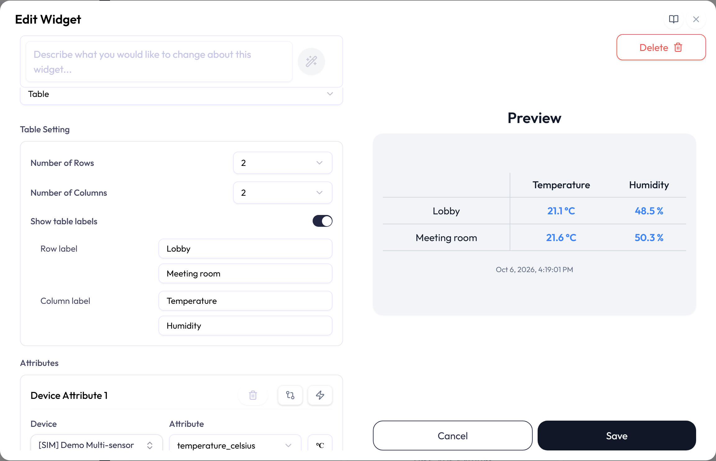
| Option | What it does |
|---|---|
| Number of Rows / Number of Columns | Creates up to 16 total cells, with at most 16 rows and eight columns. Increasing one dimension may reduce the allowed size of the other. |
| Show table labels | Shows or hides editable row and column labels. |
| Cell | Places an attribute in a cell. Every attribute needs a unique cell. |
Multi Status: Map
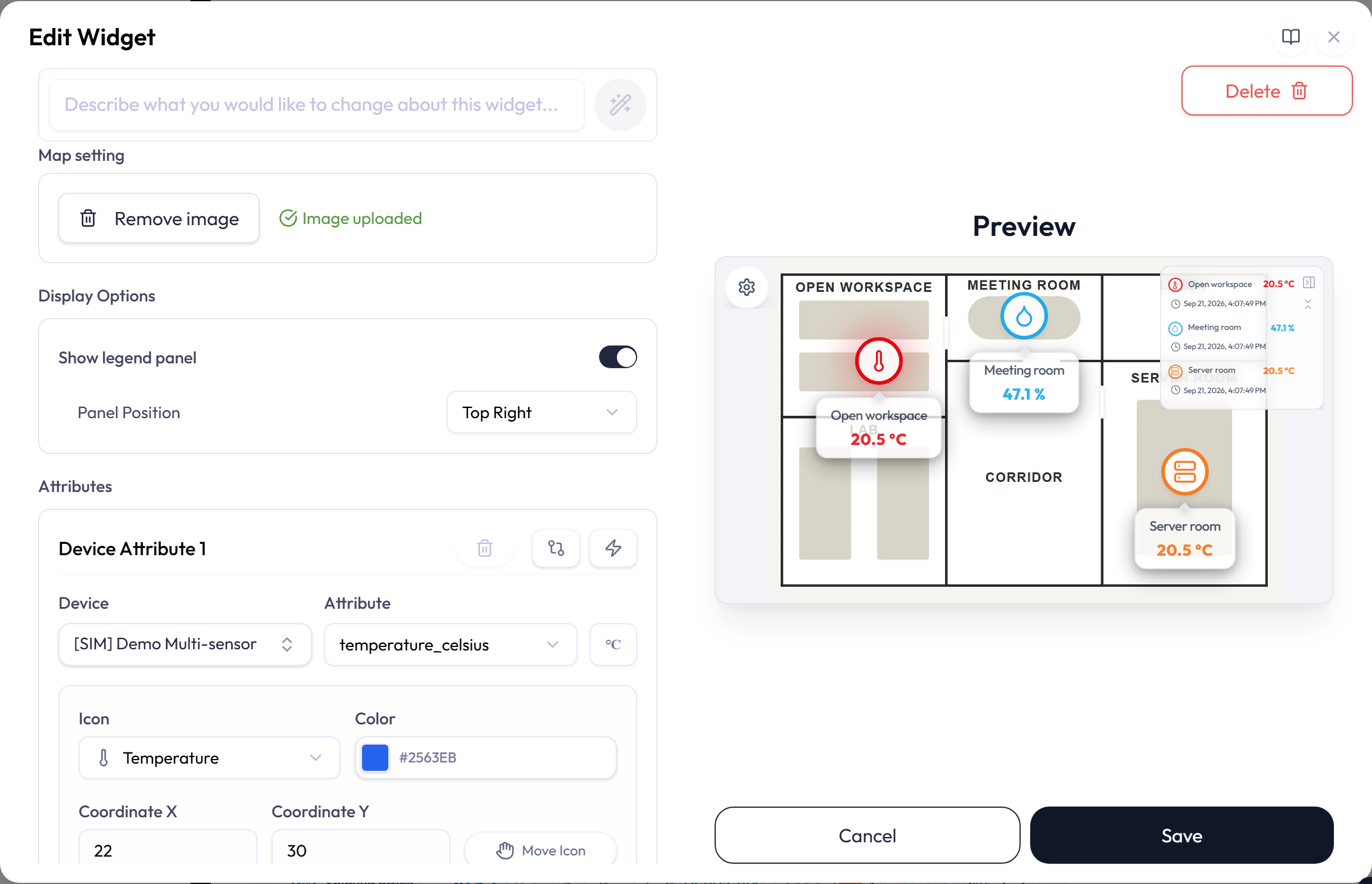
A Map places device pins on an image of a physical space, such as a floor plan, site layout, rack diagram, or piece of equipment. Each pin shows one attribute’s live reading and changes color when a related alert fires. A Map can also show a System’s image and placed members instead of pins of its own; see Systems on dashboards in the Systems page for that variant.
-
1Under Map setting, select Add image and choose a
PNG,JPEG, orWebPfile. The editor confirms Image uploaded; until then it warns that the image is required. -
2In each attribute row, pick the Device and Attribute, an Icon, and a Color. Then set Coordinate X and Coordinate Y as percentages of the image, or select Move Icon and click the spot on the preview.
-
3Open the row’s Options for the label, the value display, related widgets and alerts. Add more rows for more pins, then save.
| Option | What it does |
|---|---|
| Icon | Sets the pin’s symbol from a list of more than fifty, from Temperature, Humidity, Air Flow, and CO2 through Door, Occupancy, Power, and Battery to Building, Vehicle, Server, and Gateway. None draws a plain marker. The icon does not change the data. |
| Color | The pin color while no related alert is active. |
| Label and Show value in label | Adds text next to the pin, the live reading, or both. Label position puts the text at the center, top, bottom, left, or right of the pin. |
| Related widget | Links the pin to another widget on the same dashboard. The pin’s menu then offers Expand widget to open it. |
| Related alerts and Display Alert | Selects the alerts whose events color the pin. With several alerts linked, Display Alert chooses which one drives the color: Severity Priority takes the most severe active event, Latest Event Priority the most recent. |
| Display Options | Show legend panel lists the pins with their current values on the widget. Panel Position is a corner, or Auto, which moves the panel away from the selected pin. |
Reading and editing a Map on the dashboard
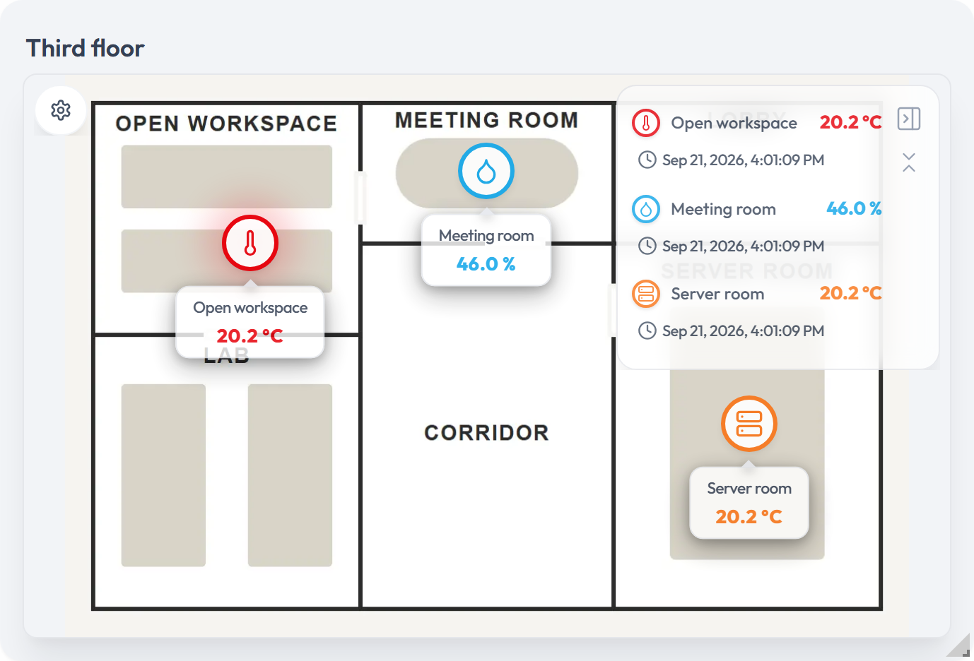
- Pan and zoom. Drag the image to pan, and use the scroll wheel or pinch to zoom between half and five times its size. The settings button on the map opens a control strip with Zoom In, Zoom Out, and Reset Zoom.
- Status colors. A pin with an active related alert turns red for critical, amber for warning, or blue for info. When the alert clears the pin returns to its own color. A pin whose device has stopped reporting is greyed out.
- Legend panel. Select a row to highlight that pin. The panel can be minimized or hidden from its own header.
- Filters. The control strip also opens the Filters panel, which narrows the pins by Devices, Icons, and Alerts, the last by Severity (Critical, Warning, Info, No Alert) and Current Status (New, In Progress, Completed, Pending, Dismissed). Keep filter open pins the panel while you work.
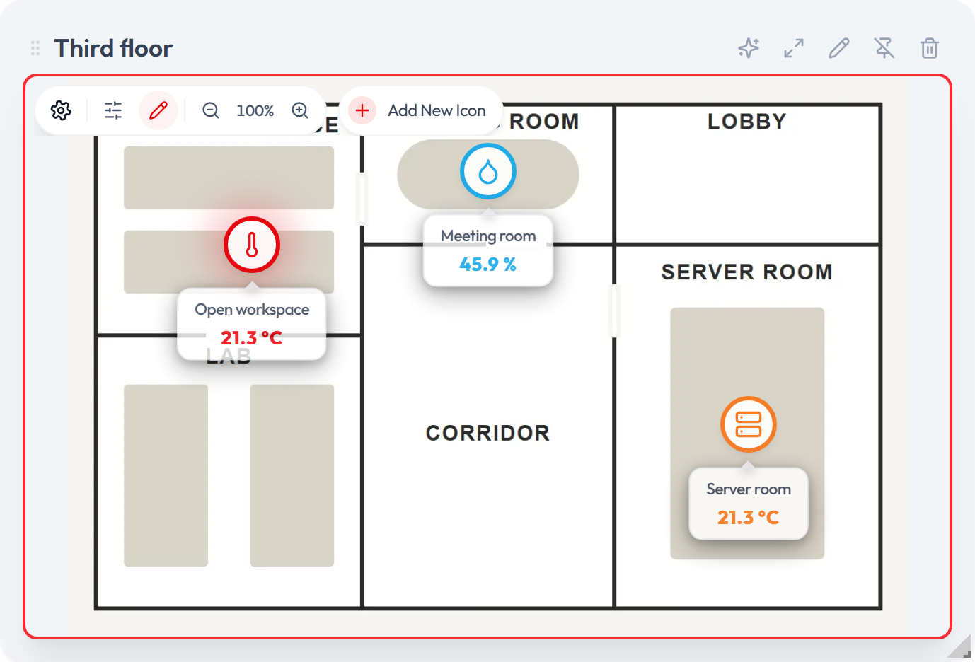
With permission to edit widgets, the control strip also has an edit mode toggle. In edit mode Add New Icon lets you click the image to place a pin; the Add Icon dialog then asks for the device, attribute, icon, and options. Select a pin to open its menu: Edit position to drag it, Edit to reopen its settings, and Delete, which confirms with Remove icon from map? and is offered while more than one pin remains. Every change made here is saved to the widget.
Multi Status: World Map
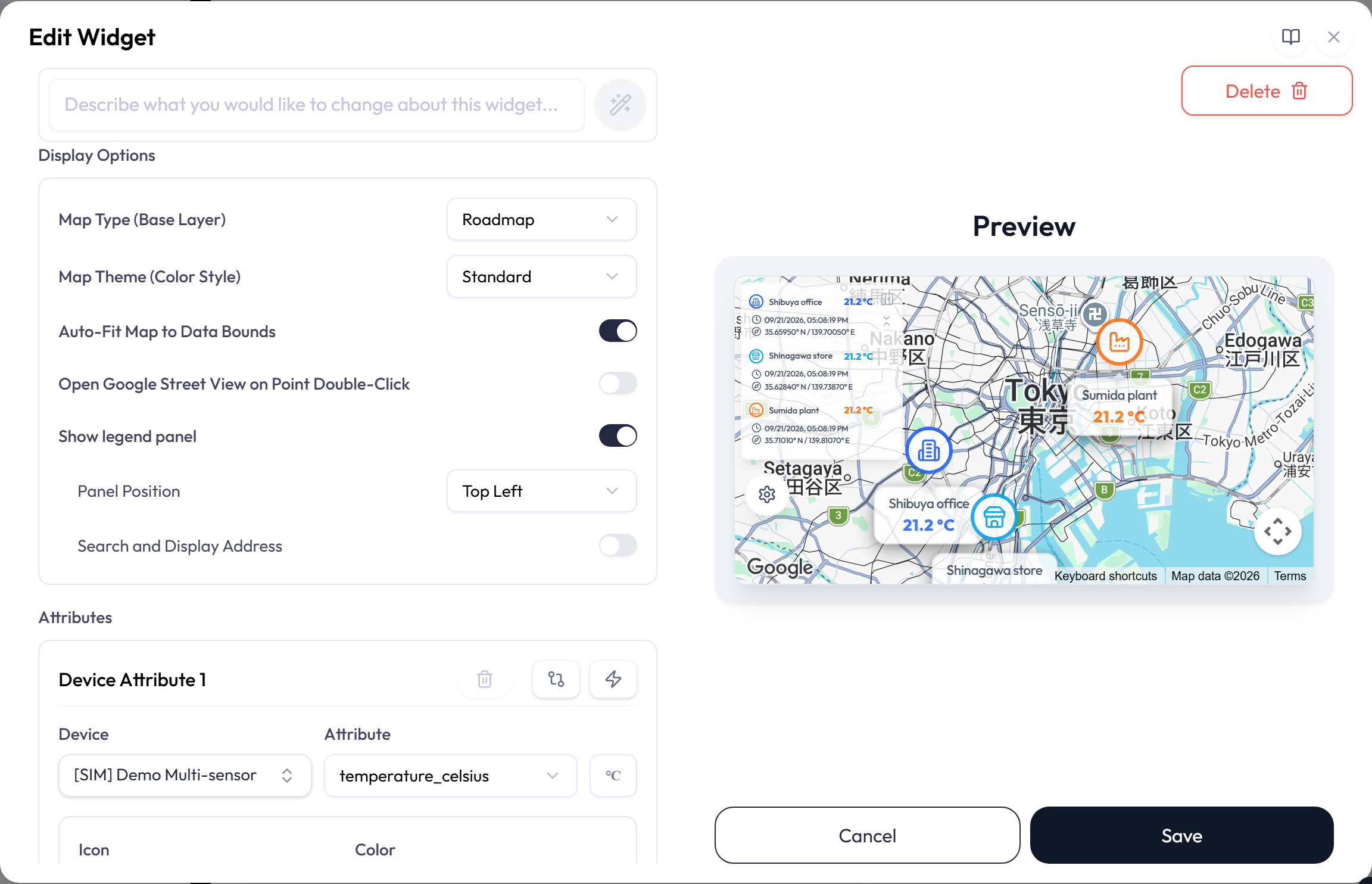
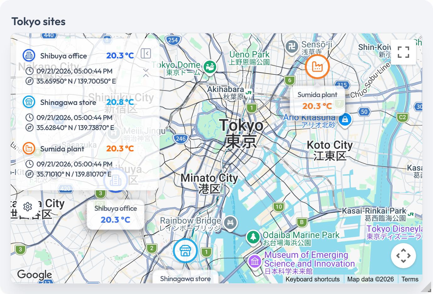
A World Map places a marker for each device on a Google map at a latitude and longitude, and shows the attribute’s latest value beside it. Use it for sites spread across a region, or for devices that report their own position. It appears only when the application has Google Maps enabled.
| Option | What it does |
|---|---|
| Latitude / Longitude | The marker’s position in decimal degrees, from -90 to 90 and -180 to 180. Use Search by address to look up a place and fill both fields. A marker with an invalid position is not drawn. |
| Icon, Color, Label, Related alerts | Work as they do for the floor-plan Map, including Display Alert. |
| Map Type and Map Theme | Roadmap, Satellite, Hybrid, or Terrain, with Standard, Dark, Silver, or Retro styling. |
| Auto-Fit Map to Data Bounds | Frames all markers on every update. Turn it off to set a Default Zoom Level and choose whether the map recenters or resets on updates. |
| Legend panel | Show legend panel lists every device with its coordinates and the time of its last reading; Search and Display Address adds the resolved address. Panel Position is a corner or Auto, which keeps the panel clear of the selected marker. |
| Open Google Street View on Point Double-Click | Opens Street View at a marker when you double-click it. |
Multi Status: Progress
Progress widgets show how far each attribute has come toward a target, as a bar across a time window or a numeric range. Use them for daily production targets, scheduled jobs, or capacity.
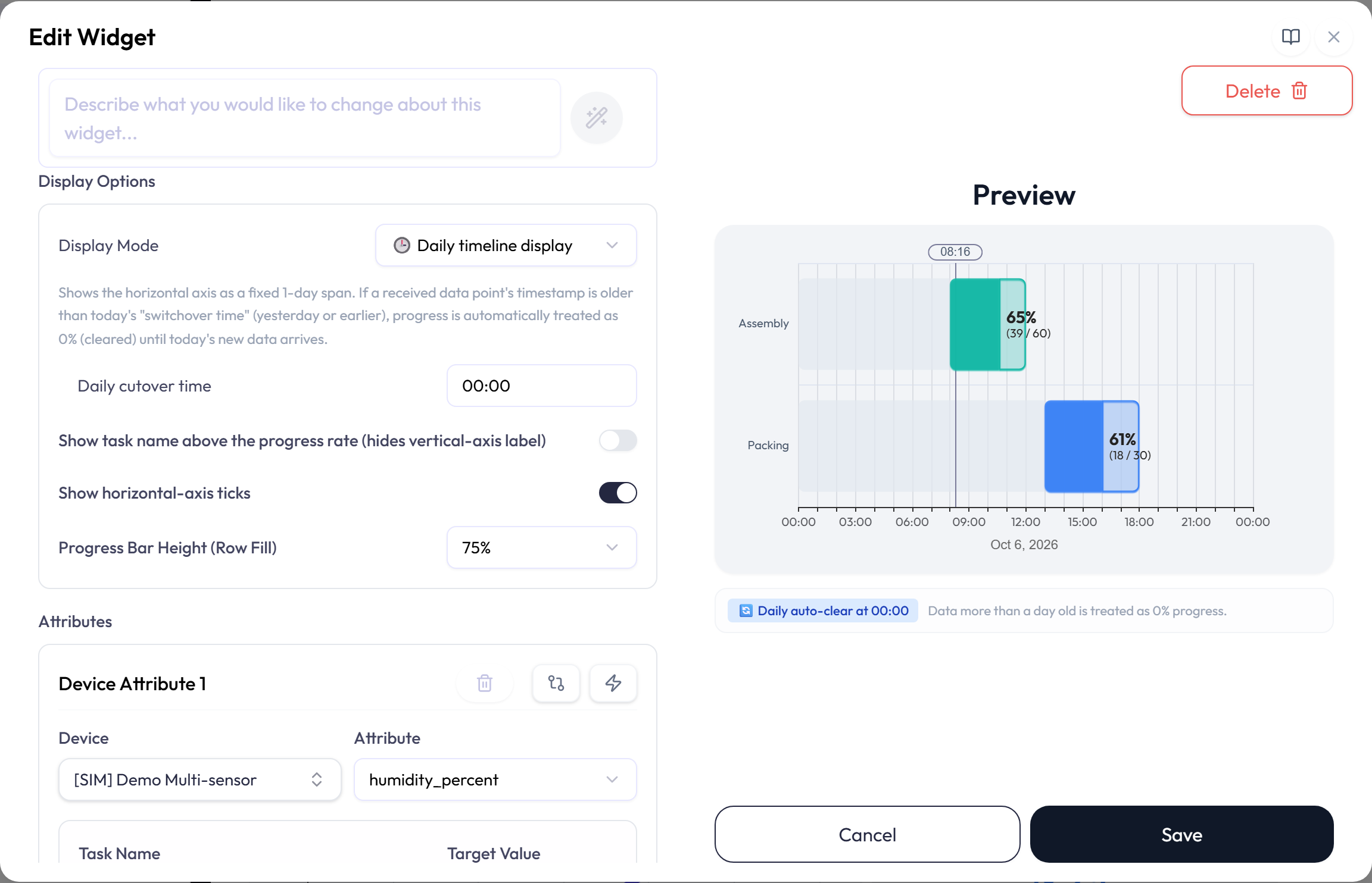
The Display Options box sets how the bars are drawn:
| Option | What it does |
|---|---|
| Display Mode | Daily timeline display, the default for a new widget, draws a 24-hour axis that starts at the Daily cutover time (00:00 unless you change it) and clears each day. Flexible scale display keeps showing the latest data with no daily clear, on the axis chosen in Horizontal axis tick display unit: Time (HH:mm) or Numeric. |
| Show task name above the progress rate (hides vertical-axis label) | Prints each task name on its bar’s badge instead of on the vertical axis. Off by default. |
| Show horizontal-axis ticks | On by default. In Daily mode it also marks the current time on the axis. |
| Progress Bar Height (Row Fill) | How much of its row each bar fills, from 50% to 100%. The default is 75%. |
Each attribute row has a Task Name, a Target Value, a Start Point and End Point, and a color. The task name is also written into PDF reports.
- In Daily mode the points are times within the 24 hours that start at the Daily cutover time. An end earlier than the start runs past midnight only if it still ends by the next cutover, so with the default 00:00 cutover a range cannot cross midnight. Setting both points to the cutover time covers the whole day.
-
In Flexible mode with a time axis, the points are
HH:mmtimes that may pass 24:00, such as25:30. With a numeric axis they are numbers of 0 or more. - A bar fills to the latest value as a share of the Target Value. Its badge shows the percentage with the value and target underneath: a green check at exactly 100%, a red arrow over 100%, and N/A for a negative value or a target of 0 or less.
- In Daily mode, a row whose latest reading is from before the most recent Daily cutover time, in your profile’s time zone, shows — with a warning and how many days ago it reported, until new data arrives. In Flexible mode a reading a day old or more keeps its bar and is marked with how many days ago it arrived.
Multi Status: Pie and Doughnut
Pie and Doughnut widgets compare the latest values as parts of a total. Each attribute becomes one slice.
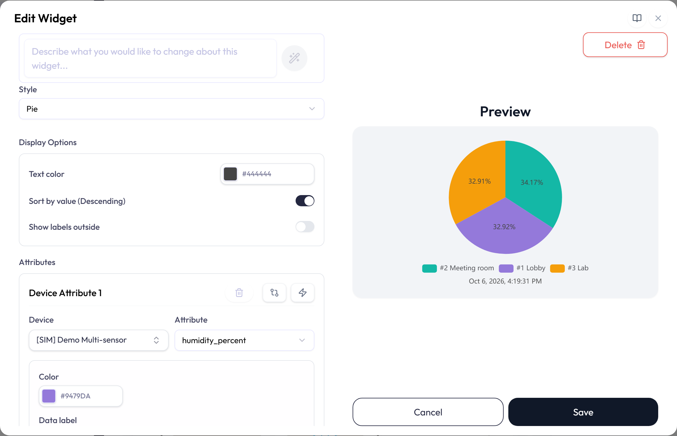
- Every slice is labeled with its share of the total as a percentage. Give an attribute a Data label to print that name above the percentage; the full attribute name always appears in the legend.
- A Doughnut also shows the Total of the visible slices in its center.
- Text color styles the slice labels.
- Sort by value orders slices from largest to smallest.
- Show labels outside moves labels beyond the chart edge, where they keep clear of the legend.
- Each attribute has its own color.
Multi Status: Switch
A Switch shows on/off attributes as switches, one per attribute row. Use it for states such as a pump running, a door open, or an alarm armed. It only displays the state and does not control the device; to send a command, use a Data Push widget.
![The Edit Widget dialog for a Switch widget. Switch style is set to Toggle. Device Attribute 1 binds [SIM] Door Contact Sensor and contact_state_number, with State text set to Open / Closed, Show state text checked, and a green color. The preview shows two toggles side by side, contact_number reading Closed and learnButton_number reading Off, both switched off.](https://neqto.ai/wp-content/uploads/2026/10/dashboard-chart-switch.png)
| Option | What it does |
|---|---|
| Switch style | Toggle, the default, Light switch, or Button. One style applies to every row. |
| State text | The words for on and off, chosen per row as described under Attributes and their options. With Not set, the Switch shows On and Off. |
| Show state text | Set per row, on by default. Turn it off to hide that row’s words; a Button is then left blank, and a row with no data shows only its dashed outline. |
| Color | The row’s on color. Off is grey. |
-
A value other than
true,false,1, or0, including a device that has not reported yet, shows No data with a dashed outline. - A single row is drawn large in the middle of the widget under its device name. Several rows wrap as cards, each named by its attribute, and also by its device when the rows come from more than one device.
- Clicking a switch changes nothing. Double-click it to open the expanded view.
- The assistant, in Ask AI or the editor’s AI field, can create a Switch and set its style and state text. The dashboard creation wizard does not plan Switch widgets.
Data Push: Form, Button
Data Push sends a command or setting to a device endpoint from the dashboard. It does not show device readings.
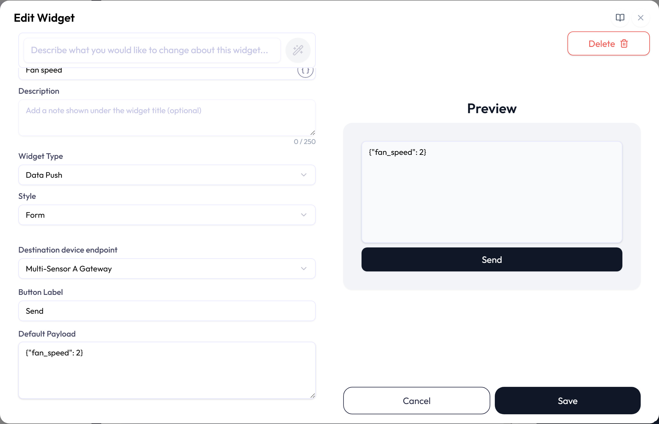
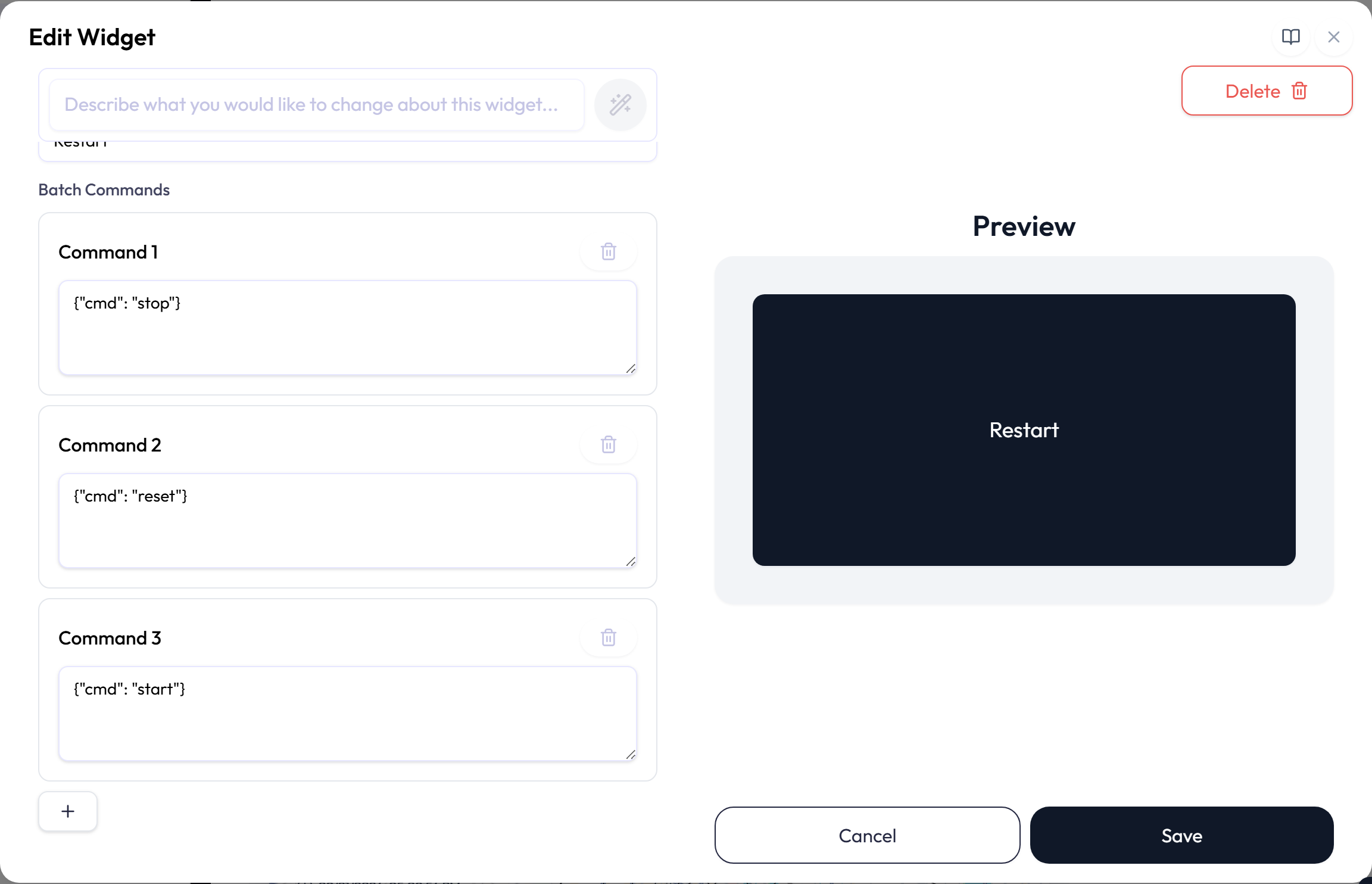
| Option | What it does |
|---|---|
| Destination device endpoint | Selects the required destination. HTTPS endpoints are disabled for Data Push. |
| Button Label | Sets the required text shown on the send button. |
| Default Payload | For Form style, pre-fills the editable input with up to 4,096 characters of text, JSON, or hexadecimal data. |
| Batch Commands | For Button style, saves one to four payloads of up to 4,096 characters each and sends them in order. |
Device List
Device List shows device names and connection status in a card or table. Select all devices in the current scope or choose up to 100 devices.
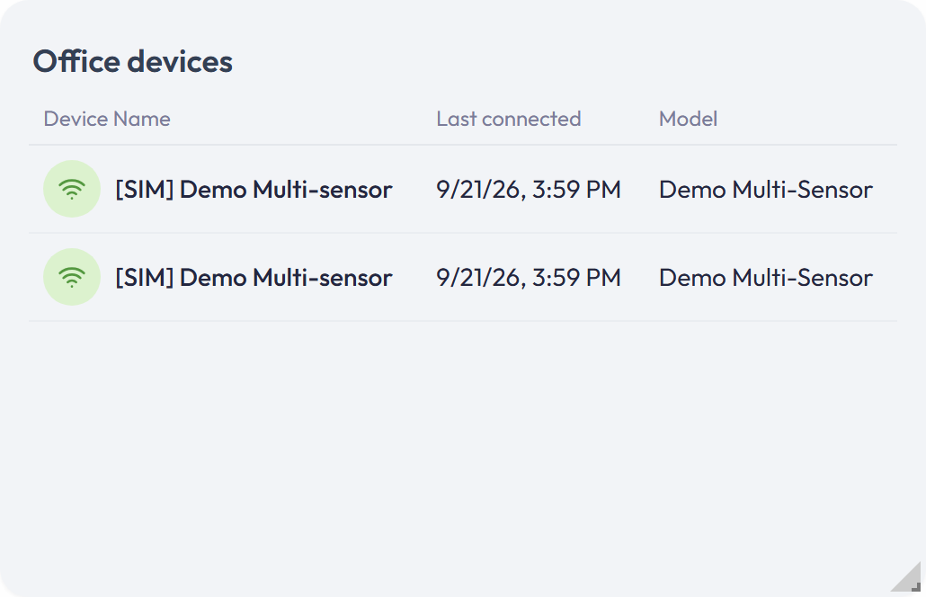
| Option | What it does |
|---|---|
| Devices | Shows all devices or a selected set. All-devices mode lists 100 devices per page in the saved sort order; when there are more, the footer reads, for example, 1–100 of 240 devices, with arrows to move between pages. Changing the sort returns to the first page. |
| Columns | Adds Endpoint or Integration, Tags, Last connected, External ID, Vendor, Model, Notes, or Created. Name and connection status always appear. |
| Show device image | Adds a thumbnail to table rows when an image is available. The single-device card always includes its image or a placeholder. |
| Sort by / Order | Selects a supported column and ascending or descending order. |
![Device List settings in a Display Options box: All devices switched off, two selected devices shown as chips, [SIM] Demo Multi-sensor — Multi-Sensor A Gateway and Delivery Van 3 — Fleet Telematics, the count 2/100 devices selected, and the Columns switches with Last connected and Model on. The preview lists both devices with their connection icons, last connected time, and model.](https://neqto.ai/wp-content/uploads/2026/10/dashboard-config-device-list.png)
- Connection changes update as they arrive; other device details refresh periodically.
- Select a device name to open that device in a new tab.
Alert List
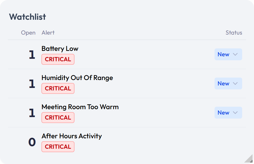
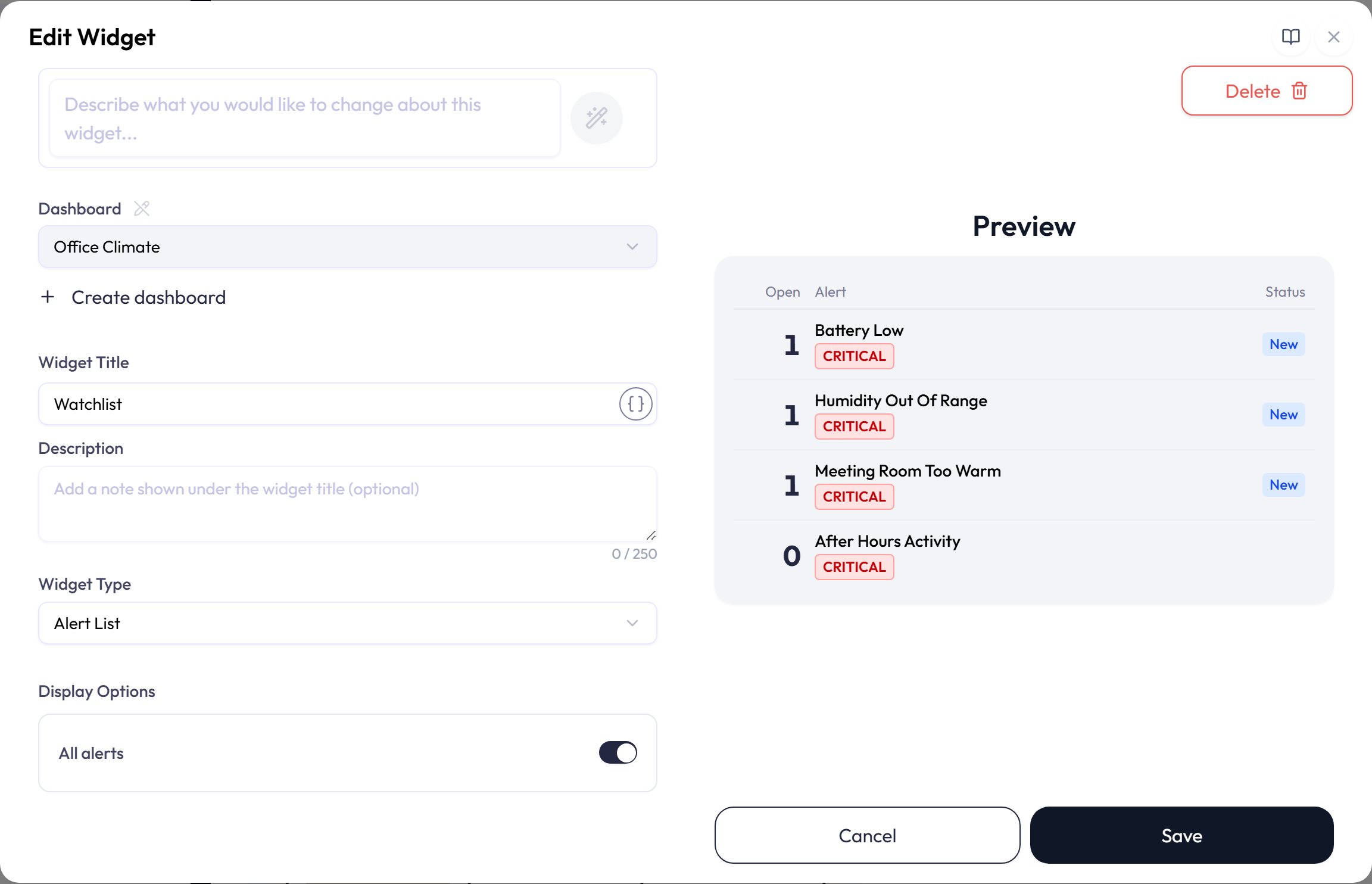
Alert List shows alert names, severity, open event counts, and the status of each alert’s latest open event. It is available only on application dashboards and requires alert view permission. Select all alerts or choose up to 20. A single alert uses a card; several alerts use a list.
An open event is New, In Progress, or Pending. Completed and Dismissed events are not counted. With alert edit permission you can change the latest open event’s status from the widget; otherwise it is read-only. Alerts with the most open events come first, then by severity and name.
The status menu offers New, In Progress, Completed, Pending, and Dismissed. Choosing Completed or Dismissed closes the event: a toast confirms Event closed, the count drops, and the next open event, if any, takes its place. If someone else changed the event first, an error toast says so and the widget shows the event’s current status.
- Event counts update when alert events change.
- Disabled alerts are marked in the list.
- If a selected alert was deleted, the editor marks it as Deleted and blocks saving until you remove it.
- A viewer without alert view permission sees a permission message instead of alert data.
Plan Limits
Your plan sets how many dashboards and widgets the account can have. The editor also enforces these structural limits:
| Feature | Limit |
|---|---|
| Dashboard creation wizard | 20 devices per selection; 1 to 16 planned widgets |
| Map and World Map widgets | No separate limit on Map widgets per dashboard beyond the plan’s widget allowance. No limit on pins per widget. |
| Table | 16 cells total; up to 16 rows and eight columns |
| XY-Chart | Eight pairs |
| Tracking Map | Eight location series |
| Fan chart | One attribute |
| Distribution chart | 20 attributes, 366 days, and 8,000 aggregation buckets |
| Gauge zones | 20 |
| Data Push button | Four commands |
| Device List | 100 selected devices; all-devices mode shows 100 per page |
| Alert List | 20 selected alerts |